Following on from my graphs from January and February‘s data releases, here are some updated graphs based on May’s data release from the BLS [click on each graph to get a bigger version].
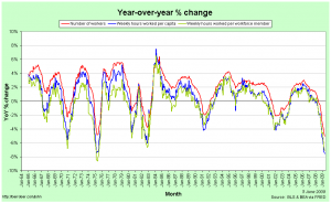
First the year-over-year % change in number of production workers, hours worked per member of the workforce and hours worked per capita:
A casual inspection of this graph suggests that the current recession is, for employment, about the same as or a little better than the 1973-75 recession, but that is an incorrect interpretation. This graph effectively shows rates of change, so it’s not just the depth below zero that matters but the time beneath it as well. As we will shortly see, the current recession is actually quite a bit worse than the ’73-75 recession and the 2001 recession was a lot worse than it looks.
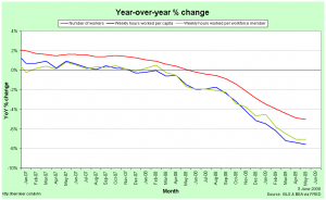
First, though, it’s instructive to zoom-in to the last year or two on the graph:
The red line indicates the year-over-year change in employment. It’s clearly badly negative. The green line is the change in hours worked per member of the workforce. This is worse than that for employment because not only are people losing their jobs, but those who keep their jobs are, on average, having their hours cut. The blue line is the change in hours worked per capita. This is the worst of the three because in addition to people losing their jobs and those with jobs having their hours cut, some of those without jobs have given up looking. Notice that the blue and green lines were pretty close together at first. This suggests that in the first half of the current recession, people who lost their jobs were staying in the workforce in the hope of finding work, while it was only in the second half that some of the unemployed started to lose hope and give up looking.
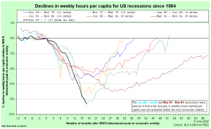
In comparing recessions, I prefer to use the hours-worked-per-capita metric because it captures much more of the employment picture than just employment figures or total hours worked. Here is a comparison between recessions dating back to 1964, centred around their NBER-determined peak in economic activity:
Notice that hours worked per capita tend to have been falling for some time before the NBER-determined peak in economic activity. This is because employment is not the be all and end all of the economy and the dating committee has to take those other elements into account as well.
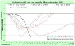
Now we rebase that comparison so each recession is relative to it’s actual peak in hours worked per capita:
This gives us a true measure of the depth of each recession with respect to employment. We can see that the ’71-75 and 2001 recessions reached about the same depth and that the current recession has now gone lower than either of them. Since it is reasonable to assume that the USA will continue to lose jobs (or at least hours worked) in the next couple of months, we can safely call the current recession the worst of this group of seven.
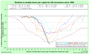
Finally, I thought it worthwhile to compare the falls relative to actual peaks, but centred around each recession’s trough in hours worked per capita (for comparison purposes, I have assumed that the current recession’s trough was in May ’09):
This graph gives some hope to those imagining a quick recovery. While the recoveries do tend to be a little slower than the recessions, there does appear to be some symmetry around the troughs.
John – I find your graphs & analyses pretty interesting.
I decided to see if I could reproduce some of your graphs, and of course,
I couldn’t help but to try to make a few small improvements 🙂
Here are 3 graphs, in case you’d like to see them:
In this one, I use dot-markers on the plot, which I think help users “see” where the graph is increasing/decreasing more rapidly (faster change = more distance between dots). And also I add html hover-text (hover your mouse over the dots to see the exact values). Also, I just put the year in the horizontal axis tickmarks:
http://robslink.com/SAS/democd39/YoY.htm
In this one, I color-code the left & right axis labels the same as the data lines, to help users more quickly know which axis goes with which line:
http://robslink.com/SAS/democd39/weekly_worked.htm
Similarl to the first one, I add dot-markers with html hover-text:
http://robslink.com/SAS/democd39/recession.htm
Let’s say we call any employment cycle that doesn’t recover fully to peak to be part of a greater recession (like the great depression spanned two gdp and employment falls and rises).
So what would it look like if the 1981 recession started in 1980(1979?) and the current Great Recession started in 2000.
What did they call the depression before the Great Depression? the Long Depression? Maybe fron early 2000 we are in the Long Recession that will span at least as many years as the Great Depression, if not 5-10 years more.