On interest rates

In what Tyler Cowen calls “Critically important stuff and two of the best recent economics blog posts, in some time,” Paul Krugman and Brad DeLong have got some interesting thoughts on US interest rates.  First Krugman:

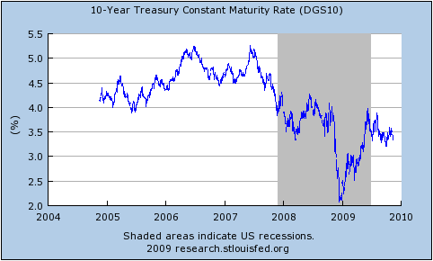
On the face of it, there’s no reason to be worried about interest rates on US debt. Despite large deficits, the Federal government is able to borrow cheaply, at rates that are up from the early post-Lehman period … but well below the pre-crisis levels:

DESCRIPTION

Underlying these low rates is, in turn, the fact that overall borrowing by the nonfinancial sector hasn’t risen: the surge in government borrowing has in fact, less than offset a plunge in private borrowing.

So what’s the problem?

Well, what I hear is that officials don’t trust the demand for long-term government debt, because they see it as driven by a “carry trade”: financial players borrowing cheap money short-term, and using it to buy long-term bonds. They fear that the whole thing could evaporate if long-term rates start to rise, imposing capital losses on the people doing the carry trade; this could, they believe, drive rates way up, even though this possibility doesn’t seem to be priced in by the market.

What’s wrong with this picture?

First of all, what would things look like if the debt situation were perfectly OK? The answer, it seems to me, is that it would look just like what we’re seeing.

Bear in mind that the whole problem right now is that the private sector is hurting, it’s spooked, and it’s looking for safety. So it’s piling into “cash”, which really means short-term debt. (Treasury bill rates briefly went negative yesterday). Meanwhile, the public sector is sustaining demand with deficit spending, financed by long-term debt. So someone has to be bridging the gap between the short-term assets the public wants to hold and the long-term debt the government wants to issue; call it a carry trade if you like, but it’s a normal and necessary thing.

Now, you could and should be worried if this thing looked like a great bubble — if long-term rates looked unreasonably low given the fundamentals. But do they? Long rates fluctuated between 4.5 and 5 percent in the mid-2000s, when the economy was driven by an unsustainable housing boom. Now we face the prospect of a prolonged period of near-zero short-term rates — I don’t see any reason for the Fed funds rate to rise for at least a year, and probably two — which should mean substantially lower long rates even if you expect yields eventually to rise back to 2005 levels. And if we’re facing a Japanese-type lost decade, which seems all too possible, long rates are in fact still unreasonably high.

Still, what about the possibility of a squeeze, in which rising rates for whatever reason produce a vicious circle of collapsing balance sheets among the carry traders, higher rates, and so on? Well, we’ve seen enough of that sort of thing not to dismiss the possibility. But if it does happen, it’s a financial system problem — not a deficit problem. It would basically be saying not that the government is borrowing too much, but that the people conveying funds from savers, who want short-term assets, to the government, which borrows long, are undercapitalized.

And the remedy should be financial, not fiscal. Have the Fed buy more long-term debt; or let the government issue more short-term debt. Whatever you do, don’t undermine recovery by calling off jobs creation.

The point is that it’s crazy to let the rescue of the economy be held hostage to what is, if it’s an issue at all, a technical matter of maturity mismatch. And again, it’s not clear that it even is an issue. What the worriers seem to regard as a danger sign — that supposedly awful carry trade — is exactly what you would expect to see even if fiscal policy were on a perfectly sustainable trajectory.

Then DeLong:

I am not sure Paul is correct when he says that the possible underlying problem is merely “a technical matter of maturity mismatch.” The long Treasury market is thinner than many people think: it is not completely implausible to argue that it is giving us the wrong read on what market expectations really are because long Treasuries right now are held by (a) price-insensitive actors like the PBoC and (b) highly-leveraged risk lovers borrowing at close to zero and collecting coupons as they try to pick up nickles in front of the steamroller. And to the extent that the prices at which businesses can borrow are set by a market that keys off the Treasury market, an unwinding of this “carry trade”–if it really exists–could produce bizarre outcomes.

Bear in mind that this whole story requires that the demand curve slope the wrong way for a while–that if the prices for Treasury bonds fall carry traders lose their shirts and exit the market, and so a small fall in Treasury bond prices turns into a crash until someone else steps in to hold the stock…

For reference, here are the time paths of interest rates for a variety of term lengths and risk profiles (all taken from FRED):

interest_rates_1monthinterest_rates_3monthsinterest_rates_30years

To my own mind, I’m somewhat inclined to agree with Krugman.  While I do believe that the carry trade is occurring, I suspect that it’s effects are mostly elsewhere, or at least that the carry trade is not being played particularly heavily in long-dated US government debt relative to other asset markets.

Notice that the AAA and BAA 30-year corporate rates are basically back to pre-crisis levels and that the premium they pay over 30-year government debt is also back to typical levels.  If the long-dated rates are being pushed down to pre-crisis levels solely by increased supply thanks to the carry trade, then we would surely expect the quantity of credit to also be at pre-crisis levels.  But new credit issuance is down relative to the pre-crisis period.  Since the price is largely unchanged, that means that both demand and supply of credit have shrunk – the supply from fear in the financial market pushing money to the short end of the curve and the demand from the fact that there’s been a recession.

An information-based approach to understanding why America let Lehman Brothers collapse but saved everyone afterwards

In addition to his previous comments on the bailouts [25 Aug27 Aug28 Aug], which I highlighted here, Tyler Cowen has added a fourth post [2 Sep]:

I side with Bernanke because an economy can withstand only so much major bank insolvency at once. Lots of major banks were levered up 30-1 or so. Their assets fell in value more than a modest amount and then they were insolvent, sometimes grossly so. (A three percent decline in asset values already puts you into insolvency range.) If AIG had gone into bankruptcy court, some major banks would have been even more insolvent. Or if Frannie securities had been allowed to find their non-bailout values. My guess is that at least 15 out of the top 20 U.S. banks would have been flat-out insolvent if, starting at the time of Bear Stearns, all we had done was loose monetary policy and no other bailouts. Subsequent contagion effects, and the shut down of short-term repo markets, and a run on money market funds, would have made even more financial institutions insolvent. The world as we know it then becomes very dire, both for credit reasons and deflation reasons (yes you can print up currency to keep measured M up and running but the economy still collapses). So we needed not just emergency lending but also resource transfers to banks, basically to put them back into the range of possible solvency.

I really like to see Tyler’s evolving attitudes here.  It lets me know that mere grad students are allowed to not be sure of themselves. 🙂  In any event, let me present my latest thoughts on the bailouts:

Imagine being Bernanke/Paulson two days before Lehman Brothers went down:  you know they’re going to go down if you don’t bail them out and you know that to bail them out creates moral hazard problems (i.e. increases the likelihood of a repeat of the entire mess in another 10 years).  You don’t know how close to the edge everyone else is, nor how large an effect a Lehman collapse will have on everyone else in the short-run (thanks, in no small part, to the fact that all those derivatives were sold over-the-counter), but you’re nevertheless almost certain that Lehman Brothers are not important enough to take down the whole planet.

In that situation, I think of the decision to let Lehman Brothers go down as an experiment to allow estimation of the system’s interconnectedness.  Suppose you’ve got a structural model of the U.S. financial system as a whole, but no empirical basis for calibrating it.  Normally you might estimate the deep parameters from micro models, but when derivatives were exempted from regulation in the 2000 Commodities Futures Modernization Act, in addition to letting firms do what they wanted with derivatives you also gave up having information about what they were doing.  So instead, what you need is a macro shock that you can fully identify so that at least you can pull out the reduced-form parameters.  Letting Lehman go was the perfect opportunity for that shock.

I’m not saying that Bernanke had an actual model that he wanted to calibrate (although if he didn’t, I really hope he has one now), but he will certainly have had a mental model.  I don’t even mean to suggest that this was the reasoning behind letting Lehman go.  That would be one hell of a (semi) natural experiment and a pretty reckless way to gather the information.  Nevertheless, the information gained is tremendously valuable, both in itself and to society as a whole because it is now, at least in part, public information.

To some extent, I feel like the ideal overall response to the crisis from the Fed and Treasury would have been to let everyone fail a little bit, but that isn’t possible — you can’t let an institution become a little bit bankrupt in the same way that you can’t be just a little bit pregnant.  To me, the best real-world alternative was to let one or two institutions die to put the frighteners on everyone and discover the degree of interconnectedness of the system and then save the rest, with the nature and scale of the subsequent bailouts being determined by the reaction to the first couple going down.  I would only really throw criticism at the manner of the saving of the rest (especially the secrecy) and even then I would be hesitant because:

(a) it was all terribly political and at that point the last thing Bernanke needed was a financially-illiterate representative pushing his or her reelection-centred agenda every step of the way (we don’t let people into a hospital emergency room when the doctor isn’t yet sure of what’s wrong with the patient);

(b) perhaps the calibration afforded by the collapse of Lehman Brothers convinced Bernanke-the-physician that short-term secrecy was necessay to “stop the bleeding” (although that doesn’t necessarily imply that long-term secrecy is warranted); and

(c) there was still inherent (i.e. Knightian) uncertainty in what was coming next on a day-to-day basis.

In which I respectfully disagree with Paul Krugman

Paul Krugman [Ideas, Princeton, Unofficial archive] has recently started using the phrase “jobless recovery” to describe what appears to be the start of the economic recovery in the United States [10 Feb, 21 Aug, 22 Aug, 24 Aug].  The phrase is not new.  It was first used to describe the recovery following the 1990/1991 recession and then used extensively in describing the recovery from the 2001 recession.  In it’s simplest form, it is a description of an economic recovery that is not accompanied by strong jobs growth.  Following the 2001 recession, in particular, people kept losing jobs long after the economy as a whole had reached bottom and even when employment did bottom out, it was very slow to come back up again.  Professor Krugman (correctly) points out that this is a feature of both post-1990 recessions, while prior to that recessions and their subsequent recoveries were much more “V-shaped”.  He worries that it will also describe the recovery from the current recession.

While Professor Krugman’s characterisations of recent recessions are broadly correct, I am still inclined to disagree with him in predicting what will occur in the current recovery.  This is despite Brad DeLong’s excellent advice:

  1. Remember that Paul Krugman is right.
  2. If your analysis leads you to conclude that Paul Krugman is wrong, refer to rule #1.

This will be quite a long post, so settle in.  It’s quite graph-heavy, though, so it shouldn’t be too hard to read. 🙂

Professor Krugman used his 24 August post on his blog to illustrate his point.  I’m going to quote most of it in full, if for no other reason than because his diagrams are awesome:

First, here’s the standard business cycle picture:

DESCRIPTION

Real GDP wobbles up and down, but has an overall upward trend. “Potential output” is what the economy would produce at “full employment”, which is the maximum level consistent with stable inflation. Potential output trends steadily up. The “output gap” — the difference between actual GDP and potential — is what mainly determines the unemployment rate.

Basically, a recession is a period of falling GDP, an expansion a period of rising GDP (yes, there’s some flex in the rules, but that’s more or less what it amounts to.) But what does that say about jobs?

Traditionally, recessions were V-shaped, like this:

DESCRIPTION

So the end of the recession was also the point at which the output gap started falling rapidly, and therefore the point at which the unemployment rate began declining. Here’s the 1981-2 recession and aftermath:

DESCRIPTION

Since 1990, however, growth coming out of a slump has tended to be slow at first, insufficient to prevent a widening output gap and rising unemployment. Here’s a schematic picture:

DESCRIPTION

And here’s the aftermath of the 2001 recession:

DESCRIPTION

Notice that this is NOT just saying that unemployment is a lagging indicator. In 2001-2003 the job market continued to get worse for a year and a half after GDP turned up. The bad times could easily last longer this time.

Before I begin, I have a minor quibble about Prof. Krugman’s definition of “potential output.”  I think of potential output as what would occur with full employment and no structural frictions, while I would call full employment with structural frictions the “natural level of output.”  To me, potential output is a theoretical concept that will never be realised while natural output is the central bank’s target for actual GDP.  See this excellent post by Menzie Chinn.  This doesn’t really matter for my purposes, though.

In everything that follows, I use total hours worked per capita as my variable since that most closely represents the employment situation witnessed by the average household.  I only have data for the last seven US recessions (going back to 1964).  You can get the spreadsheet with all of my data here: US_Employment [Excel].  For all images below, you can click on them to get a bigger version.

The first real point I want to make is that it is entirely normal for employment to start falling before the official start and to continue falling after the official end of recessions.  Although Prof. Krugman is correct to point out that it continued for longer following the 1990/91 and 2001 recessions, in five of the last six recessions (not counting the current one) employment continued to fall after the NBER-determined trough.  As you can see in the following, it is also the case that six times out of seven, employment started falling before the NBER-determined peak, too.

Hours per capita fell before and after recessions

Prof. Krugman is also correct to point out that the recovery in employment following the 1990/91 and 2001 recessions was quite slow, but it is important to appreciate that this followed a remarkably slow decline during the downturn.  The following graph centres each recession around it’s actual trough in hours worked per capita and shows changes relative to those troughs:

Hours per capita relative to and centred around trough

The recoveries following the 1990/91 and 2001 recessions were indeed the slowest of the last six, but they were also the slowest coming down in the first place.  Notice that in comparison, the current downturn has been particularly rapid.

We can go further:  the speed with which hours per capita fell during the downturn is an excellent predictor of how rapidly they rise during the recovery.  Here is a scatter plot that takes points in time chosen symmetrically about each trough (e.g. 3 months before and 3 months after) to compare how far hours per capita fell over that time coming down and how far it had climbed on the way back up:

ComparingRecessions_20090605_Symmetry_Scatter_All

Notice that for five of the last six recoveries, there is quite a tight line describing the speed of recovery as a direct linear function of the speed of the initial decline.  The recovery following the 1981/82 recession was unusually rapid relative to the speed of it’s initial decline.  Remember (go back up and look) that Prof. Krugman used the 1981/82 recession and subsequent recovery to illustrate the classic “V-shaped” recession.  It turns out to have been an unfortunate choice since that recovery was abnormally rapid even for pre-1990 downturns.

Excluding the 1981/82 recession on the basis that it’s recovery seems to have been driven by a separate process, we get quite a good fit for a simple linear regression:

ComparingRecessions_20090605_Symmetry_Scatter_Excl_81-82

Now, I’m the first to admit that this is a very rough-and-ready analysis.  In particular, I’ve not allowed for any autoregressive component to employment growth during the recovery.  Nevertheless, it is quite strongly suggestive.

Given the speed of the decline that we have seen in the current recession, this points us towards quite a rapid recovery in hours worked per capita (although note that the above suggests that all recoveries are slower than the preceding declines – if they were equal, the fitted line would be at 45% (the coefficient would be one)).

On China

Menzie Chinn emphasises that for the purposes of estimating country shares in global GDP, it is necessary to think of them in nominal terms.  On that basis, China is large, but only half the size of the Euro zone and well under half the size of America.  Therefore, he implies, an increase in demand from China won’t really contribute as much to global growth as people might be hoping.

Nevertheless, people do seem to be wondering about China as an engine of global growth in demand.  The reason is simple:  Despite a near catastrophic collapse in world trade, China’s economy is still growing while those of  other export-oriented countries like Japan or Germany are falling precipitously.

Clearly part of the reason for the continued Chinese growth, like in Australia, is the successful use of a fiscal stimulus to boost local demand (the Australian rebound was also helped by the fact that, by not manufacturing much, their decline in investment was offset by a fall in imports and (price) changes in natural resource exports occur with a significant lag).

Brad Setser has explored the Chinese stimulus a little.  He writes:

I initially underestimated the magnitude of China’s stimulus by focusing on the (fairly modest) change in the government’s fiscal balance. It is now clear that the majority of China’s stimulus has been off-budget: the huge increase in lending by state owned banks mattered far more than the change in the budget of the central government. The expected loss on these loans can be considered a form of fiscal stimulus.

Which is a fascinating way to conduct government business.

On the symmetry of employment contraction and recovery in US recessions

A couple of days ago I gave some graphs depicting movements in weekly hours worked per capita during US recessions since 1964.  Towards the end, I gave this graph:

Comparing US recessions in hours worked per capita, centred around their troughs

I thought it might be worthwhile to look at this idea further.  Here is the equivalent graph where movements in hours worked per capita are made relative to their actual troughs rather than their actual peaks:

Comparing US recessions in hours worked per capita, centred around and relative to their troughs

At a first glance, recoveries do appear to be somewhat symmetric to their corresponding contractions, although they do also appear to be a bit slower coming back up to falling down in the first place.

I then identified data pairs that are symmetric in time around each trough (e.g. 3 months before and after the trough) and put them in a scatter-plot:

Scatter plot of falls-to-come in weekly hours per capita against subsequent gains in recovery

Points along the 45-degree line here would represent recoveries that were perfectly symmetric with their preceding contraction.  Notice that for five of the six recessions shown, recoveries are in a fairly tight line below the 45-degree line.  By comparison, the recovery following the ’81-’82 recession was especially rapid – it came back up faster than it fell down.

Excluding the ’81-’82 recession on the basis that it’s recovery seems to have been driven by a separate process, a simple linear regression gives a remarkably good fit:

comparingrecessions_20090605_symmetry_scatter_excl_81-82

This is a very rough-and-ready analysis.  In particular, I’ve not allowed for any autoregressive component to employment growth during the recovery.  Nevertheless, it is suggestive.

There are more serious efforts in looking at this for the economy as a whole (rather than just hours worked).  James Hamilton is not convinced that it will occur this time.  The oddly rapid recovery in hours worked per capita following the ’81-’82 recession should give us reason to agree with Professor Hamilton, not disagree: it shows that the typical recovery is not guaranteed.  Look back at the scatter-plot of all the recessions.  Notice that the recovery following the ’69-’70 recession was actually quite slow.  It’s fitted line is y = 0.252 x.

For me, the big thing that makes me lean towards Professor Hamilton’s fears of a slower-than-typical recovery is the possibility of zombie banks, or as John Hempton argues, zombie borrowers.  Zombie borrowers should worry us because, if they exist, they are keeping hold of the capital that could (and should) be better placed elsewhere in the economy, which means that those more deserving would-be borrowers are not able to expand and employ more people.

As Hempton argues in the second of his posts, on this basis it is a Good Thing ™ that two of the three US car manufacturers have been forced into a bankruptcy-induced contraction.  Note that Ford only really managed to avoid the same fate by borrowing a huge amount just before the credit markets froze.  It probably needs (from the point of view of the economy as a whole) to follow the same process, whether inside or outside the courts.

But the car manufacturers are by no means the only candidates for the “zombie borrower” epithet.  The really big borrower behind all of the mess in the financial sector is the one at the bottom of all the “toxic” CDOs:  the underwater American households.

Comparison of US recessions in hours worked per capita

Following on from my graphs from January and February‘s data releases, here are some updated graphs based on May’s data release from the BLS [click on each graph to get a bigger version].

First the year-over-year % change in number of production workers, hours worked per member of the workforce and hours worked per capita:

Year-over-year changes in employment and hours worked

A casual inspection of this graph suggests that the current recession is, for employment, about the same as or a little better than the 1973-75 recession, but that is an incorrect interpretation.  This graph effectively shows rates of change, so it’s not just the depth below zero that matters but the time beneath it as well.  As we will shortly see, the current recession is actually quite a bit worse than the ’73-75 recession and the 2001 recession was a lot worse than it looks.

First, though, it’s instructive to zoom-in to the last year or two on the graph:

Year-over-year change in employment and hours worked (zoomed in)

The red line indicates the year-over-year change in employment.  It’s clearly badly negative.  The green line is the change in hours worked per member of the workforce.  This is worse than that for employment because not only are people losing their jobs, but those who keep their jobs are, on average, having their hours cut.  The blue line is the change in hours worked per capita.  This is the worst of the three because in addition to people losing their jobs and those with jobs having their hours cut, some of those without jobs have given up looking.  Notice that the blue and green lines were pretty close together at first.  This suggests that in the first half of the current recession, people who lost their jobs were staying in the workforce in the hope of finding work, while it was only in the second half that some of the unemployed started to lose hope and give up looking.

In comparing recessions, I prefer to use the hours-worked-per-capita metric because it captures much more of the employment picture than just employment figures or total hours worked.  Here is a comparison between recessions dating back to 1964, centred around their NBER-determined peak in economic activity:

Comparing hours worked per capita in US recessions relative to NBER-determined peaks in economic activity

Notice that hours worked per capita tend to have been falling for some time before the NBER-determined peak in economic activity.  This is because employment is not the be all and end all of the economy and the dating committee has to take those other elements into account as well.

Now we rebase that comparison so each recession is relative to it’s actual peak in hours worked per capita:

Comparing US recessions relative to actual peaks in hours worked per capita

This gives us a true measure of the depth of each recession with respect to employment.  We can see that the ’71-75 and 2001 recessions reached about the same depth and that the current recession has now gone lower than either of them.  Since it is reasonable to assume that the USA will continue to lose jobs (or at least hours worked) in the next couple of months, we can safely call the current recession the worst of this group of seven.

Finally, I thought it worthwhile to compare the falls relative to actual peaks, but centred around each recession’s trough in hours worked per capita (for comparison purposes, I have assumed that the current recession’s trough was in May ’09):

Comparing US recessions in hours worked per capita, centred around their troughs

This graph gives some hope to those imagining a quick recovery.  While the recoveries do tend to be a little slower than the recessions, there does appear to be some symmetry around the troughs.

A hint on the nature of the current global recession

It’s only for a six-month time period and (importantly) doesn’t attempt to correct for the varying policy responses across countries, but this graph highlighted by the Australian Reserve Bank’s governor, Glenn Stevens, is interesting:

gdp-manufacutring


Australia generally imports intermediate capital goods so in the latest numbers the fall in investment was largely balanced out by a fall in imports, while the government’s stimulus handouts probably served to keep consumption up.

As a first guess and without hunting around to see if there are numbers, I suspect that households’ spending of the handouts was also skewed more towards domestically produced goods/services over imports than has been typical for the last few years.

It would be interesting to see trade figures broken down into intermediate and final goods flows more generally.

Hat tip: Peter Martin.

US February Employment and Recession vs. Depression

The preliminary employment data for February in the USA has been out for a little while now and I thought it worthwhile to update the graphs I did after January’s figures.

As I explained when producing the January graphs, I believe that it’s more representative to look at Weekly Hours Worked Per Capita than at just the number of people with jobs so as to more fully take into account part-time work, the entry of women into the labour force and the effects of discouraged workers.  Graphs that only look at total employment (for example: 1, 2) paint a distorted picture.

The Year-over-Year percentage changes in the number of employed workers, the weekly hours per capita and the weekly hours per workforce member continue to worsen.  The current recession is still not quite as bad as that in 1981/82 by this measure, but it’s so close as to make no difference.

Year-over-year changes in employment and hours worked

Just looking at year-over-year figures is a little deceptive, though, as it’s not just how far below the 0%-change line you fall that matters, but also how long you spend below it.  Notice, for example, that while the 2001 recession never saw catastrophically rapid falls in employment, it continued to decline for a remarkably long time.

That’s why it’s useful to compare recessions in terms of their cumulative declines from peak:

Comparing US recessions relative to actual peaks in weekly hours worked per capitaA few points to note:

  • The figures are relative to the actual peak in weekly hours worked per capita, not to the official (NBER-determined) peak in economic activity.
  • I have shown the official recession durations (solid arrows) and the actual periods of declining weekly hours worked per capita (dotted lines) at the top.
  • The 1980 and 2001 recessions were odd in that weekly hours worked per capita never fully recovered before the next recession started.

The fact that the current recession isn’t yet quite as bad as the 1981/82 recession is a little clearer here.  The 1973-75 recession stands out as being worse than the current one and the 2001 recession was clearly the worst of all.

There’s also some question over the US is actually in a depression rather than just a recession.  The short answer is no, or at least not yet.  There is no official definition of a depression, but a cumulative decline of 10% in real GDP is often bandied around as a good rule of thumb.  Here are two diagrams that illustrate just how much worse things would need to be before the US was really in a depression …

First, from The Liscio Report, we have an estimated unemployment rate time-series that includes the Great Depression:

Historic Unemployment Rates in the USA

Second, from Calculated Risk, we have a time-series of cumulative declines in real gdp since World War II:

Cumulative declines in real GDP (USA)

Remember that we’d need to fall to -10% to hit the common definition of a depression.

Perspective (Comparing Recessions)

This is quite a long post.  I hope you’ll be patient and read it all – there are plenty of pretty graphs!

I have previously spoken about the need for some perspective when looking at the current recession.  At the time (early Dec 2008), I was upset that every regular media outlet was describing the US net job losses of 533k in November as being unprecedentedly bad when it clearly wasn’t.

About a week ago, the office of Nancy Pelosi (the Speaker of the House of Representatives in the US) released this graph, which makes the current recession look really bad:

Notice that a) the vertical axis lists the number of jobs lost and b) it only includes the last three recessions.  Shortly afterward, Barry Ritholtz posted a graph that still had the total number of jobs lost on the vertical axis, but now included all post-World War Two recessions:

Including all the recessions is an improvement if only for the sake of context, but displaying total job losses paints a false picture for several reasons:

  1. Most importantly, it doesn’t allow for increases in the population.  The US residential population in 1974 was 213 million, while today it is around 306 million.  A loss of 500 thousand jobs in 1974 was therefore a much worse event than it is today.
  2. Until the 1980s, most households only had one source of labour income.  Although the process started slowly much earlier, in the 1980s very large numbers of women began to enter the workforce, meaning that households became more likely to have two sources of labour income.  As a result, one person in a household losing their job is not as catastrophic today as it used to be.
  3. There has also been a general shift away from full-time work and towards part-time work.  Only looking at the number of people employed (or, in this case, fired) means that we miss altogether the impact of people having their hours reduced.
  4. We should also attempt to take into account discouraged workers; i.e. those who were unemployed and give up even looking for a job.

Several people then allowed for the first of those problems by giving graphs of job loses as percentages of the employment level at the peak of economic activity before the recession.  Graphs were produced, at the least, by Justin Fox, William Polley and Calculated Risk.  All of those look quite similar.  Here is Polley’s:

The current recession is shown in orange.  Notice the dramatic difference to the previous two graphs?  The current recession is now shown as being quite typical; painful and worse than the last two recessions, but entirely normal.  However, this graph is still not quite right because it still fails to take into account the other three problems I listed above.

(This is where my own efforts come in)

The obvious way to deal with the rise of part-time work is to graph (changes in) hours worked rather than employment.

The best way to also deal with the entry of women into the workforce is to graph hours worked per member of the workforce or per capita.

The only real way to also (if imperfectly) account for discouraged workers is to just graph hours worked per capita (i.e. to compare it to the population as a whole).

This first graph shows Weekly Hours Worked per capita and per workforce member since January 1964:

In January 1964, the average member of the workforce worked just over 21 hours per week.  In January 2009 they worked just under 20 hours per week.

The convergence between the two lines represents the entry of women into the workforce (the red line is increasing) and the increasing prevalence of part-time work (the blue line is decreasing).  Each of these represented a structural change in the composition of the labour force.  The two processes appear to have petered out by 1989. Since 1989 the two graphs have moved in tandem.

[As a side note: In econometrics it is quite common to look for a structural break in some timeseries data.  I’m sure it exists, but I am yet to come across a way to rigorously handle the situation when the “break” takes decades occur.]

The next graph shows Year-over-Year percentage changes in the number of employed workers, the weekly hours per capita and the weekly hours per workforce member:

Note that changes in the number of workers are consistently higher than the number of hours per workforce member or per capita.  In a recession, people are not just laid off, but the hours that the remaining employees are given also falls, so the average number of hours worked falls much faster.  In a boom, total employment rises faster than the average number of hours, meaning that the new workers are working few hours than the existing employees.

This implies that the employment situation faced by the average individual is consistently worse than we might think if we restrict our attention to just the number of people in any kind of employment.  In particular, it means that from the point of view of the average worker, recessions start earlier, are deeper and last longer than they do for the economy as a whole.

Here is the comparison of recessions since 1964 from the point of view of Weekly Hours Worked per capita, with figures relative to those in the month the NBER determines to be the peak of economic activity:

The labels for each line are the official (NBER-determined) start and end dates for the recession.  There are several points to note in comparing this graph to those above:

  • The magnitudes of the declines are considerably worse than when simply looking at aggregate employment.
  • Declines in weekly hours worked per capita frequently start well before the NBER-determined peak in economic activity.  For the 2001 recession, the decline started 11 months before the official peak.
  • For two recessions out of the last seven – those in 1980 and 2001 – the recovery never fully happened; another recession was deemed to have started before the weekly hours worked climbed back to its previous peak.
  • The 2001 recession was really awful.
  • The current recession would appear to still be typical.

Since so many of the recessions started – from the point of view of the average worker – before the NBER-determined date, it is helpful to rebase that graph against the actual peak in weekly hours per capita:

Now, finally, we have what I believe is an accurate comparison of the employment situation in previous recessions.

Once again, the labels for each line are the official (NBER-determined) start and end dates for the recession.  By this graph, the 2001 recession is a clear stand-out.  It fell the second furthest (and almost the furthest), lasted by far the longest and the recovery never fully happened.

The current recession also stands out as being toward the bad end of the spectrum.  It is the equally worst recession by this point since the peak.  It will need to continue getting a lot worse quite quickly in order to maintain that record, however.

After seeing Calculated Risk’s graph, Barry Ritholtz asked whether it is taking longer over time to recover from a recession recoveries (at least in employment).  This graph quite clearly suggests that the answer is “no.”  While the 2001 and 1990/91 recessions do have the slowest recoveries, the next two longest are the earliest.

Perhaps a better way to characterise it is to compare the slope coming down against the slope coming back up again.  It seems as a rough guess that rapid contractions are followed by just-as-rapid rises.  On that basis, at least, we have some slight cause for optimism.

If anybody is interested, I have also uploaded a copy of the spreadsheet with all the raw data for these graphs.  You can access it here:  US Employment (excel spreadsheet)

For reference, the closest other things that I have seen to this presentation in the blogosphere are this post by Spencer at Angry Bear and this entry by Menzie Chinn at EconBrowser.  He provides this graph of employment versus aggregate hours for the current recession only:

Alex Tabarrok has also been comparing recessions (1, 2, 3).