15:17 I predict a Conservative-LibDem coalition

The Labour and Liberal Democrat negotiating teams finished a session around 13:30.  The Conservative negotiation team then sat down with the Lib Dems at 14:00.  Ever since then, there has been a steady stream of increasingly-senior Labour figures arguing against a Lab-Lib coalition, which suggests to me that they’re softening up the ground for a Tory-led government.

From the BBC Live stream:

14:26 Labour MP and former minister Michael Meacher says his party should go into opposition and “renew itself”.

14:30 The first Labour minister has openly expressed the feeling that a Lab-Lib coalition is not viable.

14:36 “We must NOT enter a deal with Labour,” writes Keith Nevols, former Lib Dem parliamentary candidate, on his blog.

14:43 The London Evening Standard’s Paul Waugh claims that in last night’s cabinet meeting Health Secretary Andy Burnham “broke ranks to give an ominous warning of the dangers of trying to concoct such an unstable alliance” between Labour and the Lib Dems.

15:12 Labour MP for Batley and Spen Mike Wood says “David Cameron should be PM”.

My prediction:

A Conservative-Liberal Democrat coalition, with major points along the lines of:

  • Strong support for Tory spending (cut) plans;
  • Freedom for the Lib Dems to oppose the Tory line on Europe and Trident, at the least;
  • Some mechanism to equalise the size of constituencies (which would help the Tories);
  • A referendum on Alternative Vote — a.k.a. Preferential Voting — for the House of Commons (which would help the Lib Dems);
  • No agreement on reform of the House of Lords;
  • The Lib Dems getting one mid-to-high level cabinet position (something like Home Secretary); and
  • An intention to keep the new parliament for at least two years.

The Lib Dems will desperately want two things:

  1. to have electoral reform enacted (presuming that they succeed in the referendum) before the next election; and
  2. to have an opportunity to be seen to be actively influencing policy in their favour.

Of course, the Liberal Democrats have their Southport resolution.  Any coalition must obtain 75% support amoung Lib Dem MPs, members of the House of Lords and executives of the party.  Nevertheless, I think that they’ll pull it through.  If nothing else, the prospect of the first Lib Dem cabinet position in a century will awaken the real politik in their MPs.

Previously on the UK electoral system:

Why electoral boundaries favour Labour and why electoral reform would favour the Liberal Democrats

Brief answers to three questions about elections in the United Kingdom:

  • Why do electoral boundaries favour Labour?
  • Why would moving to Proportional Representation favour the Liberal Democrats?
  • Why would moving to Alternative Vote/Instant Runoff/Preferential Voting favour the Liberal Democrats?

Why the current seat allocation is biased towards Labour
Two reasons:

Firstly, it’s because of demographics, migration and the timing of boundary changes.  There’s a long-term trend across most of the country (excluding London) for people to be moving away from inner city areas and towards suburban, semi-rural and rural areas.  On average, that represents a movement of Labour-party supporters into Conservative seats.  As a result, the inner city areas remain staunchly pro-Labour, but the suburban and semi-rural areas become contested.  Under British law, electoral boundaries are only updated very rarely.  Quoting ukpollingreport.co.uk:

Because the effect of boundary changes is one way, any delay in keeping the boundaries up to date with population movements tends to be to the advantage of the Labour party and the disadvantage of the Conservatives.Currently, Parliamentary boundary reviews are based on the electorates at the time the boundary review commences (unlike local authorities boundaries, which are based on projections of the future electorate). In the case of the boundaries which will be used for the next election, the review began in 2000, so by the time the boundaries are first used in 2009/10 they will already be a decade out of date. By the time they are replaced by the next boundary review, due to report between 2014 and 2018, they will be close to 20 years out of date.

Secondly, there are different rates of turnout across different seats.  The poor and poorly educated correlate positively with Labour support and negatively with turning out to vote.

To appreciate what this means, suppose that you had two seats with equal numbers of people living in them (contrary to the demographics mentioned above); one generally pro-Labour and the other generally pro-Tory.  Let’s say that they each win 60-40.  On election day only 25% of eligible voters turn up in the pro-Labour seat, but 75% of eligible voters turn up in the pro-Conservative seat.  That will produce one Labour MP and one Tory MP (50% each), but when combined, the Conservatives will have received 60%*75% + 40%*25% = 55% of all the votes cast.

When combined with the demographic changes, this adds up to a significant advantage for Labour.  Obviously the second distortion (but not the demographic one) vanishes if you introduce compulsory voting like we have in Australia.

How Proportional Representation would help the Lib Dems

This one is easy to explain:

  • In 1992, the Lib Dems received 17.8% of the total vote, but only 3.1% of the seats in parliament.
  • In 1997, the Lib Dems received 16.8% of the total vote, but only 7.0% of the seats in parliament.
  • In 2001, the Lib Dems received 18.3% of the total vote, but only 7.9% of the seats in parliament.
  • In 2005, the Lib Dems received 22.6% of the total vote, but only 9.5% of the seats in parliament.
  • According to the fivethirtyeight.com forecast, this week the Lib Dems will receive 28.7% of the total vote, but only 18.4% of the seats in parliament

How Alternative Vote/Instant Runoff/Preferential Voting would help the Lib Dems
Two reasons:

Firstly, with first-past-the-post, Lib Dem supporters have an incentive to vote for someone else so that their vote “counts”.  This effect is particularly strong in contests that are perceived to be close (so it’s less of a concern this time).

Secondly, the Lib Dems do well when you ask people to rank their preferences – they’re rarely 1st, but they’re frequently 2nd.  To really understand how this would affect things, have a look at the transition matrix fivethirtyeight.com uses in their prediction.  This is their matrix for how they believe people have changed relative to 2005 (e.g. of previous Labour voters, 62% remain with Labour, 9% have switched to the Tories, 13% to the Lib Dems, etc):

It is therefore not really a matrix of average preferences, but it gives an idea of what it might be.

When Labour supporters switch, they favour the Lib Dems over the Tories 13/9 = 1.44
When Tory supporters switch, they favour the Lib Dems over Labour 6.5/3 = 2.17
When Lib Dem supporters switch, they narrowly favour the Tories over Labour 5/4 = 1.25

So, with preferential voting and pretending that there are only the three parties contesting each seat:

If a Lib Dem candidate is in the top two after the first round of voting, they can be confident of receiving the majority of the preferences of the supporters of the 3rd ranked candidate, no matter who they were.

But that can’t be said for the other two parties.  If a Labour or Tory candidate is in the twop two after the first round, whether they get a majority of the 3rd-place candidate’s preferences crucially depends on the identity of that 3rd-place candidate.  If it was Lib Dem in 3rd place, it’s a flip of the dice.  If it was the other big party in 3rd place, they’ll typically get only a minority of the preferences.

On average — over many seats and over several elections — that skewing of preference ranking will act in the Lib Dems’ favour with preferential voting.

Alternative Vote/Instant Runoff/Preferential Voting would help the Lib Dems

Variation in US unemployment

The NY Times brings us a another wonderful graphic.  As of September 2009, white women aged 25 to 34 with a college degree had an unemployment rate of just 3.6%, while black men aged 18 to 24 without a highschool diploma had an unemployment rate of 48.5%.  Change that last group to white men aged 18 to 24 without a highschool diploma and it falls to 25.6%.

In which I respectfully disagree with Paul Krugman

Paul Krugman [Ideas, Princeton, Unofficial archive] has recently started using the phrase “jobless recovery” to describe what appears to be the start of the economic recovery in the United States [10 Feb, 21 Aug, 22 Aug, 24 Aug].  The phrase is not new.  It was first used to describe the recovery following the 1990/1991 recession and then used extensively in describing the recovery from the 2001 recession.  In it’s simplest form, it is a description of an economic recovery that is not accompanied by strong jobs growth.  Following the 2001 recession, in particular, people kept losing jobs long after the economy as a whole had reached bottom and even when employment did bottom out, it was very slow to come back up again.  Professor Krugman (correctly) points out that this is a feature of both post-1990 recessions, while prior to that recessions and their subsequent recoveries were much more “V-shaped”.  He worries that it will also describe the recovery from the current recession.

While Professor Krugman’s characterisations of recent recessions are broadly correct, I am still inclined to disagree with him in predicting what will occur in the current recovery.  This is despite Brad DeLong’s excellent advice:

  1. Remember that Paul Krugman is right.
  2. If your analysis leads you to conclude that Paul Krugman is wrong, refer to rule #1.

This will be quite a long post, so settle in.  It’s quite graph-heavy, though, so it shouldn’t be too hard to read. 🙂

Professor Krugman used his 24 August post on his blog to illustrate his point.  I’m going to quote most of it in full, if for no other reason than because his diagrams are awesome:

First, here’s the standard business cycle picture:

DESCRIPTION

Real GDP wobbles up and down, but has an overall upward trend. “Potential output” is what the economy would produce at “full employment”, which is the maximum level consistent with stable inflation. Potential output trends steadily up. The “output gap” — the difference between actual GDP and potential — is what mainly determines the unemployment rate.

Basically, a recession is a period of falling GDP, an expansion a period of rising GDP (yes, there’s some flex in the rules, but that’s more or less what it amounts to.) But what does that say about jobs?

Traditionally, recessions were V-shaped, like this:

DESCRIPTION

So the end of the recession was also the point at which the output gap started falling rapidly, and therefore the point at which the unemployment rate began declining. Here’s the 1981-2 recession and aftermath:

DESCRIPTION

Since 1990, however, growth coming out of a slump has tended to be slow at first, insufficient to prevent a widening output gap and rising unemployment. Here’s a schematic picture:

DESCRIPTION

And here’s the aftermath of the 2001 recession:

DESCRIPTION

Notice that this is NOT just saying that unemployment is a lagging indicator. In 2001-2003 the job market continued to get worse for a year and a half after GDP turned up. The bad times could easily last longer this time.

Before I begin, I have a minor quibble about Prof. Krugman’s definition of “potential output.”  I think of potential output as what would occur with full employment and no structural frictions, while I would call full employment with structural frictions the “natural level of output.”  To me, potential output is a theoretical concept that will never be realised while natural output is the central bank’s target for actual GDP.  See this excellent post by Menzie Chinn.  This doesn’t really matter for my purposes, though.

In everything that follows, I use total hours worked per capita as my variable since that most closely represents the employment situation witnessed by the average household.  I only have data for the last seven US recessions (going back to 1964).  You can get the spreadsheet with all of my data here: US_Employment [Excel].  For all images below, you can click on them to get a bigger version.

The first real point I want to make is that it is entirely normal for employment to start falling before the official start and to continue falling after the official end of recessions.  Although Prof. Krugman is correct to point out that it continued for longer following the 1990/91 and 2001 recessions, in five of the last six recessions (not counting the current one) employment continued to fall after the NBER-determined trough.  As you can see in the following, it is also the case that six times out of seven, employment started falling before the NBER-determined peak, too.

Hours per capita fell before and after recessions

Prof. Krugman is also correct to point out that the recovery in employment following the 1990/91 and 2001 recessions was quite slow, but it is important to appreciate that this followed a remarkably slow decline during the downturn.  The following graph centres each recession around it’s actual trough in hours worked per capita and shows changes relative to those troughs:

Hours per capita relative to and centred around trough

The recoveries following the 1990/91 and 2001 recessions were indeed the slowest of the last six, but they were also the slowest coming down in the first place.  Notice that in comparison, the current downturn has been particularly rapid.

We can go further:  the speed with which hours per capita fell during the downturn is an excellent predictor of how rapidly they rise during the recovery.  Here is a scatter plot that takes points in time chosen symmetrically about each trough (e.g. 3 months before and 3 months after) to compare how far hours per capita fell over that time coming down and how far it had climbed on the way back up:

ComparingRecessions_20090605_Symmetry_Scatter_All

Notice that for five of the last six recoveries, there is quite a tight line describing the speed of recovery as a direct linear function of the speed of the initial decline.  The recovery following the 1981/82 recession was unusually rapid relative to the speed of it’s initial decline.  Remember (go back up and look) that Prof. Krugman used the 1981/82 recession and subsequent recovery to illustrate the classic “V-shaped” recession.  It turns out to have been an unfortunate choice since that recovery was abnormally rapid even for pre-1990 downturns.

Excluding the 1981/82 recession on the basis that it’s recovery seems to have been driven by a separate process, we get quite a good fit for a simple linear regression:

ComparingRecessions_20090605_Symmetry_Scatter_Excl_81-82

Now, I’m the first to admit that this is a very rough-and-ready analysis.  In particular, I’ve not allowed for any autoregressive component to employment growth during the recovery.  Nevertheless, it is quite strongly suggestive.

Given the speed of the decline that we have seen in the current recession, this points us towards quite a rapid recovery in hours worked per capita (although note that the above suggests that all recoveries are slower than the preceding declines – if they were equal, the fitted line would be at 45% (the coefficient would be one)).

US February Employment and Recession vs. Depression

The preliminary employment data for February in the USA has been out for a little while now and I thought it worthwhile to update the graphs I did after January’s figures.

As I explained when producing the January graphs, I believe that it’s more representative to look at Weekly Hours Worked Per Capita than at just the number of people with jobs so as to more fully take into account part-time work, the entry of women into the labour force and the effects of discouraged workers.  Graphs that only look at total employment (for example: 1, 2) paint a distorted picture.

The Year-over-Year percentage changes in the number of employed workers, the weekly hours per capita and the weekly hours per workforce member continue to worsen.  The current recession is still not quite as bad as that in 1981/82 by this measure, but it’s so close as to make no difference.

Year-over-year changes in employment and hours worked

Just looking at year-over-year figures is a little deceptive, though, as it’s not just how far below the 0%-change line you fall that matters, but also how long you spend below it.  Notice, for example, that while the 2001 recession never saw catastrophically rapid falls in employment, it continued to decline for a remarkably long time.

That’s why it’s useful to compare recessions in terms of their cumulative declines from peak:

Comparing US recessions relative to actual peaks in weekly hours worked per capitaA few points to note:

  • The figures are relative to the actual peak in weekly hours worked per capita, not to the official (NBER-determined) peak in economic activity.
  • I have shown the official recession durations (solid arrows) and the actual periods of declining weekly hours worked per capita (dotted lines) at the top.
  • The 1980 and 2001 recessions were odd in that weekly hours worked per capita never fully recovered before the next recession started.

The fact that the current recession isn’t yet quite as bad as the 1981/82 recession is a little clearer here.  The 1973-75 recession stands out as being worse than the current one and the 2001 recession was clearly the worst of all.

There’s also some question over the US is actually in a depression rather than just a recession.  The short answer is no, or at least not yet.  There is no official definition of a depression, but a cumulative decline of 10% in real GDP is often bandied around as a good rule of thumb.  Here are two diagrams that illustrate just how much worse things would need to be before the US was really in a depression …

First, from The Liscio Report, we have an estimated unemployment rate time-series that includes the Great Depression:

Historic Unemployment Rates in the USA

Second, from Calculated Risk, we have a time-series of cumulative declines in real gdp since World War II:

Cumulative declines in real GDP (USA)

Remember that we’d need to fall to -10% to hit the common definition of a depression.

Perspective (Comparing Recessions)

This is quite a long post.  I hope you’ll be patient and read it all – there are plenty of pretty graphs!

I have previously spoken about the need for some perspective when looking at the current recession.  At the time (early Dec 2008), I was upset that every regular media outlet was describing the US net job losses of 533k in November as being unprecedentedly bad when it clearly wasn’t.

About a week ago, the office of Nancy Pelosi (the Speaker of the House of Representatives in the US) released this graph, which makes the current recession look really bad:

Notice that a) the vertical axis lists the number of jobs lost and b) it only includes the last three recessions.  Shortly afterward, Barry Ritholtz posted a graph that still had the total number of jobs lost on the vertical axis, but now included all post-World War Two recessions:

Including all the recessions is an improvement if only for the sake of context, but displaying total job losses paints a false picture for several reasons:

  1. Most importantly, it doesn’t allow for increases in the population.  The US residential population in 1974 was 213 million, while today it is around 306 million.  A loss of 500 thousand jobs in 1974 was therefore a much worse event than it is today.
  2. Until the 1980s, most households only had one source of labour income.  Although the process started slowly much earlier, in the 1980s very large numbers of women began to enter the workforce, meaning that households became more likely to have two sources of labour income.  As a result, one person in a household losing their job is not as catastrophic today as it used to be.
  3. There has also been a general shift away from full-time work and towards part-time work.  Only looking at the number of people employed (or, in this case, fired) means that we miss altogether the impact of people having their hours reduced.
  4. We should also attempt to take into account discouraged workers; i.e. those who were unemployed and give up even looking for a job.

Several people then allowed for the first of those problems by giving graphs of job loses as percentages of the employment level at the peak of economic activity before the recession.  Graphs were produced, at the least, by Justin Fox, William Polley and Calculated Risk.  All of those look quite similar.  Here is Polley’s:

The current recession is shown in orange.  Notice the dramatic difference to the previous two graphs?  The current recession is now shown as being quite typical; painful and worse than the last two recessions, but entirely normal.  However, this graph is still not quite right because it still fails to take into account the other three problems I listed above.

(This is where my own efforts come in)

The obvious way to deal with the rise of part-time work is to graph (changes in) hours worked rather than employment.

The best way to also deal with the entry of women into the workforce is to graph hours worked per member of the workforce or per capita.

The only real way to also (if imperfectly) account for discouraged workers is to just graph hours worked per capita (i.e. to compare it to the population as a whole).

This first graph shows Weekly Hours Worked per capita and per workforce member since January 1964:

In January 1964, the average member of the workforce worked just over 21 hours per week.  In January 2009 they worked just under 20 hours per week.

The convergence between the two lines represents the entry of women into the workforce (the red line is increasing) and the increasing prevalence of part-time work (the blue line is decreasing).  Each of these represented a structural change in the composition of the labour force.  The two processes appear to have petered out by 1989. Since 1989 the two graphs have moved in tandem.

[As a side note: In econometrics it is quite common to look for a structural break in some timeseries data.  I’m sure it exists, but I am yet to come across a way to rigorously handle the situation when the “break” takes decades occur.]

The next graph shows Year-over-Year percentage changes in the number of employed workers, the weekly hours per capita and the weekly hours per workforce member:

Note that changes in the number of workers are consistently higher than the number of hours per workforce member or per capita.  In a recession, people are not just laid off, but the hours that the remaining employees are given also falls, so the average number of hours worked falls much faster.  In a boom, total employment rises faster than the average number of hours, meaning that the new workers are working few hours than the existing employees.

This implies that the employment situation faced by the average individual is consistently worse than we might think if we restrict our attention to just the number of people in any kind of employment.  In particular, it means that from the point of view of the average worker, recessions start earlier, are deeper and last longer than they do for the economy as a whole.

Here is the comparison of recessions since 1964 from the point of view of Weekly Hours Worked per capita, with figures relative to those in the month the NBER determines to be the peak of economic activity:

The labels for each line are the official (NBER-determined) start and end dates for the recession.  There are several points to note in comparing this graph to those above:

  • The magnitudes of the declines are considerably worse than when simply looking at aggregate employment.
  • Declines in weekly hours worked per capita frequently start well before the NBER-determined peak in economic activity.  For the 2001 recession, the decline started 11 months before the official peak.
  • For two recessions out of the last seven – those in 1980 and 2001 – the recovery never fully happened; another recession was deemed to have started before the weekly hours worked climbed back to its previous peak.
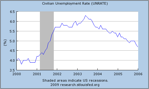
  • The 2001 recession was really awful.
  • The current recession would appear to still be typical.

Since so many of the recessions started – from the point of view of the average worker – before the NBER-determined date, it is helpful to rebase that graph against the actual peak in weekly hours per capita:

Now, finally, we have what I believe is an accurate comparison of the employment situation in previous recessions.

Once again, the labels for each line are the official (NBER-determined) start and end dates for the recession.  By this graph, the 2001 recession is a clear stand-out.  It fell the second furthest (and almost the furthest), lasted by far the longest and the recovery never fully happened.

The current recession also stands out as being toward the bad end of the spectrum.  It is the equally worst recession by this point since the peak.  It will need to continue getting a lot worse quite quickly in order to maintain that record, however.

After seeing Calculated Risk’s graph, Barry Ritholtz asked whether it is taking longer over time to recover from a recession recoveries (at least in employment).  This graph quite clearly suggests that the answer is “no.”  While the 2001 and 1990/91 recessions do have the slowest recoveries, the next two longest are the earliest.

Perhaps a better way to characterise it is to compare the slope coming down against the slope coming back up again.  It seems as a rough guess that rapid contractions are followed by just-as-rapid rises.  On that basis, at least, we have some slight cause for optimism.

If anybody is interested, I have also uploaded a copy of the spreadsheet with all the raw data for these graphs.  You can access it here:  US Employment (excel spreadsheet)

For reference, the closest other things that I have seen to this presentation in the blogosphere are this post by Spencer at Angry Bear and this entry by Menzie Chinn at EconBrowser.  He provides this graph of employment versus aggregate hours for the current recession only:

Alex Tabarrok has also been comparing recessions (1, 2, 3).