Paul Krugman [Ideas, Princeton, Unofficial archive] has recently started using the phrase “jobless recovery” to describe what appears to be the start of the economic recovery in the United States [10 Feb, 21 Aug, 22 Aug, 24 Aug]. The phrase is not new. It was first used to describe the recovery following the 1990/1991 recession and then used extensively in describing the recovery from the 2001 recession. In it’s simplest form, it is a description of an economic recovery that is not accompanied by strong jobs growth. Following the 2001 recession, in particular, people kept losing jobs long after the economy as a whole had reached bottom and even when employment did bottom out, it was very slow to come back up again. Professor Krugman (correctly) points out that this is a feature of both post-1990 recessions, while prior to that recessions and their subsequent recoveries were much more “V-shaped”. He worries that it will also describe the recovery from the current recession.
While Professor Krugman’s characterisations of recent recessions are broadly correct, I am still inclined to disagree with him in predicting what will occur in the current recovery. This is despite Brad DeLong’s excellent advice:
- Remember that Paul Krugman is right.
- If your analysis leads you to conclude that Paul Krugman is wrong, refer to rule #1.
This will be quite a long post, so settle in. It’s quite graph-heavy, though, so it shouldn’t be too hard to read. 🙂
Professor Krugman used his 24 August post on his blog to illustrate his point. I’m going to quote most of it in full, if for no other reason than because his diagrams are awesome:
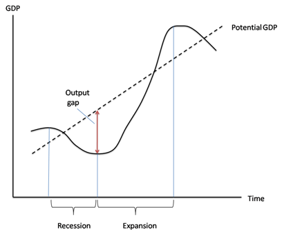
First, here’s the standard business cycle picture:
Real GDP wobbles up and down, but has an overall upward trend. “Potential output” is what the economy would produce at “full employment”, which is the maximum level consistent with stable inflation. Potential output trends steadily up. The “output gap” — the difference between actual GDP and potential — is what mainly determines the unemployment rate.
Basically, a recession is a period of falling GDP, an expansion a period of rising GDP (yes, there’s some flex in the rules, but that’s more or less what it amounts to.) But what does that say about jobs?
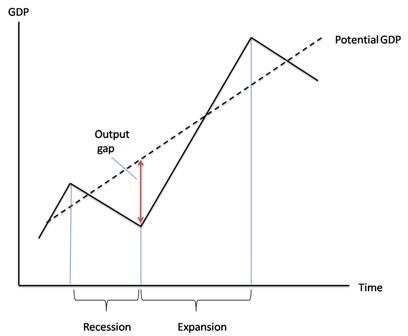
Traditionally, recessions were V-shaped, like this:
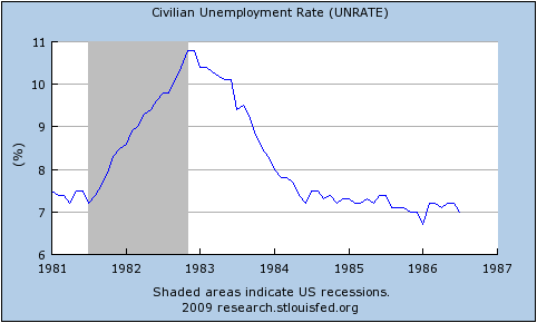
So the end of the recession was also the point at which the output gap started falling rapidly, and therefore the point at which the unemployment rate began declining. Here’s the 1981-2 recession and aftermath:
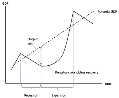
Since 1990, however, growth coming out of a slump has tended to be slow at first, insufficient to prevent a widening output gap and rising unemployment. Here’s a schematic picture:
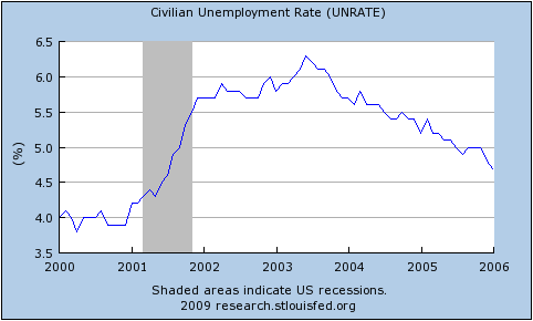
And here’s the aftermath of the 2001 recession:
Notice that this is NOT just saying that unemployment is a lagging indicator. In 2001-2003 the job market continued to get worse for a year and a half after GDP turned up. The bad times could easily last longer this time.
Before I begin, I have a minor quibble about Prof. Krugman’s definition of “potential output.” I think of potential output as what would occur with full employment and no structural frictions, while I would call full employment with structural frictions the “natural level of output.” To me, potential output is a theoretical concept that will never be realised while natural output is the central bank’s target for actual GDP. See this excellent post by Menzie Chinn. This doesn’t really matter for my purposes, though.
In everything that follows, I use total hours worked per capita as my variable since that most closely represents the employment situation witnessed by the average household. I only have data for the last seven US recessions (going back to 1964). You can get the spreadsheet with all of my data here: US_Employment [Excel]. For all images below, you can click on them to get a bigger version.
The first real point I want to make is that it is entirely normal for employment to start falling before the official start and to continue falling after the official end of recessions. Although Prof. Krugman is correct to point out that it continued for longer following the 1990/91 and 2001 recessions, in five of the last six recessions (not counting the current one) employment continued to fall after the NBER-determined trough. As you can see in the following, it is also the case that six times out of seven, employment started falling before the NBER-determined peak, too.

Prof. Krugman is also correct to point out that the recovery in employment following the 1990/91 and 2001 recessions was quite slow, but it is important to appreciate that this followed a remarkably slow decline during the downturn. The following graph centres each recession around it’s actual trough in hours worked per capita and shows changes relative to those troughs:

The recoveries following the 1990/91 and 2001 recessions were indeed the slowest of the last six, but they were also the slowest coming down in the first place. Notice that in comparison, the current downturn has been particularly rapid.
We can go further: the speed with which hours per capita fell during the downturn is an excellent predictor of how rapidly they rise during the recovery. Here is a scatter plot that takes points in time chosen symmetrically about each trough (e.g. 3 months before and 3 months after) to compare how far hours per capita fell over that time coming down and how far it had climbed on the way back up:

Notice that for five of the last six recoveries, there is quite a tight line describing the speed of recovery as a direct linear function of the speed of the initial decline. The recovery following the 1981/82 recession was unusually rapid relative to the speed of it’s initial decline. Remember (go back up and look) that Prof. Krugman used the 1981/82 recession and subsequent recovery to illustrate the classic “V-shaped” recession. It turns out to have been an unfortunate choice since that recovery was abnormally rapid even for pre-1990 downturns.
Excluding the 1981/82 recession on the basis that it’s recovery seems to have been driven by a separate process, we get quite a good fit for a simple linear regression:

Now, I’m the first to admit that this is a very rough-and-ready analysis. In particular, I’ve not allowed for any autoregressive component to employment growth during the recovery. Nevertheless, it is quite strongly suggestive.
Given the speed of the decline that we have seen in the current recession, this points us towards quite a rapid recovery in hours worked per capita (although note that the above suggests that all recoveries are slower than the preceding declines – if they were equal, the fitted line would be at 45% (the coefficient would be one)).