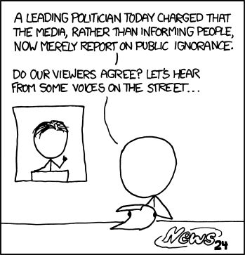
Reporting reactions to the news, not the news

XKCD: Public OpinionI know I’m not alone in getting frustrated by the tendency, in all forms of mass media, to report on reactions to an event or debate rather than provide substantial detail on the event or debate.  I do realise that it’s because the drama of people’s reactions keeps the audience’s attention for longer, that most people aren’t actually interested in the finer points, that it bores them.

Jon Stewart lambasts America’s television news providers for providing anything but news, but for me the sharpest sense of frustration comes when I read a newspaper.  I don’t really blame the providers of news for being consumed by the desire to entertain when they have sound, colour and moving pictures at their command.  Well, okay, I do.  But the defence of the newspaper editor is far weaker.  Sure, there are technicolour tits on page three, but other than that and an over-sized font for the headlines, there’s not much the newspaper can do to distract you from the article itself.

Most people don’t read more than the first few paragraphs of an article.  That’s why papers like the NY Times put those delicious, tantalising nuggets on the front page for the vrapid browsers among us and then send the hungrier reader off to page Q13, or whatever, to finish the piece.  It’s not a practice we see in Britain, but I quite like it.  It gives a visual honesty to our collective consumption of news.  It lets me imagine, as I hunt through the paper for section Q, that the real meat of the article, the guts, the nitty gritty, the actual news, is available in there somewhere.  Sadly, it almost never is.

I don’t want to single out The Grey Lady.  There is no paper anywhere on earth that consistently lists out the facts in each article.  I don’t even need quality writing.  Just chop off the final paragraph and replace it with the facts in bullet point form.  Nobody reads that paragraph anyway, even if it is the one the journalist fought most with the editor to keep.  Leave the rest of the article peppered with Mr. and Mrs. Jones’s sob story and some politician’s outrage, but give me the facts quietly at the end, where it’s not hurting anyone.

Anyway, via Matt Yglesis, I see that a report has been written by Pew Research on the coverage of the health care debate in America.  You can see the full report here or a summary here.  I quite agree with Matt that the most telling aspect of the report is summarised in the following graph (although I disagree with his conclusion that this is not such a bad result):

Pew:  Top Health Care StorylinesIt’s a terrible diagram, because 3D graphs make it near-impossible to read the actual numbers (I wonder if Pew Research sees any irony in trying to present these data in a snazzy format), so let me give them to you:

  • 41% : Politics and strategy
  • 23% : Descriptions of [proposed] plans
  • 9% : [Current] State of health care
  • 8% : Legislative process
  • 6% : Obama’s health care plan
  • 4% : Town hall protests

This is for all forms of media, though.  The then current state of health care featured more prominantly in newspapers, which gave it 18% of their coverage.  That’s better, but I suspect it’s deceptive.  That 18% will have included innumerable emotion-dripping sob stories about some old lady and her dodgy hip.  Disappointingly, online news sites, which have essentially zero marginal cost for an additional paragraph on the end of a story, gave only 8% of their coverage to describing the then current system.

Ah, well.  Go read the report.

Update:  Ezra Klein makes an excellent point:

It’s trite to say it, but the news business is biased toward, well, news. There are plenty of outlets that tell you what happened yesterday, but virtually no organizations that simply tell you what’s going on. Keeping up on the news is easy, but getting a handle on an ongoing situation that you’ve not really been following is hard. In recent years, we’ve seen the rise of outlets like FactCheck.org, which try and police lies that are relevant to the debate. But there’s really no one out there who is trying to give you the background to everything going in the debate. News organizations will write occasional pieces trying to sum up the legislation, but if you miss them, it’s hard to find them again, and they’re not comprehensive anyway. The fact that I still can’t direct people to one really good, really clear, really comprehensive online summary of the bill is an enduring frustration for me, and a real problem given the importance of the legislation and the number of questions there are about it.

If I edited a major publication — or even a medium-size one — I would begin each major legislative battle by detailing a few of my smartest, clearest writers to create a hyperlinked, fairly comprehensive, summary of the basic legislation. That summary would be updated throughout the process, and it would be linked in every single story written on the topic. As reader questions came in, and points of confusion arose, it would be expanded, so by the end, you’d have a document that was current, comprehensive, navigable and responsive to the questions people actually had about the legislation. Telling people what just happened is undeniably important, but given that most people aren’t following that closely, we in the media need to do a better job of telling people what’s been happening.
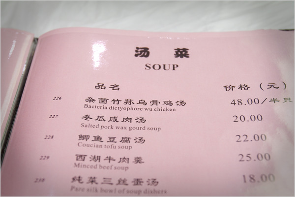
I always thought of it as Engrish

The NY Times, writing about Shanghai’s efforts to improve it’s signs, has a gallery of amusing mis-translations from Chinese to English.  This was one of my favourites:

As an aside, I like the javascript-free technique used by the NYT developers to prevent most people from saving the images.  Here is the relevent section of the page’s HTML source:

<div class="centeredElement" style="background-image:url('http://graphics8.nytimes.com/images/2010/05/03/world/20100503_CHINGLISH-slide-DFXB/20100503_CHINGLISH-slide-DFXB-slide.jpg');width:600px; height:400px;">
<img width="600" height="400" src="http://graphics8.nytimes.com/images/misc/pixel.gif" />
</div>

If somebody right-clicks on the dispayed image (technically, the background image) and chooses to view it or save it, they get pixel.gif, which is a 1×1 clear pixel.

Wanted: A measure of semantic correlation

“The quick, brown fox jumps over the lazy dog.” and “There is a dog and a fox.  The fox, which is brown, jumps over the dog, which is lazy.  The fox is quick.” should give a value of 1.

“The quick, brown fox jumps over the lazy dog.” and “There is a dog and a fox.  The fox, which is brown, jumps over the dog, which is lazy.  The fox is fast.” should give a value of 0.999.

Yes, I know that it’s complicated; but it’s not impossible.  Google clearly does something similar when grouping stories together for news.google.com.

Then I want to have all news stories automatically compared to corporate press releases.  I want my webpage to show me the press release on one side and the news article on the other.  I want the news article to be shaded with two different colours; one colour for sections that are possibly reworded, but ultimately just taken from the press release and one colour for sections that represent actual work done by the reporter.

Media bias and people who are WAAAY out on the political spectrum

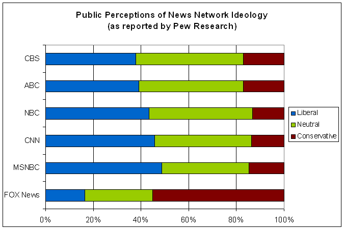
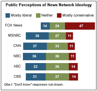
Andrew Sullivan points to this research by Pew on how American’s view the bias of the major television networks.  It’s nicely summarised in this diagram (from Pew):

Public perceptions of news network ideology

Andrew makes the obvious and easy comment bashing on Fox:

Clearly the public understands that the network MSM is skewed to the left. But there’s a difference of magnitude between that assessment and that of Fox. Quite simply, most Americans see Fox for what it is: an appendage of a political operation, not a journalistic one. Its absurd distortions, its relentless attacks on Obama from the very start, its hideously shrill hosts, and its tawdry, inflammatory chat all put it in a class by itself.

Personally, I don’t necessarily agree that the MSM is, on average, biased to the left (although maybe that’s just my internal biases talking).  I’ll get to that in a moment, but first …

14% of respondents consider Fox News to be mostly liberal in it’s bias!  That’s almost one in seven.  Just how far out in the political spectrum are those people? What would Fox need to do to convince them that they were neutral?  Actively promote the KKK?

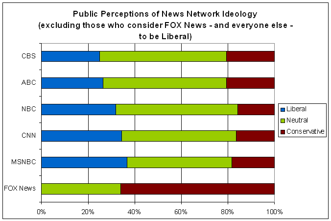
Back to perceptions of bias.  Here is another graphical illustration of the Pew Research data:

US Perceptions of MSM Bias (Pew)

It seems safe to assume that anybody who thinks Fox News is liberal will consider the rest liberal as well, so that explains a large fraction of the “liberal” responses for the rest.  So, excluding the people who are personally so conservative as to consider Fox News to have a pro-liberal bias, this is what it looks like:

US Perceptions of MSM Bias (excl. people who think Fox is liberal)

In other words, when we restrict our attention to people who are not insane [1], the American public agrees with me: by and large, the non-Fox networks are pretty evenly balanced, although MSNBC  is pro-liberal.

[1] Okay, they may not be insane.  I have no evidence than any larger fraction of them are insane than in the rest of the population.  But they do strike me as having some pretty whacky personal beliefs.

The death throes of US newspapers?

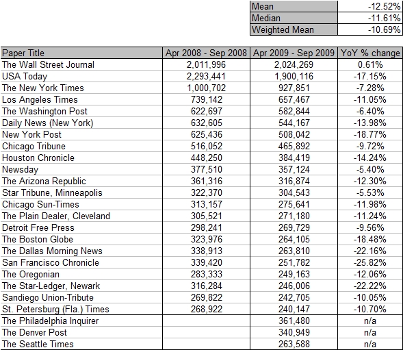
Via Megan McArdle’s excellent commentary, I discovered the Mon-Fri daily circulation figures for the top 25 newspapers in the USA.  Megan’s words:

I think we’re witnessing the end of the newspaper business, full stop, not the end of the newspaper business as we know it. The economics just aren’t there. At some point, industries enter a death spiral: too few consumers raises their average costs, meaning they eventually have to pass price increases onto their customers. That drives more customers away. Rinse and repeat . . .

[…]

The numbers seem to confirm something I’ve thought for a while: we’re eventually going to end up with a few national papers, a la Britain, rather than local dailies. The Wall Street Journal, the Washington Post, and the New York Times (sorry, conservatives!) are weathering the downturn better than most, and it’s not surprising: business, politics, and national upper-middlebrow culture. But in 25 years, will any of them still be printing their product on the pulped up remains of dead trees? It doesn’t seem all that likely.

For those of you that like your information in pictoral form, here it is:

First, the data.  Look at the Mean/Median/Weighted Mean figures.  That really is an horrific collapse in sales.

US_Newspaper_circulation_data

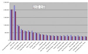
Second, the distribution (click on the image for a full-sized version):

US_Newspaper_circulation_distribution

Finally, a scatter plot of year-over-year change against the latest circulation figures (click on the image for a full-sized version):

US_Newspaper_circulation_scatterplotAs Megan alluded in the second paragraph I quoted, there appears to be a weak relationship between the size of the paper and the declines they’ve suffered, with the bigger papers holding up better.  The USA Today is the clear exception to that idea.  Indeed, if the USA Today is excluded from the (already very small!) sample the R^2 becomes 30%.

To really appreciate just how devestating those numbers are, you need to combine it with advertising figures.  Since newspapers take revenue from both sales (circulation) and advertising, the fact that advertising revenue has also collapsed, as it always does in a recession, means that newspapers have taken not just one but two knives to the chest.

Here’s advertising expenditure in newspapers over recent years, taken from here:

Year Expenditure (millions of dollars) Year-over-year % change
2005 47,408
2006 46,611 -1.7%
2007 42,209 -9.2%
2008 34,740 -17.7%

Which is ugly.  Remember, also, that this expenditure is nominal.  Adjusted for inflation, the figures will be worse.

So what do you do when your ad sales and your circulation figures both fall by over 15%?  Oh, and you can’t really cut costs any more because, as Megan says:

For twenty years, newspapers have been trying to slow the process with increasingly desperate cost cutting, but almost all are at the end of that rope; they can’t cut their newsroom or production staff any further and still put out a newspaper. There just aren’t enough customers who are willing to pay for their product what it costs to produce it.

Which, in economics speak, means that the newspaper business has a large fixed cost component that isn’t particularly variable even in the long run.

Tyler Cowen, in an excellent post that demonstrates precisely why I read him daily, says:

I believe with p = 0.6 that the world is in for a “great disruption.”  It has come to MSM first but it will not end there.  In the longer run I am optimistic about the results of this change — computers will free up lots of human labor — but in the meantime it will have drastic implications for income redistribution, across both individuals and across economic sectors.  For a core metaphor, the internet displacing paid journalism and classified ads is a good place to start.  The value of newspapers has been sucked into Google.

[…]Once The Great Disruption becomes more evident, entertainment will be very very cheap.

Which may well be true, but will be cold comfort for all of those traditional journalists out there.

Well, that didn’t take long (Trafigura)

About an hour ago I wrote about an article in The Guardian about how they had been prevented from writing about parliamentary proceedings via a court injunction.  In particular, they weren’t allowed to write about this question put before parliament:

(292409)

Paul Farrelly (Newcastle-under-Lyme): To ask the Secretary of State for Justice, what assessment he has made of the effectiveness of legislation to protect (a) whistleblowers and (b) press freedom following the injunctions obtained in the High Court by (i) Barclays and Freshfields solicitors on 19 March 2009 on the publication of internal Barclays reports documenting alleged tax avoidance schemes and (ii) Trafigura and Carter Ruck solicitors on 11 September 2009 on the publication of the Minton report on the alleged dumping of toxic waste in the Ivory Coast, commissioned by Trafigura.

The story became a Twitter sensation.  Trafigura and Carter-Ruck have been the hottest trending topics on Twitter for the last few hours, the Liberal Democrats sought an urgent debate on press freedom and now, as their journalists write furiously in the background with their editors looking over their shoulders to save time, The Guardian is reporting on their front page:

Breaking news: * LATEST: Guardian can reveal that parliamentary question from Paul Farrelly MP subjected to reporting ban was related to Trafigura toxic waste scandal. More details soon ..

Which is to say that the gag has been lifted in under (?) 24 hours.

This has all been a tremendous example of the Streisand effect, named for Barbara Streisand’s catastrophically backfiring attempt to prevent a picture of her house being made available on the internet.  While attempting to surpress attention, Trafigura and Carter-Ruck have only managed attract a huge amount of attention to themselves.

It’s a PR nightmare for them and a happy day for The Guardian.

Update 1: Here is confirmation from the Guardian.

Update 2: Here is the BBC on the matter.  By way of explaining why they did not cover the story despite not being expressly mentioned in the injunction, they say:

No injunction was served on the BBC, but ever since the Spycatcher case in the 1980s news organisations which knowingly breach an injunction served on others are in contempt of court, so the corporation too felt bound by the Guardian injunction.

Which is the equivalent of “once bitten, (forever) twice shy.”  The Beeb finishes by quoting Steven Fry’s tweet from when he discovered the good news:

Can it be true? Carter-Ruck caves in! Hurrah! Trafigura will deny it had anything to do with Twitter, but we know don’t we? We know! Yay!!!

Update 3: BBC Newsnight will have a special on Trafigura and their chemical disposals tonight.

The Guardian is excited to tell you that it can’t tell you what it wants to tell you

From yesterday’s (12 Oct 2009) Guardian:

Today’s published Commons order papers contain a question to be answered by a minister later this week. The Guardian is prevented from identifying the MP who has asked the question, what the question is, which minister might answer it, or where the question is to be found.

The Guardian is also forbidden from telling its readers why the paper is prevented – for the first time in memory – from reporting parliament. Legal obstacles, which cannot be identified, involve proceedings, which cannot be mentioned, on behalf of a client who must remain secret.

It sounds tremendously exciting, doesn’t it?

Anyway, the House of Commons Question Book is publically available.  There are thousands of them (questions, that is).  There were 2,344 outstanding questions as of Monday 12 October 2009 (see here).

But the question in question, as it were, is apparantly this one, which as I type has been shifted forward to Wednesday 14 October 2009 (I have no idea, but suspect that unanswered questions get shuffled forward as necessary, so it’s best to start at the root Question Book if you’re searching for something):

(292409)

Paul Farrelly (Newcastle-under-Lyme): To ask the Secretary of State for Justice, what assessment he has made of the effectiveness of legislation to protect (a) whistleblowers and (b) press freedom following the injunctions obtained in the High Court by (i) Barclays and Freshfields solicitors on 19 March 2009 on the publication of internal Barclays reports documenting alleged tax avoidance schemes and (ii) Trafigura and Carter Ruck solicitors on 11 September 2009 on the publication of the Minton report on the alleged dumping of toxic waste in the Ivory Coast, commissioned by Trafigura.

I didn’t figure the question out myself.  I got it from Alex Massie at The Spectator.  Alex also helpfully points us to the Guardian’s reports from Wed 16 September 2009 on Trafigura and their exploits in the Ivory Coast [Main article, supporting article, 8MB pdf of the emails] and highlights the fact that Trafigura is now a trending topic on Twitter.

While I join the general expressions of anger at the gagging of the press over parliamentary proceedings, I also note that this will ultimately serve to help The Guardian’s reputation enormously.

On being a reporter for a News Corp paper …

Anonymously faxed (!) to Crikey and from there replicated by Peter Martin, here is an internal memo from staff to management at The (Adelaide) Advertiser [Main Site, Wikipedia]:

[…]
There are many conflicting instructions, blanket bans on certain words and subjects, and a lack of trust in the reporter to choose what to focus on.
[…]
We need clearer communication about what management wants. We need early, clear direction that also incorporates flexibility when stories change throughout the day. We need to feel confident that when circumstances beyond our control change the direction of a story, we will not be verbally abused or blamed for that. Management often dictates an editorial line it wants reporters to take that is in conflict with what our contacts say. Much of a day can be wasted trying to find one person to say what management wants them to say. This is not reporting, it is fabricating news.
[…]

Here is the memo as a pdf. The document in scribd is below …

Advertiser Memo

(Brad DeLong, are you reading this?  This, if not already there, is coming to America …)

The MP expenses scandal in Britain

It’s both spectacular and petty.  The fraction of MPs that truly scammed the system is tiny and the scale of the claims for the most part only seems offensive in a recession.  It was started by Cameron as a political stunt, but when Torys were implicated he had to take it nuclear or look terrible.  The Speaker was culpable, yes, but he was thrown under the bus by Brown all the same.  That The Telegraph got the complete list in a leak is more of a story, to my mind.

What style of Speaker will emerge is an interesting question.  If it’s another Labour party member, it will be easy to imagine the role moving somewhat  in the direction of the Speakers of the lower houses in Australia (where the role is quite partisan) and the USA (where it is extremely partisan).  In a parliamentary democracy (Australia, UK) , that will serve to grant the executive more power over the legislature, which is a Bad Thing ™ in my books, as it reduces the ability of the opposition to contribute to the legislative process in any meaningful way.

I’ve occasionally thought that in the event of Australia becoming a republic, the president’s primary constitutional role might simply be to ensure the fair operation of the judicio-political system.  So, for example, the president – or their appointee – might be the official Speaker of the House but would not have a vote (even in the event of a tie) and could not introduce legislation.

Of course, having the monarch appoint an independent Speaker of the Commons in the UK would get MPs’ knickers in a collective knot over the sovereignty of parliament.  Another reason to be a republic.

The Transparent Society

During the recent US presidential election, California voted to change it’s state constitution to exclude gay couples from being married (proposition 8). Prior to the election, the Californian supreme court had overturned a regular law that banned gay marriage as being unconstitutional. Thus the (successful) move by social conservatives to change the state’s constitution.

Via Andrew Sullivan (1, 2, 3, 4) and in a demonstration of the move towards David Brin’s “Transparent Society,” I give you http://www.eightmaps.com where you can see the names, addresses, employer and amount donated of everybody that gave money to the proposition 8 campaign, all arranged on a Google Maps mash-up.