I’ve just upgraded the version of wordpress I’m using. There’s a chance some things might be broken for a little while.
Perspective (Comparing Recessions)
This is quite a long post. I hope you’ll be patient and read it all – there are plenty of pretty graphs!
I have previously spoken about the need for some perspective when looking at the current recession. At the time (early Dec 2008), I was upset that every regular media outlet was describing the US net job losses of 533k in November as being unprecedentedly bad when it clearly wasn’t.
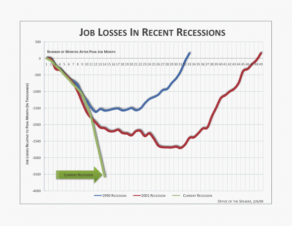
About a week ago, the office of Nancy Pelosi (the Speaker of the House of Representatives in the US) released this graph, which makes the current recession look really bad:
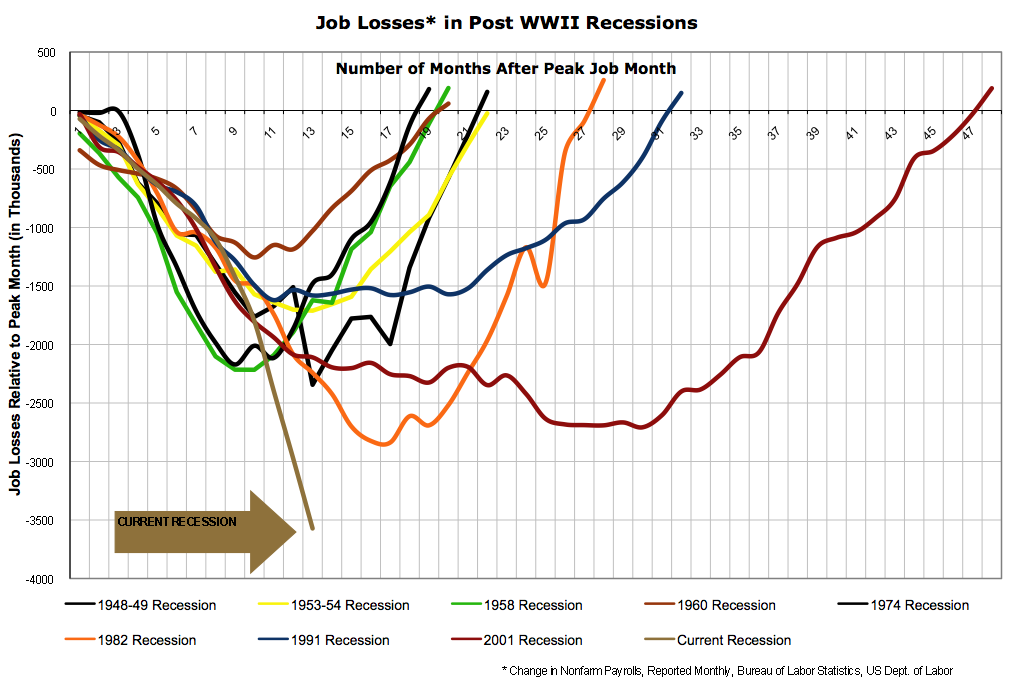
Notice that a) the vertical axis lists the number of jobs lost and b) it only includes the last three recessions. Shortly afterward, Barry Ritholtz posted a graph that still had the total number of jobs lost on the vertical axis, but now included all post-World War Two recessions:
Including all the recessions is an improvement if only for the sake of context, but displaying total job losses paints a false picture for several reasons:
- Most importantly, it doesn’t allow for increases in the population. The US residential population in 1974 was 213 million, while today it is around 306 million. A loss of 500 thousand jobs in 1974 was therefore a much worse event than it is today.
- Until the 1980s, most households only had one source of labour income. Although the process started slowly much earlier, in the 1980s very large numbers of women began to enter the workforce, meaning that households became more likely to have two sources of labour income. As a result, one person in a household losing their job is not as catastrophic today as it used to be.
- There has also been a general shift away from full-time work and towards part-time work. Only looking at the number of people employed (or, in this case, fired) means that we miss altogether the impact of people having their hours reduced.
- We should also attempt to take into account discouraged workers; i.e. those who were unemployed and give up even looking for a job.
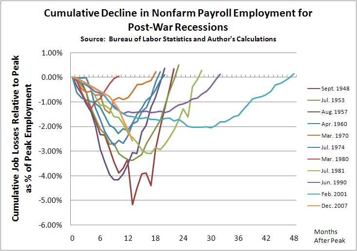
Several people then allowed for the first of those problems by giving graphs of job loses as percentages of the employment level at the peak of economic activity before the recession. Graphs were produced, at the least, by Justin Fox, William Polley and Calculated Risk. All of those look quite similar. Here is Polley’s:
The current recession is shown in orange. Notice the dramatic difference to the previous two graphs? The current recession is now shown as being quite typical; painful and worse than the last two recessions, but entirely normal. However, this graph is still not quite right because it still fails to take into account the other three problems I listed above.
(This is where my own efforts come in)
The obvious way to deal with the rise of part-time work is to graph (changes in) hours worked rather than employment.
The best way to also deal with the entry of women into the workforce is to graph hours worked per member of the workforce or per capita.
The only real way to also (if imperfectly) account for discouraged workers is to just graph hours worked per capita (i.e. to compare it to the population as a whole).
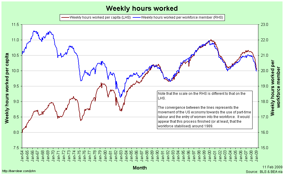
This first graph shows Weekly Hours Worked per capita and per workforce member since January 1964:
In January 1964, the average member of the workforce worked just over 21 hours per week. In January 2009 they worked just under 20 hours per week.
The convergence between the two lines represents the entry of women into the workforce (the red line is increasing) and the increasing prevalence of part-time work (the blue line is decreasing). Each of these represented a structural change in the composition of the labour force. The two processes appear to have petered out by 1989. Since 1989 the two graphs have moved in tandem.
[As a side note: In econometrics it is quite common to look for a structural break in some timeseries data. I’m sure it exists, but I am yet to come across a way to rigorously handle the situation when the “break” takes decades occur.]
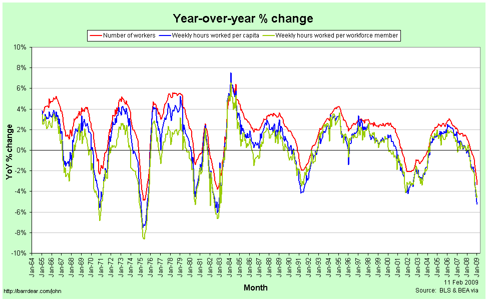
The next graph shows Year-over-Year percentage changes in the number of employed workers, the weekly hours per capita and the weekly hours per workforce member:
Note that changes in the number of workers are consistently higher than the number of hours per workforce member or per capita. In a recession, people are not just laid off, but the hours that the remaining employees are given also falls, so the average number of hours worked falls much faster. In a boom, total employment rises faster than the average number of hours, meaning that the new workers are working few hours than the existing employees.
This implies that the employment situation faced by the average individual is consistently worse than we might think if we restrict our attention to just the number of people in any kind of employment. In particular, it means that from the point of view of the average worker, recessions start earlier, are deeper and last longer than they do for the economy as a whole.
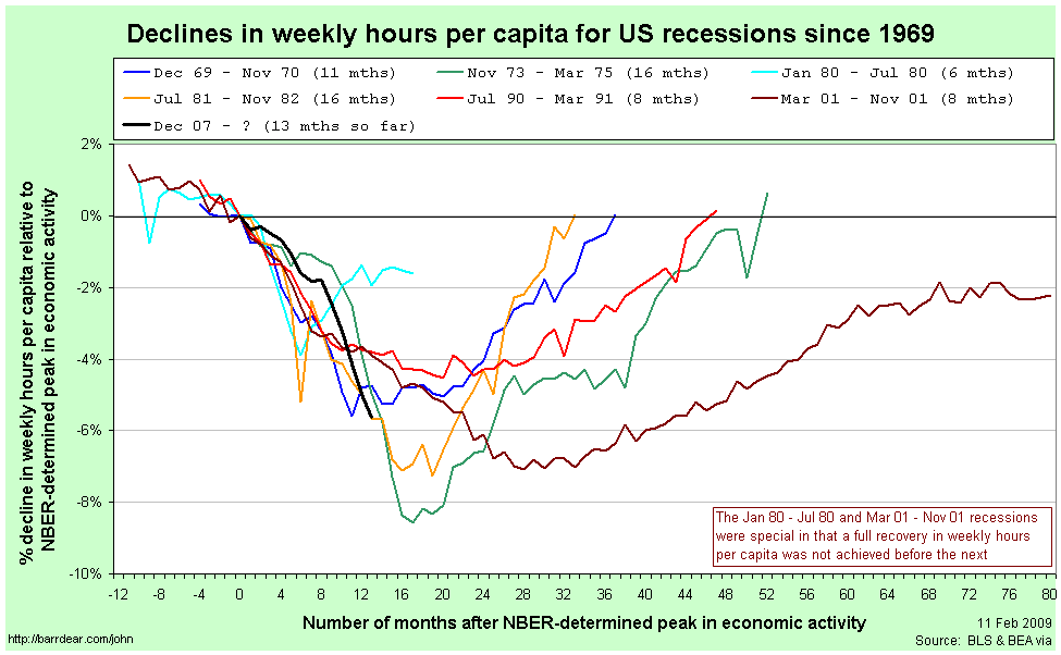
Here is the comparison of recessions since 1964 from the point of view of Weekly Hours Worked per capita, with figures relative to those in the month the NBER determines to be the peak of economic activity:
The labels for each line are the official (NBER-determined) start and end dates for the recession. There are several points to note in comparing this graph to those above:
- The magnitudes of the declines are considerably worse than when simply looking at aggregate employment.
- Declines in weekly hours worked per capita frequently start well before the NBER-determined peak in economic activity. For the 2001 recession, the decline started 11 months before the official peak.
- For two recessions out of the last seven – those in 1980 and 2001 – the recovery never fully happened; another recession was deemed to have started before the weekly hours worked climbed back to its previous peak.
- The 2001 recession was really awful.
- The current recession would appear to still be typical.
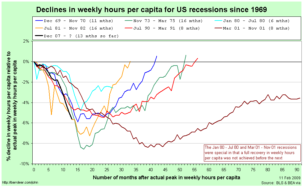
Since so many of the recessions started – from the point of view of the average worker – before the NBER-determined date, it is helpful to rebase that graph against the actual peak in weekly hours per capita:
Now, finally, we have what I believe is an accurate comparison of the employment situation in previous recessions.
Once again, the labels for each line are the official (NBER-determined) start and end dates for the recession. By this graph, the 2001 recession is a clear stand-out. It fell the second furthest (and almost the furthest), lasted by far the longest and the recovery never fully happened.
The current recession also stands out as being toward the bad end of the spectrum. It is the equally worst recession by this point since the peak. It will need to continue getting a lot worse quite quickly in order to maintain that record, however.
After seeing Calculated Risk’s graph, Barry Ritholtz asked whether it is taking longer over time to recover from a recession recoveries (at least in employment). This graph quite clearly suggests that the answer is “no.” While the 2001 and 1990/91 recessions do have the slowest recoveries, the next two longest are the earliest.
Perhaps a better way to characterise it is to compare the slope coming down against the slope coming back up again. It seems as a rough guess that rapid contractions are followed by just-as-rapid rises. On that basis, at least, we have some slight cause for optimism.
If anybody is interested, I have also uploaded a copy of the spreadsheet with all the raw data for these graphs. You can access it here: US Employment (excel spreadsheet)
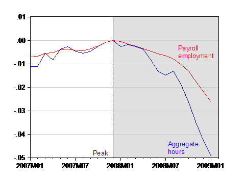
For reference, the closest other things that I have seen to this presentation in the blogosphere are this post by Spencer at Angry Bear and this entry by Menzie Chinn at EconBrowser. He provides this graph of employment versus aggregate hours for the current recession only:
Economics does not equal finance+macroeconomics
After reading Clive Cook, Arnold Kling observes:
My take on this is that the consensus of economists is likely to be more reliable on microeconomic issues than it is on macroeconomic issues. In my view, fundamental macroeconomic issues are unsettled. It makes sense to have what a Bayesian statistician would call “diffuse priors” and what an ordinary layman would call an open mind.
[…]
What is important to bear in mind is that just because economists cannot settle disputes about macro does not mean that all of economics is bunk or that nowhere is there a reliable consensus in economics. Macroeconomics is only one area of economics.
I whole-heartedly agree, albeit with a simple addition: To the typical person on the street, I suspect that economics is thought of as a combination of finance and macroeconomics. Other sub-disciplines are rarely imagined.
The velocity of money and the credit crisis
This is another one for my students of EC102.
Possibly the simplest model of aggregate demand in an economy is this equation:
MV = PY
The right-hand side is the nominal value of demand, being the price level multiplied by the real level of demand. The left-hand side has the stock of money multiplied by the velocity of money, which is the number of times the average dollar (or pound, or euro) goes around the economy in a given time span. The equation isn’t anything profound. It’s an accounting identity that is always true, because V is constructed in order to make it hold.
The Quantity Theory of Money (QTM) builds on that equation. The QTM assumes that V and Y are constant (or at least don’t respond to changes in M) and observes that, therefore, any change in M must only cause a corresponding change in P. That is, an increase in the money supply will only result in inflation.
A corresponding idea is that of Money Neutrality. If money is neutral, then changes in the money supply do not have any effect on real variables. In this case, that means that a change in M does not cause a change in Y. In other words, the neutrality of money is a necessary, but not sufficient condition for the QTM to hold; you also need the velocity of money to not vary with the money supply.
After years of research and arguing, economists generally agree today that money neutrality does not hold in the short run (i.e. in the short run, increasing the money supply does increase aggregate demand), but that it probably does hold in the long run (i.e. any such change in aggregate demand will only be temporary).
The velocity of money is an interesting concept, but it’s fiendishly difficult to tie down.
- In the long-run, it has a secular upward trend (which is why the QTM doesn’t hold in the long run, even if money neutrality does).
- It is extremely volatile in the short-run.
- Since it is constructed rather than measured, it is a residual in the same way that Total Factor Productivity is a residual. It is therefore a holding place for any measurement error in the other three variables. This will be part, if not a large part, of the reason why it is so volatile in the short-run.
- Nevertheless, the long run increases are pretty clearly real (i.e. not a statistical anomaly). We assume that this a result of improvements in technology.
- Conceptually, a large value for V is representative of an efficient financial sector. More accurately, a large V is contingent on an efficient turn-around of money by the financial sector – if a new deposit doesn’t go out to a new loan very quickly, the velocity of money is low. The technology improvements I mentioned in the previous point are thus technologies specific to improving the efficiency of the finance industry.
- As you might imagine, the velocity of money is also critically dependent on confidence both within and regarding banks.
- Finally, the velocity of money is also related to the concept of fractional reserve banking, since we’re talking about how much money gets passed on via the banks for any given deposit. In essence, the velocity of money must be positively related to the money multiplier.
Those last few points then feed us into the credit crisis and the recession we’re all now suffering through.
It’s fairly common for some people to blame the crisis on a global savings glut, especially after Ben Bernanke himself mentioned it back in 2005. But, as Brad Setser says, “the debtor and the creditor tend to share responsibility for most financial crises. One borrows too much, the other lends too much.”
So while large savings in East-Asian and oil-producing countries may have been a push, we can use the idea of the velocity of money to think about the pull:
- There was some genuine innovation in the financial sector, which would have increased V even without any change in attitudes.
- Partially in response to that innovation, partially because of a belief that thanks to enlightened monetary policy aggregate uncertainty was reduced and, I believe, partially buoyed by the broader sense of victory of capitalism over communism following the fall of the Soviet Union, confidence both within and regarding the financial industry also rose.
- Both of those served to increase the velocity of money and, with it, real aggregate demand even in the absence of any especially loose monetary policy.
- Unfortunately, that increase in confidence was excessive, meaning that the increases in demand were excessive.
- Now, confidence both within and, in particular, regarding the banking sector has collapsed. The result is a fall in the velocity of money (for any given deposit received, a bank is less likely to make a loan) and consequently, aggregate demand suffers.
More on fiscal multipliers
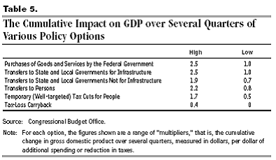
In my previous piece on this, I highlighted that the fiscal multiplier will be different for different ways of “spending” the money (I put spending in quotes because there is also the possibility of simply offering tax cuts). Via Menzie Chinn, I see that the Congressional Budget Office has put out estimates of the fiscal multiplier for different forms of fiscal stimulus:
That’s table 5 from this document.
How to value toxic assets (part 4)
Okay. First, a correction: There is (of course) a market for CDOs and other such derivatives at the moment. You can sell them if you want. It’s just that the prices that buyers are willing to pay is below what the holders of CDOs are willing to accept.
So, here are a few thoughts on estimating the underlying, or “fair,” value of a CDO:
Method 1. Standard asset pricing considers an asset’s value to be the sum of the present discounted value of all future income that it generates. We discount future income because:
- Inflation will mean that the money will be worth less in the future, so in terms of purchasing power, we should discount it when thinking of it in today’s terms.
- Even if there were no inflation, if we got the money today we could invest it elsewhere, so we need to discount future income to allow for the (lost) opportunity cost if current investment options generate a higher return than what the asset is giving us.
- Even if there were no inflation and no opportunity cost, there is a risk that we won’t receive the future money. This is the big one when it comes to valuing CDOs and the like.
- Even if there’s no inflation, no opportunity cost and no risk of not being paid, a positive pure rate of time preference means that we’d still prefer to get our money today.
The discounting due to the risk of non-payment is difficult to quantify because of the opacity of CDOs. The holders of CDOs don’t know exactly which mortgages are at the base of their particular derivative structure and even if they did, they don’t know the household income of each of those borrowers. Originally, they simply trusted the ratings agencies, believing that something labeled “AAA” would miss payment with probability p%, something “AA” with probability q% and so on. Now that the ratings handed out have been shown to be so wildly inappropriate, investors in CDOs are being forced to come up with new numbers. This is where Knightian Uncertainty is coming into effect: Since even the risk is uncertain, we are in the Rumsfeldian realm of unknown unknowns.
Of course we do know some things about the risk of non-payment. It obviously rises as the amount of equity a homeowner has falls and rises especially quickly when they are underwater (a.k.a. have negative equity (a.k.a. they owe more than the property is worth)). It also obviously rises if there have been a lot of people laid off from their jobs recently (remember that the owner of a CDO can’t see exactly who lies at the base of the structure, so they need to think about the probability that whoever it is just lost their job).
The first of those is the point behind this idea from Chris Carroll out of NYU: perhaps the US Fed should simply offer insurance against falls in US house prices.
The second of those will be partially addressed in the future by this policy change announced recently by the Federal Housing Finance Agency:
[E]ffective with mortgage applications taken on or after Jan. 1, 2010, Freddie Mac and Fannie Mae are required to obtain loan-level identifiers for the loan originator, loan origination company, field appraiser and supervisory appraiser … With enactment of the S.A.F.E. Mortgage Licensing Act, identifiers will now be available for each individual loan originator.
“This represents a major industry change. Requiring identifiers allows the Enterprises to identify loan originators and appraisers at the loan-level, and to monitor performance and trends of their loans,” said Lockhart [, director of the FHFA].
It’s only for things bought by Fannie and Freddie and it’s only for future loans, but hopefully this will help eventually.
Method 2. The value of different assets will often necessarily covary. As a absurdly simple example, the values of the AAA-rated and A-rated tranches of a CDO offering must provide upper and lower bounds on the value of the corresponding AA-rated tranche. Statistical estimation techniques might therefore be used to infer an asset’s value. This is the work of quantitative analysts, or “quants.”
Of course, this sort of analysis will suffer as the quality of the inputs falls, so if some CDOs have been valued by looking at other CDOs and none of them are currently trading (or the prices of those trades are different to the true values), then the value of this analysis correspondingly falls.
Method 3. Borrowing from Michael Pomerleano’s comment in rely to Christopher Carroll’s piece, one extreme method of valuing CDOs is to ask at what price a distressed debt (a.k.a. vulture) fund would be willing to buy them at with the intention of merging all the CDOs and other MBSs for a given mortgage pool so that they could then renegotiate the debt with the underlying borrowers (the people who took out the mortgages in the first place). This is, in essense, a job of putting Humpty Dumpty back together again. Gathering all the CDOs and other MBSs for a given pool of mortgage assets will take time. Identifying precisely those mortgage assets will also take time. There will be sizable legal costs. Some holders of the lower-rated CDOs may also refuse to sell if they realise what’s happening, hoping to draw out some rent extraction from the fund. The price that the vulture fund would offer on even the “highly” rated CDOs would therefore be very low in order to ensure that they made a profit.
It would appear that banks and other holders of CDOs and the like are using some combination of methods one and two to value their assets, while the bid-prices being offered by buyers are being set by the logic of something like method three. Presumably then, if we knew the banks’ private valuations, we might regard the difference between them and the market prices as the value of the uncertainty.
The fiscal multiplier
This is mostly for my EC102 students. There’s been some argument in the academic economist blogosphere over the size of the fiscal multiplier in the USA. The fiscal multiplier is a measure of by how much GDP rises for an extra dollar of government spending. There are several main forces in determining it’s size:
- The Marginal Propensity to Consume (MPC) determines the upper limit of the multiplier. Suppose that for each extra dollar of income, we tend to spend 60 cents in consumption. Because the economy is a massive, whirling recycling of money – I spend a dollar in your shop, you save 40 cents and spend 60 cents in the second shop, the guy in the second shop pockets 40% of that and spends the rest in the third shop and so on – one dollar of government spending might produce 1+ 0.6 + 0.6^2 + 0.6^3 + … = 1 / (1 – 0.6) = 2.5 dollars of GDP.
- The extra government spending needs to be paid for, which means that taxes will need to go up. For it to be a stimulus now, it’ll typically be financed through borrowing instead of raising taxes now (i.e. taxes will go up later). If people recognise that fact, they may instead choose to consume less and save more in anticipation of that future tax bill, therefore lowering the multiplier. If it gets to a point where there is no difference between raising-taxes-now and borrowing-now-and-raising-taxes-later, we have Ricardian equivalence.
- If the extra government spending is paid for by borrowing, that will raise interest rates (Interest rates and the price of bonds move in opposite directions – by selling more bonds, the government will be increasing their supply and thus lowering their price; hence, the interest rate will rise). If the interest rate goes up, that makes it more expensive for private businesses to borrow, which means that private investment will go down. This is the crowding-out effect. Since GDP = Consumption + Private Investment + Government spending + Net exports, this will lower the multiplier as well.
- The size of the multiplier will also depend on the size of the extra government spending. Generally speaking, the multiplier will be smaller for the second extra dollar spent than for the first and smaller again for the third. That is, increasing government spending exhibits decreasing marginal returns. This is because the second and third points listed above will become more and more relevant for larger and larger amounts of extra government spending.
- Everything gets more complicated when you start to look at current tax rates as well. An alternative to a debt-funded expansion in spending is a debt-funded reduction in revenue (i.e. a tax cut). The multiplier can be very different between those two circumstances.
- Then we have what is arguably the most important part: where the extra spending (or the tax cut) is directed. Poor people have a much higher marginal propensity to consume than rich people, so if you want to increase government spending, you should target the poor to get a larger multiplier. Alternatively, cutting taxes associated with an increase in a business (e.g. payroll taxes) will lower the cost of that increase and produce a larger multiplier than a tax-cut for work that was already happening anyway.
- Next, it is important to note that everything above varies depending on where we are in the business cycle. For example, the crowding-out effect will be strongest (i.e. worst) when the economy is near full employment and be weakest (i.e. less of a problem) when the economy is in recession.
- Finally, we have the progressivity of the tax system. This won’t really affect the size of the multiplier directly, but it is important that you think about it. Rich people pay more tax than poor people, not just in absolute levels (which is obvious), but also as a fraction of their income. That means that the burden of paying back the government debt will fall more on the shoulders of the rich, even after you take into account the fact that they earn more.
Much of what you’ll read arguing for or against a stimulus package will fail to take all of those into account. People are often defending their personal views on the ideal size of government and so tend to pick-and-choose between the various effects in support of their view.
Not good
Uh oh. This doesn’t look good at all. I did Engineering for my undergrad, spent five years working in Computer Science and am now becoming an economist.
On the plus side (for me, at least), my wife studied Philosophy and Political Science in her undergrad, is now in Law school and speaks four-and-a-half languages.
One of the challenges in negotiation for Israel/Palestine
There’s a perennial idea of proposing Northern Ireland as a model of how progress might be achieved in the fighting between Israelis and Palestinians. After reading this recent posting by Megan McArdle, one of the difficulties in such an idea becomes plain.
In Northern Ireland, both sides had moral, if not logistical, support from larger powers that were themselves allies. So while the nationalists found it difficult to trust the British government, they would generally trust the US government, who in turn trusted the British government, while the same chain applied in reverse for the loyalists.
By contrast, while Israel receives moral and logistical support from the USA, none of America’s close allies really comes close to giving the Palestinian cause at large, let alone Hamas in particular, the sort of tacit support that America gave the Irish nationalists.
How to value toxic assets (part 3)
Continuing on from my previous thoughts (1, 2, 3, 4) …
In the world of accounting, the relevant phrase here is “fair value.” In the United States (which presently uses a different set of accounting requirements to the rest of the world, although that is changing), assets are classified as being in one of three levels (I’m largely reproducing the Wikipedia article here):
Level one assets are those traded in liquid markets with quoted prices. Fair value (in a mark-to-market sense) is taken to be the current price.
Level two and level three assets are not traded in liquid markets with quoted prices, so their fair values need to be estimated via a statistical model.
Level two assets are those whose fair value is able to be estimated by looking at publicly-available market information. As a contrived example, maybe there is currently no market for a particular AA-rated tranche of CDOs, but there are recent prices for the corresponding AAA-rated and A-rated tranches, so the AA-rated stuff should be valued somewhere in between those two.
Level three assets are those whose fair value can only be estimated by appealing to information that is not publicly observable.
These are listed in the U.S. Financial Accounting Standards Board (FASB) Statement 157. In October of last year, the FASB issued some clarification/guidance on valuing derivatives like CDOs when the market for them had dried up.
Brad DeLong, in early December last year, was given a list of reasons from Steve Ross why we might not want to always mark-to-market (i.e. assume that the fair value is the currently available market price):
- If you believe in organizational capital–in goodwill–in the value of the enterprise’s skills, knowledge, and relationships as a source of future cash flows–than marking it to market as if that organizational capital had no value is the wrong thing to do.
- Especially as times in which asset values are disturbed and impaired are likely to be times when the value of that organizational capital is highest.
- If you believe in mean reversion in risk-adjusted asset values, mark-to-market accounting is the wrong thing to do.
- If you believe that transaction prices differ from risk-adjusted asset values–perhaps because transaction prices are of particular assets that are or are feared to be adversely selected and hence are not representative of the asset class–than mark-to-market accounting is the wrong thing to do.
- If you believe that changes in risk-adjusted asset values are unpredictable, but also believe:
- in time-varying required expected returns do to changing risk premia;
- that an entity’s own cost of capital does not necessarily move one-for-one with the market’s time-varying risk premia;
- then mark-to-market accounting is the wrong thing to do.
