Heading for parity?

Canadians celebrated when the Canadian dollar (“the loonie”) hit parity with the U.S. dollar in September last year. At the time, there was some speculation about whether the Australian dollar might follow suit. You’re going to see some more speculation over the next few days. Fundamentals aside, there are two main things that are serving to push the Australian dollar up: the resource boom in Australia and the spread in the interest rates between the two countries, and the latter of those is about to jump.

The US Federal Reserve cut interest rates by 75 basis points a week ago in a surprise, out-of-cycle move. Today they are expected to announce a further cut. Apparently the markets are predicting that there’s an 80% likelihood that it will be a further 50 basis point drop. Next week on the 5th of February, on the back of some truly disastrous inflation figures, the Reserve Bank of Australia will probably raise their rate by 25 basis points.  That would be an enormous, 150-point increase in the spread in the space of just two weeks.  On that basis, it’s not at all surprising that the markets are already pushing up the AUD.

Australia, you’re not as rich as you think you are

We’re covering this in my EC102 classes this week and I thought it interesting enough to share with a wider audience:

Looking at what goes into GDP is usually a pretty tedious affair, but the simplest way to think of it is like this: GDP is meant to represent the total value added. It is new work done; new stuff produced.

One upshot of this is that new houses are counted in GDP, while sales of existing houses are not. This is because sales of existing houses are just value transferred – an exchange of assets – and so don’t represent new effort. That’s not quite true. The real-estate agent fees and legal fees associated with the sale count, since they are new work done: they add new value by facilitating the trade.

Here’s a trick in looking at value added: we only need to look at the prices of final goods. This is because the price of the final good will represent the total value added along the entire production chain. The typical example of this used in introductory textbooks is bread:

Who Sells Price Value added
Farmer Wheat $0.10 $0.10
Miller Flour $0.20 $0.10
Baker Bread $0.45 $0.15
Supermarket Packaged and convenient bread $1.00 $0.55


The price of the final good – packaged, convenient bread – is $1.00, which exactly equal to the sum of all the value added. So when the statisticians want to calculate a country’s GDP, they can ignore all the intermediate levels and just add up all the final goods that were produced.So what counts as a final good? Anything that gets sold to someone for consumption or investment. That might be to an individual, or to a private firm, or the government, or someone overseas. (Of course, since I buy both bread and flour from my supermarket, flour is sometimes an intermediate good and sometimes a final good; but it’s easy to tell which is which – flour sold by the supermarket is final, while flour sold by the miller is intermediate.)

Now consider a country that has a large natural resource sector. Australia is a great example. So are all the oil exporting countries. We’ll pick the mining of iron ore in Australia as an example. Just like with the wheat above, there is a whole range of production possibilities based on the iron ore. However, when it’s exported, the final good that gets counted from the point of view of the Australian economy is the iron ore in the ship as it sails off to another country.The mining companies are definitely adding value. They’ve got to find the stuff in the first place, dig it up, clean it a bit to get rid of the dirt, transport it to the coast and then ship it overseas. They’ve also got to maintain all their equipment and allow for the fact that they wear out over time. All of that is new effort. But the price that India or China pays for the ore is more than cost of doing all of that. A large fraction of the price they pay represents the market value of the underlying asset – the ore – itself. But since the mining company didn’t actually produce the ore, that part of the price shouldn’t really count in GDP, for the same reason that when existing houses are sold, only the agent and legal fees are counted. None of this is really news.

When natural-resource-based industries are only a small part of a country’s economy, there’s not too much distortion, so we tend not to worry about it. But when those industries represent a large share of the national income, then the overestimates can be significant. In Australia, mining represents about 6.7% of the national economy. A fair chunk of that will be “true” value added, but a large share of it is really just the transfer of assets. How much? Well, BHP currently has a Return on Equity of 49%, while the long-run, risk-free return on capital is more like 8-10%. So as a very rough guess, assuming that BHP is representative of the mining industry as a whole and that the mining industry is competitive, we might suggest that Australia’s “true” GDP is at least 39% * 6.7% = 2.6% smaller than we think it is.

Some people might at this point wonder about the farmer back in the bread example. What if the farmer who, like BHP, is taking something from the land, is actually only adding 60% of the value that we think she is? The answer lies in the fact that there is a large production chain that builds up from the farmer’s wheat. Even if we remove a large fraction of the farmer’s value-added, that is only a small share of the total value added that we see in the final good’s price. So we would expect this overestimate to be very small overall. The point about mining is that we are only adding a small amount of value relative to that of the asset we are trading away, so as a percentage of the final good, the asset itself is quite large.

Oz Election

Well, the Australian election is getting pretty damn close now.  A few random thoughts:

  • Both at an aggregate and at a seat-by-seat level, the betting markets have blown out in favour of a Labor victory.
  • There have been plenty of predictions of exactly how many seats Labor will win, but as ever, Bryan Palmer does a superb job of aggregation and analysis.
  • We have, as Joshua Gans puts it, “US style election-lawyering” from the Coalition, who have released legal advise suggesting that 13 Labor candidates may be inelligible to stand.  I am entirely in agreement with The Possum on this one:  “Sour grapes do not play well with the electorate, threatening to bring in lawyers to try and overturn the election result looks bitter. Not accepting the umpires decision, and threatening to take your bat and ball and go home looks pathetic.”
  • Andrew Norton has some good work in looking at the reasons why the Coalition are on the nose.  His prognosis:  expect a long time in opposition.  I’m not sure I agree with him, but I can’t really explain why, so I’ll just shut up and direct you to him.
  • A friend here in London was voting for somewhere (sorry, I have no clue where) in NSW and thanks to the beauty of the Australian preferential voting system, had to rank One Nation, Family First and Fred Niles.  I really don’t know how I’d put them.

Oz Election (again)

I’m still not that interested in general, but these two bits looked interesting in their specifics:

  • Looking at Bryan Palmer’s “Day 6 report,” it seems that the betting markets have started moving sharply in favour of the Coalition. Labor is still being billed as the favourites, but it’s narrowing fast.

* The action is really at the top. The only difference between the Howard and Rudd tax cuts is that Rudd wouldn’t cut tax rates from 45% to 42% for those earning over $180,000. Assuming the same rate of wage growth that we’ve had over past years, only 1.4% of adults in 2010-11 will have an income in that range, while only 3% of families will have an income-earner in that range.

* This means that the richest 1% of families get 7% of the Howard tax cuts, but only 4% of the Rudd tax cuts. The richest 10% get 28% of the Howard tax cuts, but 25% of the Rudd tax cuts.

* The education credit is fairly evenly distributed across the income spectrum (as Labor pointed out on Friday, 2/3rds of families with children are eligible for it). So the Rudd package looks more even – but only a little – if you take account of it.

The Election in Oz

So, the campaigning has formally begun for the 2007 Federal Election in Australia. I’m interested, but mostly in an abstract sense and at the same time have a definite feeling of “blah” towards the whole thing. When I do end up wanting to know what’s happening, I’m pretty sure that Bryan Palmer will be a superlative aggregator of information that I ought to care about.

I did notice, with a sigh and a rolling of eyeballs at the stereotypes involved, that the two sides are squabbling over the debates: how many to have and when to have them. The Coalition is calling for just one and early in the campaign (before most policies have been released), while Labor wants three spread out over the entire length of the campaign.

Two questions for the punters

1) Does the large gap in the implied probabilities of a Labor win in the upcoming Australian Federal Election between overall-result betting (62% at the latest update) versus seat-by-seat betting (23% at the latest update) imply some sort of arbitrage opportunity? Is the overround really that large?

2) Why the gap in the first place? I assume it’s got something to do with the particulars of just how marginal each seat is (see below), but why do the two markets disagree so much? Is one of them massively incorrect?

For those that don’t know, I’d recommend looking at the tabular and graphical representations of the marginal seats here. Here are the guts of it (there are 150 seats in the House of Representatives):

Uniform swing Labor gains Labor total Coalition total Result
2.92% (+13) 73 75 Clear Coalition win
3.27% (+14) 74 74 Sort-of-hung parliment (depending on the two independents)
3.27% (+15) 75 73 Sort-of-hung parliment (depending on the two independents)
4.85% (+16) 76 72 Clear Labor win

The first 13 seats for Labor only need a 2.92% swing, or 0.22% per seat. The 14th seat will take an extra 0.35%, the 15th a further 0.90% again and the 16th another 0.71% on top. Remember that each extra percent of swing to Labor takes an increasing amount of goodwill from the electorate (i.e. increasing your swing from 1% to 2% is doable, but increasing it from 25% to 26% is effectively impossible).

Managing the news cycle

Peter Martin draws attention to the Australian Treasury press release listing the adjusted figures for the government surplus in 2006-07:

Preliminary estimates indicate that the Australian Government general government sector recorded an underlying cash surplus of $17.3 billion for 2006-07, which is $3.7 billion higher than expected at the time of the 2007-08 Budget.

A commenter on Peter’s site asks the obvious question:

Is it a good thing that treasury gets it’s numbers so consistently wrong? Who is responsible for the mistake – in this case an error of 27%. If it had gone 27% the other way who would have copped it?

27% is indeed a very large adjustment, and it’s rather difficult to imagine this sort of revision being made in the other direction. It is possible that the adjustment is just as much a surprise to Mr Costello as it (nominally) is to the media, but I suspect that it was always known – or at least believed – in the Treasury that the figures included in the 2007-08 Budget were too low. They will have, at best, decided to err on the side of caution (in case their internal numbers were wrong or there was a sudden crisis that worked against it) and, at worst, knowingly understated the true figures in order to guarantee the political capital boost they’d get later in the election cycle (i.e. now) when the upwardly revised figures were released.

I’ll leave it up to the audience to come to their own conclusions on which is the more likely explanation.

Aggregate demand for the spiritual (updated)

Adam (sans-blog, but when he bothers, he writes at the South Sea Republic) pointed me to this article at The Guardian. All we need to know comes from the opening sentence:

After a break of 16 centuries, Greek pagans are worshipping the ancient gods again – despite furious opposition from the Orthodox church.

Is there a link between the rise of modern-day paganism, astrology, homoeopathic medicine etc. and the hardening of mainstream religions? If so, does one cause the other, or are they both caused by a third factor?

I wonder if it might be possible to develop some sort of measure of a country’s aggregate demand for the spiritual. You might do it by adding up all the money spent on them (including donations to religious bodies) and then adding in the value of the time spent attending religious services and festivals. I guess you could derive the latter by looking at attendance numbers, knowing something about the average duration of services and making an estimate of the value of leisure-time.

If it was feasible, you’d be able to infer answers to several questions:

The proportional break-down of the “spending” might give a truer estimate of the distribution of religious belief in society than census data … in essence, we would be looking at revealed preference rather than stated preference.

If aggregate demand for the spiritual were changing over time, that might indicate a demographic shift (from immigration, say) or — and this would be more interesting — it might provide a measure of movements in dissatisfaction with life in general. For example, a trend of decreasing demand might indicate that people are becoming more satisfied with life, or at least that they are able to find what they want in the temporal world without needing to turn to the spiritual.

*sigh* So little time, so many pointless things to waste my time thinking about.

Update 1:

Adam read this and interpreted it as my suggesting that as people become richer, they become less religious. Rereading it, I guess that’s a fair interpretation, but it’s not what I meant at all. My current suspicion is that, on the whole, demand for the spiritual has remained remarkably constant over the years. With absolutely no figures to back it up, I reckon that aggregate demand in Australia reached a low-point in the early ’80s, increased steadily and has largely stabilised since the turn of the century. I think that the aggregate demand now is much closer to historical trend levels and that the early ’80s represented a temporary low point. I also think that the reversion-to-the-mean that we’ve seen over the last 30 years has not come from a return to 1950s-style religion, but from a general embrace of smaller aspects of spirtuality coupled with nostalgic, idealised views of the distant past and an increasing distrust of authority and “the system”. The diversity that ensued has therefore seen the rise (or perhaps more accurately, the return) of stuff like paganism and astrology, coupled with attempts to merge these small-scale, anti-establishment religious views with pop science in the form of stuff like “What the bleep do we know?” and so forth.

I’ve heard this latter stuff described as “quasi-religious” and to some extent, I agree. To the extent that they’re not codified, formalised or doctrinal, they’re only quasi-religious; but on the whole, I think that it still represents the same underlying desire for the spiritual that existed in the 1950s, simply expressed in a different form. So in that sense, there’s nothing “quasi” about it … it’s just “religious.”

Assuming that I’m correct in my gut-feel for the figures (which is why I’d love to find some proper figures instead of randomly waving my hands in the air), all of this just raises the questions of a) why is the demand there in general? and b1) why did it drop in the early ’80s? or b2) why, after dropping in the early ’80s, has it come back?
Paul Wolfowitz and the World Bank

I think that Wolfowitz was a tainted choice to head the World Bank from the get-go; an architect of the Iraq war was never going to be a popular choice among Europeans. To some extent, I see a parallel between the US choosing Paul Wolfowitz to lead the World Bank and John Howard choosing Peter Hollingworth to be Governor-General of Australia. Both were seen as placing an ideological choice into a role that is, in theory, meant to be above ideology. In both cases, ideological opponents complained loudly, but could do nothing until a moral slight could be held against the appointee.

The man whose name is anathema

Peter Martin, currently the economics editor of The Canberra Times, has got a nice little piece on labour productivity in Australia over here.

It’s fascinating for two reasons. The first is that growth in labour productivity in Australia has stalled – it may even be as low as 0% for the current financial year – and this slow-down coincides neatly with the Coalition’s Work Choices program. I’m not convinced that one necessarily caused the other. At the very least, I would have expected some sort of lag between Work Choices coming into effect and any change in productivity growth. Nevertheless, it looks ugly for the Howard government and they’re clearly doing their darndest to avoid drawing attention to it.

The second fascinating thing is that, even though this raises the question of whether Keating’s enterprise bargaining system was better in terms of promoting productivity growth, nobody – on either side of Australian politics – will dare mention this possibility. For the coalition, this makes perfect sense. They don’t want to acknowledge anything about the previous Labor government that was “better” than under them. For the Labor party, though, it’s far sadder. They’re clearly working under the assumption that invoking the name of Keating will tar them with the 1991 recession. It’s sad, because they’re just as clearly throwing away the best piece of evidence they have for Labor’s economic-management credentials.

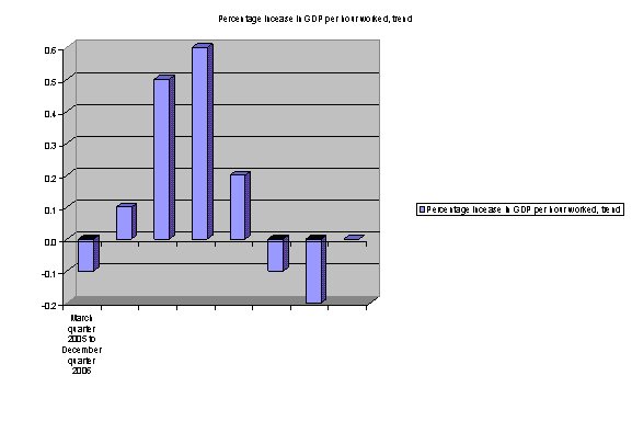
In case anyone is interested, here is a graph from ABS data that Peter included in his piece, showing clearly that the quarterly change in labour productivity has turned negative for the last two quarters:

Quarterly change in Australian labour productivity

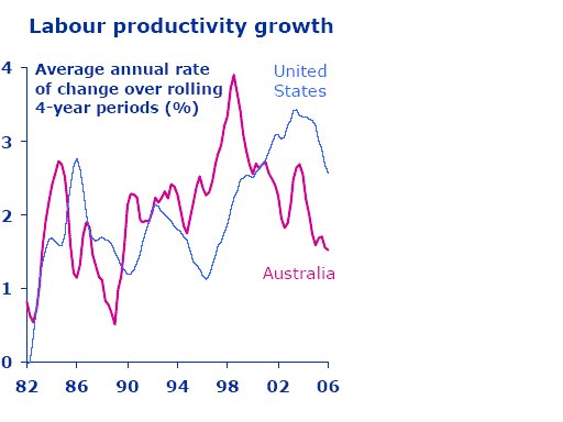
Recognising the probable noise in quarterly data, Peter also includes this graph of a four-year rolling average courtesy of Saul Eslake at ANZ:

Four-year rolling average of changes in Australian and American labour productivity

Paul Keating, speaking to the ABC’s Eleanor Hall in the week leading up to the recent budget, justified enterprise bargaining over individual contracts thus:

On this floor at the ABC here, there must be 150 people. If you went out there and said to them, look we’re going to make an agreement for the next three years or four with the ABC and we want 3 per cent productivity a year out of it, or 2 per cent productivity, together you could all do something.

But if they just take Eleanor Hall by herself and say, you will give us an increase in productivity, how can you, individually? How can you? What are you going to do, talk louder? Talk more? Be at work earlier?

For reference, the latest Australian federal budget can be found here. The section relevant to Peter Martin’s commentary is Budget Paper 1, statement 4.

Update – 14 May 2007 – In response to Andrew Norton:

Andrew is absolutely right that a firm is concerned principally with profit, but there are always two ways to get more of the stuff. You can do the same at a lower cost (as he speaks of), or you can do more, with the value of the extra done being more than the extra cost it requires.

Assuming that the amount of labour employed remains the same in both cases, the first possibility does not increase worker productivity; it only shifts a greater proportion of the output away from labour and into firm profits. The second possibility increases worker productivity, with an ambiguous effect on the labour/capital shares of output.