Output gaps, inflation and totally awesome blogosphere debates

I love the blogosphere.  It lets all sorts of debates happen that just can’t happen face to face in the real world.  Here’s one that happened lately:

James Bullard, of the St. Louis Fed, gave a speech in which (I believe) he argued that wealth effects meant that potential output was discretely lower now after the crash of 2006-2008.  David Andolfato and Tyler Cowen both liked his argument.

Scott Sumner, Noah Smith, Paul Krugman, Matt Yglesias, Mark Thoma and Tim Duy (apologies if I missed anyone) all disagreed with it for largely the same reason:  A bubble is a price movement and prices don’t affect potential output, if for no other reason then because potential output is defined as the output that would occur if prices didn’t matter.

Brad DeLong also disagreed on the same grounds, but was willing to grant that a second-order effect through labour-force participation may be occurring, although that was not the argument that Bullard appeared to be making.

In response, Bullard wrote a letter to Tim Duy, in which he revised his argument slightly, saying that it’s not that potential output suddenly fell, but that it was never so high to start with.  We were overestimating potential output during the bubble period and are now estimating it more accurately.

The standard reply to this, as provided by by Scott SumnerTim DuyMark Thoma and Paul Krugman, takes the form of:  If actual output was above potential during the bubble, then where was the resulting inflation?  What is so wrong with the CBO’s estimate of potential output (which shows very little output gap during the bubble period)?

Putting to one side discussions of what the output gap really is and how to properly estimate it (see, for example, Menzie Chinn here, here and here), I’ve always felt a sympathy with the idea that Bullard is advocating here.  Although I do not have a formal model to back it up, here is how I’ve generally thought of it:

  • Positive output gaps (i.e. actual output above potential) do not directly cause final-good inflation.  Instead, they cause wage inflation, which raises firms’ marginal costs, which causes final-good inflation.
  • Globalisation in general, and the rise of China in particular, meant that there was — and remains — strong, competition-induced downward pressure on the price of internationally tradable goods.
  • That competition would induce domestic producers of tradable goods to either refuse wage increases or go out of business.
  • Labour is not (or at least is very poorly) substitutable.  Somebody trained as a mechanic cannot do the work of an accountant.
  • Therefore, the wages of workers in industries producing tradable goods stayed down, while the wages of workers in industries producing non-tradable goods were able to rise.
  • Indeed, we see in the data that both price and wage inflation in non-tradable industries have been consistently higher than those in tradable sectors over the last decade and, in some cases, very much higher.

The inflation was there.  It was just limited to a subset of industries … like the financial sector.

(Note that I’m implicitly assuming fixed, or at least sticky, exchange rates)

As it happens, I also — like Tyler Cowen — have a sneaking suspicion that temporary (nominal) demand shocks can indeed have effects that are observationally equivalent to (highly) persistent (real) supply shocks.  That’s a fairly controversial statement, but backing it up will have to wait for another post …

Some brief thoughts on QE2

  • Instead of speaking about “the interest rate” or even “the yield curve”, I wish people would speak more frequently about the yield surface:  put duration on the x-axis, per-period default risk on the y-axis and the yield on the z-axis.  Banks do not just borrow short and lend long; they also borrow safe and lend risky.
  • Liquidity is not uniform over the duration-instantaneous-default-risk space.   Liquidity is not even monotonic over the duration-instantaneous-default-risk space.
  • There is still a trade-off for the Fed in wanting lower interest rates for long-duration, medium-to-high-risk borrowers to spur the economy and wanting a steep yield surface to help banks with weak balance sheets improve their standing.
  • By keeping IOR above the overnight rate, the Fed is sterilising their own QE (the newly-injected cash will stay parked in reserve accounts) and the sole remaining effect, as pointed out by Brad DeLong, is through a “correction” for any premiums demanded for duration risk.
  • Nevertheless, packaging the new QE as a collection of monthly purchases grants the Fed future policy flexibility, as they can always declare that it will be cut off after only X months or will be extended to Y months.
  • It seems fairly clear to me that the announcement was by-and-large expected and so “priced in” (e.g. James Hamilton), but there was still something of a surprise (it was somewhat greater easing than was expected) (e.g. Scott Sumner).
  • Menzie Chinn thinks there is a bit of a puzzle in that while bond markets had almost entirely priced it in, fx-rate markets (particularly USD-EUR) seemed to move a lot.  I’m not entirely sure that I buy his argument, as I’m not entirely sure why we should expect the size of the response to a monetary surprise to be the same in each market.

In which I respectfully disagree with Paul Krugman

Paul Krugman [Ideas, Princeton, Unofficial archive] has recently started using the phrase “jobless recovery” to describe what appears to be the start of the economic recovery in the United States [10 Feb, 21 Aug, 22 Aug, 24 Aug].  The phrase is not new.  It was first used to describe the recovery following the 1990/1991 recession and then used extensively in describing the recovery from the 2001 recession.  In it’s simplest form, it is a description of an economic recovery that is not accompanied by strong jobs growth.  Following the 2001 recession, in particular, people kept losing jobs long after the economy as a whole had reached bottom and even when employment did bottom out, it was very slow to come back up again.  Professor Krugman (correctly) points out that this is a feature of both post-1990 recessions, while prior to that recessions and their subsequent recoveries were much more “V-shaped”.  He worries that it will also describe the recovery from the current recession.

While Professor Krugman’s characterisations of recent recessions are broadly correct, I am still inclined to disagree with him in predicting what will occur in the current recovery.  This is despite Brad DeLong’s excellent advice:

  1. Remember that Paul Krugman is right.
  2. If your analysis leads you to conclude that Paul Krugman is wrong, refer to rule #1.

This will be quite a long post, so settle in.  It’s quite graph-heavy, though, so it shouldn’t be too hard to read. 🙂

Professor Krugman used his 24 August post on his blog to illustrate his point.  I’m going to quote most of it in full, if for no other reason than because his diagrams are awesome:

First, here’s the standard business cycle picture:

DESCRIPTION

Real GDP wobbles up and down, but has an overall upward trend. “Potential output” is what the economy would produce at “full employment”, which is the maximum level consistent with stable inflation. Potential output trends steadily up. The “output gap” — the difference between actual GDP and potential — is what mainly determines the unemployment rate.

Basically, a recession is a period of falling GDP, an expansion a period of rising GDP (yes, there’s some flex in the rules, but that’s more or less what it amounts to.) But what does that say about jobs?

Traditionally, recessions were V-shaped, like this:

DESCRIPTION

So the end of the recession was also the point at which the output gap started falling rapidly, and therefore the point at which the unemployment rate began declining. Here’s the 1981-2 recession and aftermath:

DESCRIPTION

Since 1990, however, growth coming out of a slump has tended to be slow at first, insufficient to prevent a widening output gap and rising unemployment. Here’s a schematic picture:

DESCRIPTION

And here’s the aftermath of the 2001 recession:

DESCRIPTION

Notice that this is NOT just saying that unemployment is a lagging indicator. In 2001-2003 the job market continued to get worse for a year and a half after GDP turned up. The bad times could easily last longer this time.

Before I begin, I have a minor quibble about Prof. Krugman’s definition of “potential output.”  I think of potential output as what would occur with full employment and no structural frictions, while I would call full employment with structural frictions the “natural level of output.”  To me, potential output is a theoretical concept that will never be realised while natural output is the central bank’s target for actual GDP.  See this excellent post by Menzie Chinn.  This doesn’t really matter for my purposes, though.

In everything that follows, I use total hours worked per capita as my variable since that most closely represents the employment situation witnessed by the average household.  I only have data for the last seven US recessions (going back to 1964).  You can get the spreadsheet with all of my data here: US_Employment [Excel].  For all images below, you can click on them to get a bigger version.

The first real point I want to make is that it is entirely normal for employment to start falling before the official start and to continue falling after the official end of recessions.  Although Prof. Krugman is correct to point out that it continued for longer following the 1990/91 and 2001 recessions, in five of the last six recessions (not counting the current one) employment continued to fall after the NBER-determined trough.  As you can see in the following, it is also the case that six times out of seven, employment started falling before the NBER-determined peak, too.

Hours per capita fell before and after recessions

Prof. Krugman is also correct to point out that the recovery in employment following the 1990/91 and 2001 recessions was quite slow, but it is important to appreciate that this followed a remarkably slow decline during the downturn.  The following graph centres each recession around it’s actual trough in hours worked per capita and shows changes relative to those troughs:

Hours per capita relative to and centred around trough

The recoveries following the 1990/91 and 2001 recessions were indeed the slowest of the last six, but they were also the slowest coming down in the first place.  Notice that in comparison, the current downturn has been particularly rapid.

We can go further:  the speed with which hours per capita fell during the downturn is an excellent predictor of how rapidly they rise during the recovery.  Here is a scatter plot that takes points in time chosen symmetrically about each trough (e.g. 3 months before and 3 months after) to compare how far hours per capita fell over that time coming down and how far it had climbed on the way back up:

ComparingRecessions_20090605_Symmetry_Scatter_All

Notice that for five of the last six recoveries, there is quite a tight line describing the speed of recovery as a direct linear function of the speed of the initial decline.  The recovery following the 1981/82 recession was unusually rapid relative to the speed of it’s initial decline.  Remember (go back up and look) that Prof. Krugman used the 1981/82 recession and subsequent recovery to illustrate the classic “V-shaped” recession.  It turns out to have been an unfortunate choice since that recovery was abnormally rapid even for pre-1990 downturns.

Excluding the 1981/82 recession on the basis that it’s recovery seems to have been driven by a separate process, we get quite a good fit for a simple linear regression:

ComparingRecessions_20090605_Symmetry_Scatter_Excl_81-82

Now, I’m the first to admit that this is a very rough-and-ready analysis.  In particular, I’ve not allowed for any autoregressive component to employment growth during the recovery.  Nevertheless, it is quite strongly suggestive.

Given the speed of the decline that we have seen in the current recession, this points us towards quite a rapid recovery in hours worked per capita (although note that the above suggests that all recoveries are slower than the preceding declines – if they were equal, the fitted line would be at 45% (the coefficient would be one)).

Demand for sex in Japan

Mentioning sex in a blog post is a great way to generate some interesting traffic.  The last time I filled some time writing about it (on the rise of public sexuality, the rationality of prostitution and the extent of human trafficking), I got hits via some very odd queries on Google.

Titillation aside,  prostitution is a tremendously interesting topic in economics .  As John Hempton discussed initially in July 2008 and more extensively in May 2009, the price of prostitution is enormously flexible, unlike prices (and wages) in most industries.  That means that when, as John discussed, a country is operating under a fixed exchange rate and only prices can adjust in response to a macroeconomic shock, the sex industry will almost certainly move both first and furthest.

But because prostitution has very flexible wages and prices, that also makes it a candidate proxy for estimating changes in the potential output of an economy — the output that would occur if all prices were perfectly flexible.  (Remember there are differences between potential and natural levels of output)

I mention this after reading that the Bank of Japan is conducting surveys to estimate changes in demand in the Japanese sex industry:

The survey of sex shops and restaurants was designed to better gauge demand for services, an area of the economy that’s becoming more important as exports slump. “Any study into services is most welcome,” said Martin Schulz, senior economist at Fujitsu Research Institute in Tokyo. “We’ve got hundreds of studies on exports and manufacturing. What’s needed is creative thinking on services and if that includes brothels, so be it.” … While services including restaurants and retailing make up about 60 percent of gross domestic product, Japan’s economy has risen and fallen with the strength of its exports.

(Hat tip:  Tyler Cowen).

On China

Menzie Chinn emphasises that for the purposes of estimating country shares in global GDP, it is necessary to think of them in nominal terms.  On that basis, China is large, but only half the size of the Euro zone and well under half the size of America.  Therefore, he implies, an increase in demand from China won’t really contribute as much to global growth as people might be hoping.

Nevertheless, people do seem to be wondering about China as an engine of global growth in demand.  The reason is simple:  Despite a near catastrophic collapse in world trade, China’s economy is still growing while those of  other export-oriented countries like Japan or Germany are falling precipitously.

Clearly part of the reason for the continued Chinese growth, like in Australia, is the successful use of a fiscal stimulus to boost local demand (the Australian rebound was also helped by the fact that, by not manufacturing much, their decline in investment was offset by a fall in imports and (price) changes in natural resource exports occur with a significant lag).

Brad Setser has explored the Chinese stimulus a little.  He writes:

I initially underestimated the magnitude of China’s stimulus by focusing on the (fairly modest) change in the government’s fiscal balance. It is now clear that the majority of China’s stimulus has been off-budget: the huge increase in lending by state owned banks mattered far more than the change in the budget of the central government. The expected loss on these loans can be considered a form of fiscal stimulus.

Which is a fascinating way to conduct government business.

Perspective (Comparing Recessions)

This is quite a long post.  I hope you’ll be patient and read it all – there are plenty of pretty graphs!

I have previously spoken about the need for some perspective when looking at the current recession.  At the time (early Dec 2008), I was upset that every regular media outlet was describing the US net job losses of 533k in November as being unprecedentedly bad when it clearly wasn’t.

About a week ago, the office of Nancy Pelosi (the Speaker of the House of Representatives in the US) released this graph, which makes the current recession look really bad:

Notice that a) the vertical axis lists the number of jobs lost and b) it only includes the last three recessions.  Shortly afterward, Barry Ritholtz posted a graph that still had the total number of jobs lost on the vertical axis, but now included all post-World War Two recessions:

Including all the recessions is an improvement if only for the sake of context, but displaying total job losses paints a false picture for several reasons:

  1. Most importantly, it doesn’t allow for increases in the population.  The US residential population in 1974 was 213 million, while today it is around 306 million.  A loss of 500 thousand jobs in 1974 was therefore a much worse event than it is today.
  2. Until the 1980s, most households only had one source of labour income.  Although the process started slowly much earlier, in the 1980s very large numbers of women began to enter the workforce, meaning that households became more likely to have two sources of labour income.  As a result, one person in a household losing their job is not as catastrophic today as it used to be.
  3. There has also been a general shift away from full-time work and towards part-time work.  Only looking at the number of people employed (or, in this case, fired) means that we miss altogether the impact of people having their hours reduced.
  4. We should also attempt to take into account discouraged workers; i.e. those who were unemployed and give up even looking for a job.

Several people then allowed for the first of those problems by giving graphs of job loses as percentages of the employment level at the peak of economic activity before the recession.  Graphs were produced, at the least, by Justin Fox, William Polley and Calculated Risk.  All of those look quite similar.  Here is Polley’s:

The current recession is shown in orange.  Notice the dramatic difference to the previous two graphs?  The current recession is now shown as being quite typical; painful and worse than the last two recessions, but entirely normal.  However, this graph is still not quite right because it still fails to take into account the other three problems I listed above.

(This is where my own efforts come in)

The obvious way to deal with the rise of part-time work is to graph (changes in) hours worked rather than employment.

The best way to also deal with the entry of women into the workforce is to graph hours worked per member of the workforce or per capita.

The only real way to also (if imperfectly) account for discouraged workers is to just graph hours worked per capita (i.e. to compare it to the population as a whole).

This first graph shows Weekly Hours Worked per capita and per workforce member since January 1964:

In January 1964, the average member of the workforce worked just over 21 hours per week.  In January 2009 they worked just under 20 hours per week.

The convergence between the two lines represents the entry of women into the workforce (the red line is increasing) and the increasing prevalence of part-time work (the blue line is decreasing).  Each of these represented a structural change in the composition of the labour force.  The two processes appear to have petered out by 1989. Since 1989 the two graphs have moved in tandem.

[As a side note: In econometrics it is quite common to look for a structural break in some timeseries data.  I’m sure it exists, but I am yet to come across a way to rigorously handle the situation when the “break” takes decades occur.]

The next graph shows Year-over-Year percentage changes in the number of employed workers, the weekly hours per capita and the weekly hours per workforce member:

Note that changes in the number of workers are consistently higher than the number of hours per workforce member or per capita.  In a recession, people are not just laid off, but the hours that the remaining employees are given also falls, so the average number of hours worked falls much faster.  In a boom, total employment rises faster than the average number of hours, meaning that the new workers are working few hours than the existing employees.

This implies that the employment situation faced by the average individual is consistently worse than we might think if we restrict our attention to just the number of people in any kind of employment.  In particular, it means that from the point of view of the average worker, recessions start earlier, are deeper and last longer than they do for the economy as a whole.

Here is the comparison of recessions since 1964 from the point of view of Weekly Hours Worked per capita, with figures relative to those in the month the NBER determines to be the peak of economic activity:

The labels for each line are the official (NBER-determined) start and end dates for the recession.  There are several points to note in comparing this graph to those above:

  • The magnitudes of the declines are considerably worse than when simply looking at aggregate employment.
  • Declines in weekly hours worked per capita frequently start well before the NBER-determined peak in economic activity.  For the 2001 recession, the decline started 11 months before the official peak.
  • For two recessions out of the last seven – those in 1980 and 2001 – the recovery never fully happened; another recession was deemed to have started before the weekly hours worked climbed back to its previous peak.
  • The 2001 recession was really awful.
  • The current recession would appear to still be typical.

Since so many of the recessions started – from the point of view of the average worker – before the NBER-determined date, it is helpful to rebase that graph against the actual peak in weekly hours per capita:

Now, finally, we have what I believe is an accurate comparison of the employment situation in previous recessions.

Once again, the labels for each line are the official (NBER-determined) start and end dates for the recession.  By this graph, the 2001 recession is a clear stand-out.  It fell the second furthest (and almost the furthest), lasted by far the longest and the recovery never fully happened.

The current recession also stands out as being toward the bad end of the spectrum.  It is the equally worst recession by this point since the peak.  It will need to continue getting a lot worse quite quickly in order to maintain that record, however.

After seeing Calculated Risk’s graph, Barry Ritholtz asked whether it is taking longer over time to recover from a recession recoveries (at least in employment).  This graph quite clearly suggests that the answer is “no.”  While the 2001 and 1990/91 recessions do have the slowest recoveries, the next two longest are the earliest.

Perhaps a better way to characterise it is to compare the slope coming down against the slope coming back up again.  It seems as a rough guess that rapid contractions are followed by just-as-rapid rises.  On that basis, at least, we have some slight cause for optimism.

If anybody is interested, I have also uploaded a copy of the spreadsheet with all the raw data for these graphs.  You can access it here:  US Employment (excel spreadsheet)

For reference, the closest other things that I have seen to this presentation in the blogosphere are this post by Spencer at Angry Bear and this entry by Menzie Chinn at EconBrowser.  He provides this graph of employment versus aggregate hours for the current recession only:

Alex Tabarrok has also been comparing recessions (1, 2, 3).

Are US policy-makers panicking?

With respect to fiscal policy, I suspect that the stimulus package will help, but believe – like every other political cynic – that the package is being undertaken principally so that candidates in this year’s congressional, senate and presidential elections can be seen to be acting.  I am not at all surprised that debate over the precise structure of the package never really rose above the blogosphere, since although that is of enormous significance in how effective it will be, it is of near utter insignificance from the point of view of being seen to act.  I find myself agreeing both with Paul Krugman, who points out that only a third of the money will go to people likely to be liquidity-constrained and with Megan McArdle, who (here, here, here, here and here) argues that if you’re going to give aid to the poor of America, doing it via food stamps is, to say the least, less than ideal.

On the topic of monetary policy, I will prefix my thoughts with the following four points:

  • The decision makers at the US Federal Reserve are almost certainly smarter than I am (or, indeed, my audience is)
  • They certainly have more experience than I do
  • They certainly put more effort into thinking about this stuff than I do
  • They certainly have access to more timely and higher quality data than I do

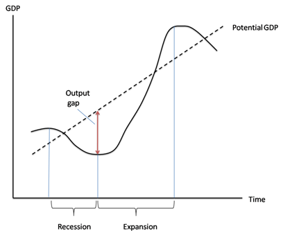
As I see it, there are three different concerns:  whether (and if so, how) monetary policy can help in this scenario; whether the Fed’s actions come with added risks; and whether the timing of the Fed’s actions were appropriate.

First up, we have concerns over whether monetary policy will have any positive effect at all.  Paul Krugman (U. Princeton) worries:

Here’s what normally happens in a recession: the Fed cuts rates, housing demand picks up, and the economy recovers.  But this time the source of the economy’s problems is a bursting housing bubble. Home prices are still way out of line with fundamentals … how much can the Fed really do to help the economy?

By way of arguing for a a fiscal package, Robert Reich (U.C. Berkley) has a related concern:

[A] Fed rate cut won’t stimulate the economy. That’s because lending institutions, fearing their portfolios are far riskier than they assumed several months ago, won’t lend lots more just because the Fed lowers interest rates. Average consumers are already so deep in debt — record levels of mortgage debt, bank debt, and credit-card debt — they can’t borrow much more, anyway.

Menzie Chinn (U. Wisconsin) looks at these and other worries by going back to the textbook channels through which monetary policy works, concluding:

In answer to the question of which sector can fulfill the role previously filled by housing, I would say the only candidate is net exports. The decline in the Fed Funds rate has led to a depreciation of the dollar. In the future, net exports will be higher than they otherwise would be. However, the behavior of net exports, unlike other components of aggregate demand, depends substantially on what happens in other economies. If policy rates decline in the UK, the euro area, and elsewhere, additional declines of the dollar might not occur. (And as I’ve pointed out before, if rest-of-world GDP growth declines (as seems likely [2]), then net exports might decline even with a weakened dollar).

I think the main point is that the decreases in interest rates, working through the traditional channels, will have a positive impact on components of aggregate demand. With respect to the credit view channels, the impact on lending is going to be quite muted, I think, given the supply of credit is likely to be limited. In fact, I suspect monetary policy will only be mitigating the negative effects of slowing growth and a reduction of perceived asset values working their way through the system.

James Hamilton (U.C. San Diego) is more sanguine, arguing that:

[I]t is hard to imagine that the latest actions by the Fed would fail to have a stimulatory effect.

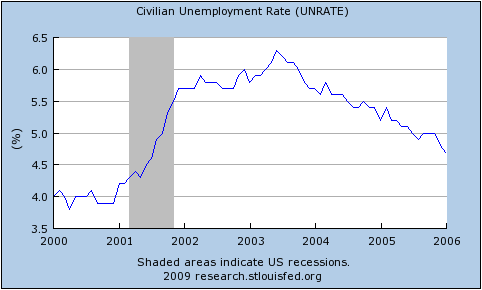
[A]lthough interest rates respond immediately to the anticipation of any change from the Fed, it takes a considerable amount of time for this to show up in something like new home sales, due to the substantial time lags involved for most people’s home-purchasing decisions … According to the historical correlations, we would expect the biggest effects of the January interest rate cuts to show up in home sales this April.

[The scale of any effect is unknown, though.] Tightening lending standards rather than the interest rate have in my opinion been the biggest explanation for why home sales continued to deteriorate after January 2007 … The effect of rising unemployment and expectations of falling house prices on housing demand is another big and potentially very important unknown.

Going further, Martin Wolf at the FT worries that the Fed may be doing too much, that they the recent cuts in interest rates may serve only to renew or exacerbate the problems that caused the current crisis in the first place.

[P]essimists argue that the combination of declining asset prices (particularly house prices) with household overindebtedness and a fragile banking system means that monetary policy is, in the celebrated words of John Maynard Keynes, like “pushing on a string”. It may not be quite that bad. But, on its own, monetary policy will not act swiftly unless employed on a dramatic scale. The case for fiscal action looks strong.

Yet, in current US circumstances, monetary loosening should have some expansionary effects: it will encourage refinancing of home mortgages; it will weaken the exchange rate, thereby improving net exports; it will, above all, strengthen the health of banking institutions, by giving them cheap government loans.

This brings us to the biggest question: what are the risks? Unfortunately, they are large. One is indefinite continuation of an excessively low rate of US national saving. Others are a loss of confidence in the US currency and much higher inflation.Yet another is a further round of the very asset bubbles and credit expansion that created the present crisis. After all, the financial fragility used to justify current Fed actions is, in large part, the direct result of past Fed efforts at the risk management Mr Mishkin extols.

Moreover, the risks are not just domestic. If the US authorities succeed in reigniting domestic demand, this is likely to reverse the decline in the current account deficit. It will surely reduce the pressure on other countries to change the exchange rate, fiscal, monetary and structural policies that have forced the US to absorb most of the rest of the world’s huge surplus savings.

I find it impossible to look at what the US is now trying to do without feeling severely torn. If it succeeds it will renew and, at worst, exacerbate the fragility, both domestic and international, that triggered the turmoil. If it fails, the US and, perhaps, much of the rest of the world could well suffer a prolonged period of economic weakness. This is hardly a pleasant choice. But that it is indeed the choice shows how weakened the world economy and particularly the financial system has become.

In reaction at the FT’s hosted blog, Christopher Carroll (Johns Hopkins U.) argues:

This situation provides a more than sufficient rationale for the Fed’s dramatic actions: Deflation combined with a debt crisis make a toxic combination, because as prices fall, real debt rises. This point was amply illustrated in Japan, where deflation amplified both the number of zombies and the degree of zombification (among the initial stock of the undead). It was also the basis of Irving Fisher’s theory of what made the Great Depression great, and has clear echoes in the macroeconomic literature on the “financial accelerator” pioneered by none other than Ben Bernanke (along with a few other authors who have pursued more respectable careers).

In this context, the risk of an extra year or two of an extra point or two of inflation (if the deflation jitters prove unwarranted and the subprime crisis proves transitory) seems a gamble well worth taking.

Martin Wolf then replied:

[W]hat the Bernanke Fed seems to be trying to halt (with enthusiastic assistance from Congress and the president) is a natural and necessary adjustment, as Ricardo Hausmann argued in the FT on January 31st. I agree that this adjustment must not be too brutal. I agree, too, that both a steep recession and deflation should be avoided. I agree, finally, that market adjustments must not be frozen, as happened in Japan. But I disagree that the US confronts a huge threat of deflation from which the Fed must rescue the economy at all costs. What I fear it is doing, instead, is bailing out the banking system and so trying to reignite the credit cycle, with the consequent dangers of a flight from the dollar, considerably higher inflation and much more bad lending ahead.

Which leaves us with the third concern, over the timing of the rate cuts.  The first of them, of 75 basis points, was the largest single cut in a quarter century.  The fact that it came from an out-of-schedule meeting makes it almost unprecedented.  When we add the fact that the world was in the middle of a broad share sell-off – exacerbated, it turns out, by the winding out of US$75 billion of bets by Societe General – it definitely has the appearance of a panicked decision.  Adding the 50bp cut eight days later made for an enormous 1.25 percentage point drop in rates in a fraction over a week.

So what’s my take?  Well …

1) The Fed is not as independent as central banks in other countries are.  Greg Mankiw may not like it, but the fact is that both Congress and the Whitehouse actively seek to influence monetary policy in the United States.  This photograph of Ben Bernanke (chairman of the US Federal Reserve), Christopher Dodd (chairman of the US senate’s banking committee) and Hank Paulson (US Treasury secretary) from mid-August 2007 is typical:

bernanke_dodd_paulson.jpg

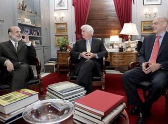
As Martin Wolf noted at the time:

This showed Mr Bernanke as a performer in a political circus. Mr Dodd even announced Mr Bernanke’s policies: the latter had, said Mr Dodd, told him he would use “all the tools ” at his disposal to contain market turmoil and prevent it from damaging the economy. The Fed has its orders: save Main Street and rescue Wall Street.  Such panic-driven politicisation is almost certain to lead to both overreaction and the creation of bad precedents.

2) The Fed is mandated to keep both inflation and unemployment low.  By comparison, the other major central banks are only required to focus on inflation.  When they do look at unemployment, it plays lexicographic second fiddle to keeping inflation in check.  At the Fed, they are compelled to take unemployment into account at the same time as looking at inflation.

3) The banking and finance system is central to the real economy.  Without a ready supply of credit to worthy and profitable ventures, economic growth would slow dramatically, if not cease altogether.  Although it creates a clear moral hazard when bankers’ pay is not aligned with real economic outcomes, this – combined with the first two points – implies that the so-called “Bernanke put” is probably, to some extent, real.

4) The latest GDP numbers and IMF forecasts were released in between the two rate cuts.   I have nothing to back this up, but I wouldn’t be the least bit surprised to discover that the Fed gets (or got) a preview of those numbers.  Seeing that markets were already tanking, knowing that the reports would send them tumbling further, perhaps believing that they might already be in a recession, almost certainly fearing that the negative news, if released before the Fed had acted, might send risk premia skywards again and recognising that what they needed was a massive cut of at least 100bp, perhaps the Fed concluded that the best policy was to split the cut over two meeting, making a smaller but still unusually large cut before the reports were released to ensure that they didn’t trigger more credit-crunchiness and a second one after in notional “response.”

My point is this:  Which would seem more like a panicked response?  The way that things did pan out, or a global stock market melt-down that took several more days to settle, followed by the markets being hit with surprisingly negative reports from the IMF on the global economy and the BEA on the US economy, and then a 125 b.p. drop in a single sitting by the Fed?