The short-long-run, the medium-long-run and the long-long-run

EC102 has once again finished for the year.  It occurs to me that my students (quite understandably) got a little confused about the timeframes over which various elements of macroeconomics occur.  I think the reason is that we use overlapping ideas of medium- and long-run timeframes.

In essense, there are four models that we use at an undergraduate level for thinking about aggregate demand and supply.  In increasing order of time-spans involved, they are:  Investment & Savings vs. Liquidity & Money (IS-LM),  Aggregate Supply – Aggregate Demand (AS-AD), Factor accumulation (Solow growth), and Endogenous Growth Theory.

It’s usually taught that following an exogenous shock, the IS-LM model reaches a new equilibrium very quickly (which means that the AD curve shifts very quickly), the goods market in the AS-AD world clears quite quickly and the economy returns to full-employment in “the long-run” once all firms have a chance to update their prices.

But when thinking about the Solow growth model of factor (i.e. capital) accumulation, we often refer to deviations from the steady-state being in the medium-run and that we reach the steady state in the long-run.  This is not the same “long-run” as in the AS-AD model.  The Solow growth model is a classical model, which among other things means that it assumes full employment all the time.  In other words, the medium-run in the world of Solow is longer than the long-run of AS-AD.  The Solow growth model is about shifting the steady-state of the AS-AD model.

Endogenous growth theory then does the same thing to the Solow growth model: endogenous growth is the shifting of the steady-state in a Solow framework.

What we end up with are three different ideas of the “long-run”:  one at business-cycle frequencies, one for catching up to industrialised nations and one for low-frequency stuff in the industrialised countries, or as I like to call them: the short-long-run, the medium-long-run and the long-long-run.
More people have jobs AND the unemployment rate is higher

This is another one for my students in EC102.

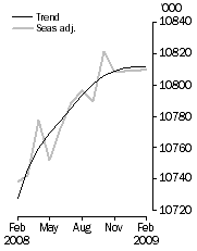
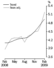
Via the always-worth-reading Peter Martin, I notice that the Australian Bureau of Statistics February release of Labour Force figures contains something interesting:  The number of people with jobs increased, but the unemployment rate still went up.  Here’s the release from the ABS:

Employed Persons Unemployment Rate
Australia Feb 2009 Employment Australia Feb 2009 Unemployment Rate

FEBRUARY KEY POINTS

TREND ESTIMATES (MONTHLY CHANGE)

  • EMPLOYMENT increased to 10,811,700
  • UNEMPLOYMENT increased to 561,100
  • UNEMPLOYMENT RATE increased to 4.9%
  • PARTICIPATION RATE increased to 65.4%

SEASONALLY ADJUSTED ESTIMATES (MONTHLY CHANGE)

EMPLOYMENT

  • increased by 1,800 to 10,810,400. Full-time employment decreased by 53,800 to 7,664,200 and part-time employment increased by 55,600 to 3,146,200.

UNEMPLOYMENT

  • increased by 47,100 to 590,500. The number of persons looking for full-time work increased by 44,400 to 426,000 and the number of persons looking for part-time work increased by 2,600 to 164,500.

UNEMPLOYMENT RATE

  • increased by 0.4 percentage points to 5.2%. The male unemployment rate increased by 0.3 percentage points to 5.1%, and the female unemployment rate increased by 0.5 percentage points to 5.3%.

PARTICIPATION RATE

  • increased by 0.2 percentage points to 65.5%.

The proximate reason is that more people want a job now than did in January.  The unemployment rate isn’t calculated using the total population, but instead uses the Labour Force, which is everybody who has a job (Employed) plus everybody who wants a job and is looking for one (Unemployed).

$$!u=\frac{U}{E+U}$$

Employment increased by 1,800, but unemployment increased by 47,100, so the unemployment rate ($$u$$) still went up.

Peter Martin also offered a suggestion on why this happened:

We’ve lost a lot of wealth and we’re worried. So those of us who weren’t looking for work are piling in.

I generally agree, but my guess would go further. Notice two things:

  • Part-time jobs went up by 55,600 and full-time jobs fell by 53,800 (the difference is the 1,800 increase in total employment).
  • The number of people looking for part-time jobs went up by only 2,600 and the number of people looking for full-time jobs rose by 44,400 (yes, I realise that there’s 100 missing – I guess the ABS has a typo somewhere).

There are plenty of other explanations, but I think that by and large, the new entrants to the Labour Force only wanted part-time work and found it pretty-much straight away – these are households that were single-income, but have moved to two-incomes out of the concern that Peter highlights.  On the other hand, I suspect that the people that lost full-time jobs have generally remained in the unemployment pool (some will have given up entirely, perhaps calling it retirement).

The aggregate result is that the economy had a shift away from full-time and towards part-time work, although the people losing the full-time jobs are not the ones getting the new part-time work.

The velocity of money and the credit crisis

This is another one for my students of EC102.

Possibly the simplest model of aggregate demand in an economy is this equation:

MV = PY

The right-hand side is the nominal value of demand, being the price level multiplied by the real level of demand.  The left-hand side has the stock of money multiplied by the velocity of money, which is the number of times the average dollar (or pound, or euro) goes around the economy in a given time span.  The equation isn’t anything profound.  It’s an accounting identity that is always true, because V is constructed in order to make it hold.

The Quantity Theory of Money (QTM) builds on that equation.  The QTM assumes that V and Y are constant (or at least don’t respond to changes in M) and observes that, therefore, any change in M must only cause a corresponding change in P.  That is, an increase in the money supply will only result in inflation.

A corresponding idea is that of Money Neutrality.  If money is neutral, then changes in the money supply do not have any effect on real variables.  In this case, that means that a change in M does not cause a change in Y.  In other words, the neutrality of money is a necessary, but not sufficient condition for the QTM to hold; you also need the velocity of money to not vary with the money supply.

After years of research and arguing, economists generally agree today that money neutrality does not hold in the short run (i.e. in the short run, increasing the money supply does increase aggregate demand), but that it probably does hold in the long run (i.e. any such change in aggregate demand will only be temporary).

The velocity of money is an interesting concept, but it’s fiendishly difficult to tie down.

  • In the long-run, it has a secular upward trend (which is why the QTM doesn’t hold in the long run, even if money neutrality does).
  • It is extremely volatile in the short-run.
  • Since it is constructed rather than measured, it is a residual in the same way that Total Factor Productivity is a residual.  It is therefore a holding place for any measurement error in the other three variables.  This will be part, if not a large part, of the reason why it is so volatile in the short-run.
  • Nevertheless, the long run increases are pretty clearly real (i.e. not a statistical anomaly). We assume that this a result of improvements in technology.
  • Conceptually, a large value for V is representative of an efficient financial sector. More accurately, a large V is contingent on an efficient turn-around of money by the financial sector – if a new deposit doesn’t go out to a new loan very quickly, the velocity of money is low. The technology improvements I mentioned in the previous point are thus technologies specific to improving the efficiency of the finance industry.
  • As you might imagine, the velocity of money is also critically dependent on confidence both within and regarding banks.
  • Finally, the velocity of money is also related to the concept of fractional reserve banking, since we’re talking about how much money gets passed on via the banks for any given deposit.  In essence, the velocity of money must be positively related to the money multiplier.

Those last few points then feed us into the credit crisis and the recession we’re all now suffering through.

It’s fairly common for some people to blame the crisis on a global savings glut, especially after Ben Bernanke himself mentioned it back in 2005.  But, as Brad Setser says, “the debtor and the creditor tend to share responsibility for most financial crises. One borrows too much, the other lends too much.”

So while large savings in East-Asian and oil-producing countries may have been a push, we can use the idea of the velocity of money to think about the pull:

  1. There was some genuine innovation in the financial sector, which would have increased V even without any change in attitudes.
  2. Partially in response to that innovation, partially because of a belief that thanks to enlightened monetary policy aggregate uncertainty was reduced and, I believe, partially buoyed by the broader sense of victory of capitalism over communism following the fall of the Soviet Union, confidence both within and regarding the financial industry also rose.
  3. Both of those served to increase the velocity of money and, with it, real aggregate demand even in the absence of any especially loose monetary policy.
  4. Unfortunately, that increase in confidence was excessive, meaning that the increases in demand were excessive.
  5. Now, confidence both within and, in particular, regarding the banking sector has collapsed.  The result is a fall in the velocity of money (for any given deposit received, a bank is less likely to make a loan) and consequently, aggregate demand suffers.

The fiscal multiplier

This is mostly for my EC102 students.  There’s been some argument in the academic economist blogosphere over the size of the fiscal multiplier in the USA.  The fiscal multiplier is a measure of by how much GDP rises for an extra dollar of government spending.  There are several main forces in determining it’s size:

  • The Marginal Propensity to Consume (MPC) determines the upper limit of the multiplier.  Suppose that for each extra dollar of income, we tend to spend 60 cents in consumption.  Because the economy is a massive, whirling recycling of money – I spend a dollar in your shop, you save 40 cents and spend 60 cents in the second shop, the guy in the second shop pockets 40% of that and spends the rest in the third shop and so on – one dollar of government spending might produce 1+ 0.6 + 0.6^2 + 0.6^3 + … = 1 / (1 – 0.6) = 2.5 dollars of GDP.
  • The extra government spending needs to be paid for, which means that taxes will need to go up.  For it to be a stimulus now, it’ll typically be financed through borrowing instead of raising taxes now (i.e. taxes will go up later).  If people recognise that fact, they may instead choose to consume less and save more in anticipation of that future tax bill, therefore lowering the multiplier.  If it gets to a point where there is no difference between raising-taxes-now and borrowing-now-and-raising-taxes-later, we have Ricardian equivalence.
  • If the extra government spending is paid for by borrowing, that will raise interest rates (Interest rates and the price of bonds move in opposite directions – by selling more bonds, the government will be increasing their supply and thus lowering their price; hence, the interest rate will rise).  If the interest rate goes up, that makes it more expensive for private businesses to borrow, which means that private investment will go down.  This is the crowding-out effect.  Since GDP = Consumption + Private Investment + Government spending + Net exports, this will lower the multiplier as well.
  • The size of the multiplier will also depend on the size of the extra government spending.  Generally speaking, the multiplier will be smaller for the second extra dollar spent than for the first and smaller again for the third.  That is, increasing government spending exhibits decreasing marginal returns.  This is because the second and third points listed above will become more and more relevant for larger and larger amounts of extra government spending.
  • Everything gets more complicated when you start to look at current tax rates as well. An alternative to a debt-funded expansion in spending is a debt-funded reduction in revenue (i.e. a tax cut). The multiplier can be very different between those two circumstances.
  • Then we have what is arguably the most important part: where the extra spending (or the tax cut) is directed. Poor people have a much higher marginal propensity to consume than rich people, so if you want to increase government spending, you should target the poor to get a larger multiplier. Alternatively, cutting taxes associated with an increase in a business (e.g. payroll taxes) will lower the cost of that increase and produce a larger multiplier than a tax-cut for work that was already happening anyway.
  • Next, it is important to note that everything above varies depending on where we are in the business cycle.  For example, the crowding-out effect will be strongest (i.e. worst) when the economy is near full employment and be weakest (i.e. less of a problem) when the economy is in recession.
  • Finally, we have the progressivity of the tax system.  This won’t really affect the size of the multiplier directly, but it is important that you think about it. Rich people pay more tax than poor people, not just in absolute levels (which is obvious), but also as a fraction of their income. That means that the burden of paying back the government debt will fall more on the shoulders of the rich, even after you take into account the fact that they earn more.

Much of what you’ll read arguing for or against a stimulus package will fail to take all of those into account.  People are often defending their personal views on the ideal size of government and so tend to pick-and-choose between the various effects in support of their view.

On the importance of sunk costs

This is mostly for my students in EC102.  There’s a concept in economics called sunk costs.  A sunk cost is one that is spent and unrecoverable:  it’s gone and you can’t get it back.  Since you cannot get them back, you should ignore sunk costs when deciding what to do in the future.  To illustrate the importance of that dictum, consider the following:

You are a software company.  Your business model involves a large, upfront expenditure as you develop and write your program, followed by extremely low variable costs when selling it (the marginal cost of producing another DVD is very low).  Since you’ll be the only company selling this particular piece of software, you will have pricing power as a (near) monopolist. Before you start, you can estimate the demand curve you’ll face and from that estimate what your total revenue will be (remember, MR = MC will give you the (Q,P) pair).  If your expected revenue is larger than your estimate of the total cost of developing and selling the software, you should go ahead.

For simplicity, we’ll assume that the marginal cost of producing a new DVD is zero. That means that your Variable Cost is zero and Total Cost = Fixed Cost.  For any uber-nerds in the audience, we’ll also assume risk-neutrality (so that we only need to look at expected values) and a rate of time preference equal to zero (so that we can compare future money to today’s money without discounting).

Here’s the situation we start with:

Month Fixed Cost (actual) Fixed Cost (future, estimated) Fixed Cost (total, estimated) Total Revenue (estimated)
January 0 100 100 120

In January, since you expect your revenue to exceed your costs, you decide to go ahead.  But in February, after spending 50, you realise that it’s going to take more work than you first thought to write the software.  In fact, you still need to spend another 80 to get it ready for sale.  You’re now facing this situation:

Month Fixed Cost (actual) Fixed Cost (future, estimated) Fixed Cost (total, estimated) Total Revenue (future, estimated)
January 0 100 100 120
February 50 80 130 120

Should you still keep going?

The answer is yes!  The reason is that, in February, the 50 you spent in January is a sunk cost.  You cannot get it back and so should ignore it in your calculations.  In February you compare a future cost of 80 and a future revenue of 120 and decide to go ahead.  The 40 you will make will offset your sunk costs for a total profit of -10.  If you stopped, your total profit would have been -50.

This sort of situation is depressingly common in the IT industry.  You can even get awful situations like this:

Month Fixed Cost (actual) Fixed Cost (future, estimated) Fixed Cost (total, estimated) Total Revenue (future, estimated)
January 0 100 100 120
February 50 80 130 120
October 140 10 150 80

By October, you’ve already spent 140 – more than you ever thought you might make as revenue – and you still aren’t finished.  Thankfully, you think you’ve only got to spend 10 more to finish it, but you’ve also now realised that the demand isn’t so good after all (maybe you’ve had to cut back on the features of your product so not as many people will want it), so your estimated future revenue is only 80.

Even then you’re better off ploughing ahead, since you’re choosing between a loss of 140 and a loss 70.

For extra credit:  Imagine that you’re the bank lending money to this software company.  In January you lent them 100, in February an extra 30.  In October, knowing that the company is going to go bankrupt, would you lend them the last 10 as well?  (Yes, I realise that I’m ignoring the cost to the IT company of interest repayments.)

Could you do first-year economics?

Once again, I’m teaching EC102, a mathematics-oriented introduction to economics for first-year undergraduate students at the London School of Economics.  The following is a question from one of the students’ weekly quizzes:

A population consists of two types, “friendlies” (Fs) and “aggressives” (As). Each individual interacts with a randomly chosen member of the population. When two Fs interact, they each earn 3 units. When two As interact, they each earn 0. When an F and an A interact the former gets 1 unit and the latter 5 units. The growth rate of each type is proportional to their average payoff. What will be the equilibrium population share of Fs?

There are some hints over the fold …
Continue reading “Could you do first-year economics?”

VW: Supply, Demand and Elasticity

Something very interesting happened to the share price of Volkswagen this week.  The FT has the story:

Volkswagen’s shares more than doubled on Monday after Porsche moved to cement its control of Europe’s biggest carmaker and hedge funds, rushing to cover short positions, were forced to buy stock from a shrinking pool of shares in free float.

VW shares rose 147 per cent after Porsche unexpectedly disclosed that through the use of derivatives it had increased its stake in VW from 35 to 74.1 per cent.

[T]he sudden disclosure meant there was a free float of only 5.8 per cent – the state of Lower Saxony owns 20.1 per cent – sparking panic among hedge funds. Many had bet on VW’s share price falling and the rise on Monday led to estimated losses among them of €10bn-€15bn ($12.5bn-$18.8bn).

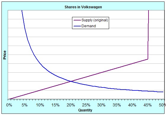
For my students in EC102, this is interesting because of the shifts in Supply and Demand and the elasticity of those curves.  The buying and selling of shares in companies is a market just like any other.  Here’s an idea of what the Supply and Demand curves for shares in Volkswagen were originally:

Shares in Volkswagen (original)

The quantity is measured as a percentage because you can only ever buy up to 100% of a company.  Notice that the supply curve suddenly rockets upwards at around 45%.  That’s because originally, 55% of the shares of Volkswagen weren’t available for sale.  20% was owned by the state of Lower Saxony and 35% by Porsche, and they weren’t willing to sell at any price [In reality, if you were to offer them enough money, they might have been willing to sell some of their shares, but the point is that it would have had to have been a lot].  We say that for quantities above 45%, the supply of shares was highly, even perfectly, inelastic.

Notice, too, that the demand curve is also extremely inelastic at quite low quantities.  That is because a lot of hedge funds had shorted the VW stock.  Shorting (sometimes called “short selling” or “going short”) is when the investor borrows shares they don’t own in order to sell them at today’s price.  When it comes time to return them, they will buy them on the open market and give them back.  If the price falls over that time, they make money, pocketing the difference between the price they sold at originally and the price they bought at eventually.  A lot of hedge funds were in that in-between time.  They had borrowed and sold the shares, and were then hoping that the price would fall.  The demand at very low quantities was inelastic because they had to buy shares to pay back whoever they’d borrowed them from, no matter which way the price moved or how far.

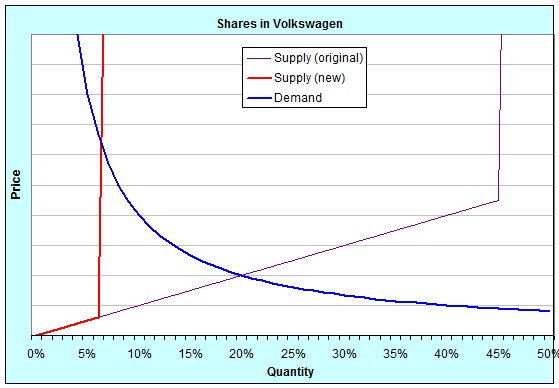
On Monday, Porsche surprised everybody by announcing that they had (through the use of derivatives like warrants and call options), increased their not-for-sale stake from 35% to a little over 74%.  This meant that instead of 45% of the shares being available for sale on the open market, only 6% were.  It was a shift in the supply curve, like this:

Shares in Volkswagen (new)

Because at such low quantities both supply and demand were very inelastic, the price jumped enormously.  Last week, the price finished on Friday at roughly €211 per share.  By the close of trading on Monday, it had reached €520 per share.  At the close of trading on Tuesday, it was €945 per share.  In fact, during the day on Tuesday it at one point reached €1005 per share, temporarily making it the largest company in the world by market capitalisation!

Who said that first-year economics classes aren’t fun?

Australia, you’re not as rich as you think you are

We’re covering this in my EC102 classes this week and I thought it interesting enough to share with a wider audience:

Looking at what goes into GDP is usually a pretty tedious affair, but the simplest way to think of it is like this: GDP is meant to represent the total value added. It is new work done; new stuff produced.

One upshot of this is that new houses are counted in GDP, while sales of existing houses are not. This is because sales of existing houses are just value transferred – an exchange of assets – and so don’t represent new effort. That’s not quite true. The real-estate agent fees and legal fees associated with the sale count, since they are new work done: they add new value by facilitating the trade.

Here’s a trick in looking at value added: we only need to look at the prices of final goods. This is because the price of the final good will represent the total value added along the entire production chain. The typical example of this used in introductory textbooks is bread:

Who Sells Price Value added
Farmer Wheat $0.10 $0.10
Miller Flour $0.20 $0.10
Baker Bread $0.45 $0.15
Supermarket Packaged and convenient bread $1.00 $0.55


The price of the final good – packaged, convenient bread – is $1.00, which exactly equal to the sum of all the value added. So when the statisticians want to calculate a country’s GDP, they can ignore all the intermediate levels and just add up all the final goods that were produced.So what counts as a final good? Anything that gets sold to someone for consumption or investment. That might be to an individual, or to a private firm, or the government, or someone overseas. (Of course, since I buy both bread and flour from my supermarket, flour is sometimes an intermediate good and sometimes a final good; but it’s easy to tell which is which – flour sold by the supermarket is final, while flour sold by the miller is intermediate.)

Now consider a country that has a large natural resource sector. Australia is a great example. So are all the oil exporting countries. We’ll pick the mining of iron ore in Australia as an example. Just like with the wheat above, there is a whole range of production possibilities based on the iron ore. However, when it’s exported, the final good that gets counted from the point of view of the Australian economy is the iron ore in the ship as it sails off to another country.The mining companies are definitely adding value. They’ve got to find the stuff in the first place, dig it up, clean it a bit to get rid of the dirt, transport it to the coast and then ship it overseas. They’ve also got to maintain all their equipment and allow for the fact that they wear out over time. All of that is new effort. But the price that India or China pays for the ore is more than cost of doing all of that. A large fraction of the price they pay represents the market value of the underlying asset – the ore – itself. But since the mining company didn’t actually produce the ore, that part of the price shouldn’t really count in GDP, for the same reason that when existing houses are sold, only the agent and legal fees are counted. None of this is really news.

When natural-resource-based industries are only a small part of a country’s economy, there’s not too much distortion, so we tend not to worry about it. But when those industries represent a large share of the national income, then the overestimates can be significant. In Australia, mining represents about 6.7% of the national economy. A fair chunk of that will be “true” value added, but a large share of it is really just the transfer of assets. How much? Well, BHP currently has a Return on Equity of 49%, while the long-run, risk-free return on capital is more like 8-10%. So as a very rough guess, assuming that BHP is representative of the mining industry as a whole and that the mining industry is competitive, we might suggest that Australia’s “true” GDP is at least 39% * 6.7% = 2.6% smaller than we think it is.

Some people might at this point wonder about the farmer back in the bread example. What if the farmer who, like BHP, is taking something from the land, is actually only adding 60% of the value that we think she is? The answer lies in the fact that there is a large production chain that builds up from the farmer’s wheat. Even if we remove a large fraction of the farmer’s value-added, that is only a small share of the total value added that we see in the final good’s price. So we would expect this overestimate to be very small overall. The point about mining is that we are only adding a small amount of value relative to that of the asset we are trading away, so as a percentage of the final good, the asset itself is quite large.

Teaching EC102 – Economics B

Apologies for the hiatus. I’ve been moving house, dealing with a broken computer, finishing up a job and stuff like that.

It turns out that I will be a class teacher (a “T.A.” for any Americans in the audience, a “tutor” for any Australians) this year for EC102. It is the largest course offered by LSE, with something like 700 students. It’s meant to be a year-long introduction to economics for the more mathematically-inclined students that intend to continue studying the topic in the rest of their degree. I’ll be looking after five classes, with 15 or so eager young minds in each. Joy. 🙂