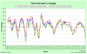
The preliminary employment data for February in the USA has been out for a little while now and I thought it worthwhile to update the graphs I did after January’s figures.
As I explained when producing the January graphs, I believe that it’s more representative to look at Weekly Hours Worked Per Capita than at just the number of people with jobs so as to more fully take into account part-time work, the entry of women into the labour force and the effects of discouraged workers. Graphs that only look at total employment (for example: 1, 2) paint a distorted picture.
The Year-over-Year percentage changes in the number of employed workers, the weekly hours per capita and the weekly hours per workforce member continue to worsen. The current recession is still not quite as bad as that in 1981/82 by this measure, but it’s so close as to make no difference.
Just looking at year-over-year figures is a little deceptive, though, as it’s not just how far below the 0%-change line you fall that matters, but also how long you spend below it. Notice, for example, that while the 2001 recession never saw catastrophically rapid falls in employment, it continued to decline for a remarkably long time.
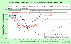
That’s why it’s useful to compare recessions in terms of their cumulative declines from peak:
- The figures are relative to the actual peak in weekly hours worked per capita, not to the official (NBER-determined) peak in economic activity.
- I have shown the official recession durations (solid arrows) and the actual periods of declining weekly hours worked per capita (dotted lines) at the top.
- The 1980 and 2001 recessions were odd in that weekly hours worked per capita never fully recovered before the next recession started.
The fact that the current recession isn’t yet quite as bad as the 1981/82 recession is a little clearer here. The 1973-75 recession stands out as being worse than the current one and the 2001 recession was clearly the worst of all.
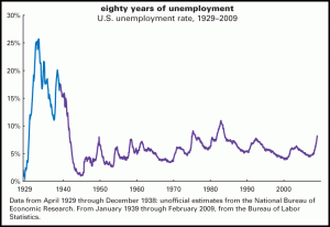
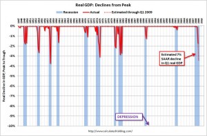
There’s also some question over the US is actually in a depression rather than just a recession. The short answer is no, or at least not yet. There is no official definition of a depression, but a cumulative decline of 10% in real GDP is often bandied around as a good rule of thumb. Here are two diagrams that illustrate just how much worse things would need to be before the US was really in a depression …
First, from The Liscio Report, we have an estimated unemployment rate time-series that includes the Great Depression:
Second, from Calculated Risk, we have a time-series of cumulative declines in real gdp since World War II:
Remember that we’d need to fall to -10% to hit the common definition of a depression.


