Calm down people. Kocherlakota is still a hawk.

A certain kind of nerd is excited about this recent speech by Narayana Kocherlakota, the president of the Minneapolis arm of the Federal Reserve.  Watching him speak, some people think they saw a leopard not only change its spots, but but paint stripes on as well.

The reason?  Well, Kocherlakota is famously an inflation hawk (we do like our animal analogies, don’t we?), but in the speech he argued that the Fed should commit to keeping interest rates at “exceptionally low levels” until unemployment in America falls to 5.5% (it’s currently 8.3% and was last at 5.5% around May 2008) and, as a general rule, inflation hawks are not meant to care about unemployment.  They’re meant to focus, like a hawk, on inflation.  Here are Bloomberg, Joe Weisenthal, Neil Irwin, FT Alphaville, Felix Salmon, Tim Duy, Scott Sumner, Aki Ito and Brad DeLong (I don’t mean to suggest that these guys are all suggesting that Kocherlakota has become a dove — they’re just all worth reading).

Let’s look at his speech (I’m mixing his words up a little, but the words and their meaning are the same):

As long as longer-term inflation expectations are stable and that the Committee’s medium-term outlook for the annual inflation rate is within a quarter of a percentage point of its target of 2 percent, [the FMOC] should keep the fed funds rate extraordinarily low until the unemployment rate has fallen below 5.5 percent.

This is not the statement that a dove would make.  A dove would be speaking about giving weight to both unemployment and inflation in any decision rule.  A NGDP-targetter, if forced against their will to speak in this language, would speak of something close to a 50-50 weighting, for example.  But that’s not what Kocherlakota is saying here.  He is instead saying that the Fed should keep long-term expectations of inflation stable (presumably at 2%) and, in any event, freak out if inflation over the coming year is likely to be any higher than 2.25% and only then, when as an inflation hawk he has nothing to worry about, should the Fed be willing to look at unemployment.

These are still lexicographic preferences.  “Fight inflation first and ignore unemployment while you’re doing it,” he is saying.  “Then look at unemployment (but be prepared to ditch it if inflation so much as twitches).”

As I say, these are not the ideas of an inflation dove.

It does represent at least a slight shift, though.  As Tim Duy makes clear, last year he thought a core PCE inflation rate of 1.5% would be enough to trigger an increase in interest rates, whereas now he appears to be focusing on 2.25% in headline CPI inflation.  Those are different objects, though, so it’s not always apples-to-apples.

Instead, I perceive two main shifts in Kocherlakota’s viewpoint:

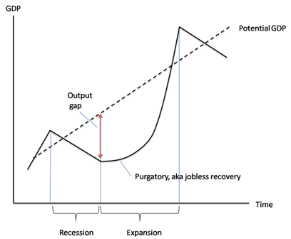
First, and most importantly, he has been convinced that much of America’s currently-high unemployment is because of deficient demand and not, as he used to hold, because of structural (i.e. supply-side) factors.  Here is a snippet from an interview he did with the FT:

“I’m putting less weight on the structural damage story,” said Mr Kocherlakota, arguing that recent research on unemployment pointed more towards “persistent demand shortfalls”. Either way, he said, “the inflation outlook is going to be pretty crucial in telling the difference between the two”.

The recent research he mentions, at least in part, will be this paper by Edward Lazear and James Spletzer presented recently at Jackson Hole.  Here’s the abstract:

The recession of 2007-09 witnessed high rates of unemployment that have been slow to recede. This has led many to conclude that structural changes have occurred in the labor market and that the economy will not return to the low rates of unemployment that prevailed in the recent past. Is this true? The question is important because central banks may be able to reduce unemployment that is cyclic in nature, but not that which is structural. An analysis of labor market data suggests that there are no structural changes that can explain movements in unemployment rates over recent years. Neither industrial nor demographic shifts nor a mismatch of skills with job vacancies is behind the increased rates of unemployment. Although mismatch increased during the recession, it retreated at the same rate. The patterns observed are consistent with unemployment being caused by cyclic phenomena that are more pronounced during the current recession than in prior recessions.

Second (and to some extent, this is just a corollary of the first), Kocherlakota is now emphasising that conditional on inflation being tightly restrained, he is happy to deploy (almost) any amount of stimulus to help improve the employment situation, whereas previously his emphasis was on how additional stimulus would lead to more inflation.

In other words, I read this speech as evidence that Kocherlakota’s underlying philosophy remains unchanged, but his perception of the problems to which he needs to apply that philosophy has changed.  That doesn’t make him a leopard changing it’s spots, that makes him principled, intelligent and open minded.

Naturally, Mark Thoma said all of this before me, and better than I could have.

Update:

Ryan Advent, over at the Economist’s Free Exchange, also has a comment worth reading. He expands a little on the two points I mention:

As Mr Kocherlakota points out, one advantage of the threshold approach (an advantage shared by NGDP targeting) is that it allows members to remain agnostic about the extent of structural unemployment in the economy. If unemployment is mostly structural, the inflation threshold will be crossed first; if not, the unemployment threshold will. Either way, the Fed has set its tolerances and adopted a policy to get there.

… which is something that I had originally meant to highlight in this post (honest!). Ryan continues:

(I will point out, however, that the threshold approach implies contracting in the fact of negative structural shocks and easing in the face of positive productivity shocks while NGDP targeting will generally pull in the opposite direction, more sensibly in my view.)

That’s the real debate, right there. Generally everyone agrees on what to do when faced with a demand shock, but how to deal with supply shocks continues to be a matter of considerable disagreement, no doubt to the frustration of both sides. That and how best to disentangle the data to identify whether a shock, or more correctly an assortment of shocks is, on net, mostly supply or mostly demand.

Seasonal adjustments to unemployment in the USA

I might as well put this here.  Brad DeLong writes:

Microsoft Excel.png

Put me down as somebody who does not believe that the seasonal factor in the unemployment rate is twice as big today as it was four short years ago, or was half as big four short years ago as it was in the early 1990s…

Not that I am complaining about the BLS, you understand. If I could do better, they would already have done better. Nevertheless this is a source of nervousness…

My first thoughts:

At a first glance, the size of the seasonal adjustment factor looks like it is countercyclical to the business cycle, which immediately raises the question: Why would seasonality-based volatility in unemployment increase during a recession?

Could it just be that seasonal employment is less susceptible to business cycle movements than regular employment, so that during a recession the (relatively constant) seasonal movements look larger relative to the smaller total employment number?

Some brief thoughts on QE2

  • Instead of speaking about “the interest rate” or even “the yield curve”, I wish people would speak more frequently about the yield surface:  put duration on the x-axis, per-period default risk on the y-axis and the yield on the z-axis.  Banks do not just borrow short and lend long; they also borrow safe and lend risky.
  • Liquidity is not uniform over the duration-instantaneous-default-risk space.   Liquidity is not even monotonic over the duration-instantaneous-default-risk space.
  • There is still a trade-off for the Fed in wanting lower interest rates for long-duration, medium-to-high-risk borrowers to spur the economy and wanting a steep yield surface to help banks with weak balance sheets improve their standing.
  • By keeping IOR above the overnight rate, the Fed is sterilising their own QE (the newly-injected cash will stay parked in reserve accounts) and the sole remaining effect, as pointed out by Brad DeLong, is through a “correction” for any premiums demanded for duration risk.
  • Nevertheless, packaging the new QE as a collection of monthly purchases grants the Fed future policy flexibility, as they can always declare that it will be cut off after only X months or will be extended to Y months.
  • It seems fairly clear to me that the announcement was by-and-large expected and so “priced in” (e.g. James Hamilton), but there was still something of a surprise (it was somewhat greater easing than was expected) (e.g. Scott Sumner).
  • Menzie Chinn thinks there is a bit of a puzzle in that while bond markets had almost entirely priced it in, fx-rate markets (particularly USD-EUR) seemed to move a lot.  I’m not entirely sure that I buy his argument, as I’m not entirely sure why we should expect the size of the response to a monetary surprise to be the same in each market.

US treasury interest rates and (disin|de)flation

This Bloomberg piece from a few days ago caught my eye.  Let me quote a few hefty chunks from the article (highlighting is mine):

Bond investors seeking top-rated securities face fewer alternatives to Treasuries, allowing President Barack Obama to sell unprecedented sums of debt at ever lower rates to finance a $1.47 trillion deficit.

While net issuance of Treasuries will rise by $1.2 trillion this year, the net supply of corporate bonds, mortgage-backed securities and debt tied to consumer loans may recede by $1.3 trillion, according to Jeffrey Rosenberg, a fixed-income strategist at Bank of America Merrill Lynch in New York.

Shrinking credit markets help explain why some Treasury yields are at record lows even after the amount of marketable government debt outstanding increased by 21 percent from a year earlier to $8.18 trillion. Last week, the U.S. government auctioned $34 billion of three-year notes at a yield of 0.844 percent, the lowest ever for that maturity.
[…]
Global demand for long-term U.S. financial assets rose in June from a month earlier as investors abroad bought Treasuries and agency debt and sold stocks, the Treasury Department reported today in Washington. Net buying of long-term equities, notes and bonds totaled $44.4 billion for the month, compared with net purchases of $35.3 billion in May. Foreign holdings of Treasuries rose to $33.3 billion.
[…]
A decline in issuance is expected in other sectors of the fixed-income market. Net issuance of asset-backed securities, after taking into account reinvested coupons, will decline by $684 billion this year, according to Bank of America’s Rosenberg. The supply of residential mortgage-backed securities issued by government-sponsored companies such as Fannie Mae and Freddie Mac is projected to be negative $320 billion, while the debt they sell directly will shrink by $164 billion. Investment- grade corporate bonds will decrease $132 billion.

“The constriction in supply is all about deleveraging,” Rosenberg said.
[…]
“There’s been a collapse in both consumer and business credit demand,” said James Kochan, the chief fixed-income strategist at Menomonee Falls, Wisconsin-based Wells Fargo Fund Management, which oversees $179 billion. “To see both categories so weak for such an extended period of time, you’d probably have to go back to the Depression.”

Greg Mankiw is clearly right to say:

“I am neither a supply-side economist nor a demand-side economist. I am a supply-and-demand economist.”

(although I’m not entirely sure about the ideas of Casey Mulligan that he endorses in that post — I do think that there are supply-side issues at work in the economy at large, but that doesn’t necessarily imply that they are the greater fraction of America’s macroeconomic problems, or that demand-side stimulus wouldn’t help even if they were).

When it comes to US treasuries, it’s clear that shifts in both demand and supply are at play.  Treasuries are just one of the investment-grade securities on the market that are, as a first approximation, close substitutes for each other.  While the supply of treasuries is increasing, the supply of investment-grade securities as a whole is shrinking (a sure sign that demand is falling in the broader economy) and the demand curve for those same securities is shifting out (if the quantity is rising and the price is going up and supply is shifting back, then demand must also be shifting out).

Paul Krugman and Brad DeLong have been going on for a while about invisible bond market vigilantes, criticising the critics of US fiscal stimulus by pointing out that if there were genuine fears in the market over government debt, then interest rates on the same (which move inversely to bond prices) should be rising, not falling as they have been.  Why the increased demand for treasuries if everyone’s meant to be so afraid of them?

They’re right, of course (as they so often are), but that’s not the whole picture.  In the narrowly-defined treasuries market, the increasing demand for US treasuries is driven not only by the increasing demand in the broader market for investment-grade securities, but also by the contraction of supply in the broader market.

It’s all, in slow motion, the very thing many people were predicting a couple of years ago — the gradual nationalisation of hither-to private debt.  Disinflation (or even deflation) is essentially occurring because the government is not replacing all of the contraction in private credit.

Double-yolk eggs, clustering and the financial crisis

I happened to be listening when Radio 4’s “Today Show” had a little debate about the probability of getting a pack of six double-yolk eggs.  Tim Harford, who they called to help them sort it out, relates the story here.

So there are two thinking styles here. One is to solve the probability problem as posed. The other is to apply some common sense to figure out whether the probability problem makes any sense. We need both. Common sense can be misleading, but so can precise-sounding misspecifications of real world problems.

There are lessons here for the credit crunch. When the quants calculate that Goldman Sachs had seen 25 standard deviation events, several days in a row, we must conclude not that Goldman Sachs was unlucky, but that the models weren’t accurate depictions of reality.

One listener later solved the two-yolk problem. Apparently workers in egg-packing plants sort out twin-yolk eggs for themselves. If there are too many, they pack the leftovers into cartons. In other words, twin-yolk eggs cluster together. No wonder so many Today listeners have experienced bountiful cartons.

Mortgage backed securities experienced clustered losses in much the same unexpected way. If only more bankers had pondered the fable of the eggs.

The link Tim gives in the middle of my quote is to this piece, also by Tim, at the FT.  Here’s the bit that Tim is referring to (emphasis at the end is mine):

What really screws up a forecast is a “structural break”, which means that some underlying parameter has changed in a way that wasn’t anticipated in the forecaster’s model.

These breaks happen with alarming frequency, but the real problem is that conventional forecasting approaches do not recognise them even after they have happened. [Snip some examples]

In all these cases, the forecasts were wrong because they had an inbuilt view of the “equilibrium” … In each case, the equilibrium changed to something new, and in each case, the forecasters wrongly predicted a return to business as usual, again and again. The lesson is that a forecasting technique that cannot deal with structural breaks is a forecasting technique that can misfire almost indefinitely.

Hendry’s ultimate goal is to forecast structural breaks. That is almost impossible: it requires a parallel model (or models) of external forces – anything from a technological breakthrough to a legislative change to a war.

Some of these structural breaks will never be predictable, although Hendry believes forecasters can and should do more to try to anticipate them.

But even if structural breaks cannot be predicted, that is no excuse for nihilism. Hendry’s methodology has already produced something worth having: the ability to spot structural breaks as they are happening. Even if Hendry cannot predict when the world will change, his computer-automated techniques can quickly spot the change after the fact.

That might sound pointless.

In fact, given that traditional economic forecasts miss structural breaks all the time, it is both difficult to achieve and useful.

Talking to Hendry, I was reminded of one of the most famous laments to be heard when the credit crisis broke in the summer. “We were seeing things that were 25-standard deviation moves, several days in a row,” said Goldman Sachs’ chief financial officer. One day should have been enough to realise that the world had changed.

That’s pretty hard-core.  Imagine if under your maintained hypothesis, what just happened was a 25-standard deviation event.  That’s a “holy fuck” moment.  David Viniar, the GS CFO, then suggests that they occurred for several days in a row.  A variety of people (for example, Brad DeLong, Felix Salmon and Chris Dillow) have pointed out that a 25-standard deviation event is so staggeringly unlikely that the universe isn’t old enough for us to seriously believe that one has ever occurred.  It is therefore absurd to propose that even a single such event occurred.   The idea that several of them happened in the space of a few days is beyond imagining.

Which is why Tim Harford pointed out that even after the first day where, according to their models, it appeared as though a 25-standard deviation event had just occurred, it should have been obvious to anyone with the slightest understanding of probability and statistics that they were staring at a structural break.

In particular, as we now know, asset returns have thicker tails than previously thought and, possibly more importantly, the correlation of asset returns varies with the magnitude of that return.  For exceptionally bad outcomes, asset returns are significantly correlated.

On interest rates

In what Tyler Cowen calls “Critically important stuff and two of the best recent economics blog posts, in some time,” Paul Krugman and Brad DeLong have got some interesting thoughts on US interest rates.  First Krugman:

On the face of it, there’s no reason to be worried about interest rates on US debt. Despite large deficits, the Federal government is able to borrow cheaply, at rates that are up from the early post-Lehman period … but well below the pre-crisis levels:

DESCRIPTION

Underlying these low rates is, in turn, the fact that overall borrowing by the nonfinancial sector hasn’t risen: the surge in government borrowing has in fact, less than offset a plunge in private borrowing.

So what’s the problem?

Well, what I hear is that officials don’t trust the demand for long-term government debt, because they see it as driven by a “carry trade”: financial players borrowing cheap money short-term, and using it to buy long-term bonds. They fear that the whole thing could evaporate if long-term rates start to rise, imposing capital losses on the people doing the carry trade; this could, they believe, drive rates way up, even though this possibility doesn’t seem to be priced in by the market.

What’s wrong with this picture?

First of all, what would things look like if the debt situation were perfectly OK? The answer, it seems to me, is that it would look just like what we’re seeing.

Bear in mind that the whole problem right now is that the private sector is hurting, it’s spooked, and it’s looking for safety. So it’s piling into “cash”, which really means short-term debt. (Treasury bill rates briefly went negative yesterday). Meanwhile, the public sector is sustaining demand with deficit spending, financed by long-term debt. So someone has to be bridging the gap between the short-term assets the public wants to hold and the long-term debt the government wants to issue; call it a carry trade if you like, but it’s a normal and necessary thing.

Now, you could and should be worried if this thing looked like a great bubble — if long-term rates looked unreasonably low given the fundamentals. But do they? Long rates fluctuated between 4.5 and 5 percent in the mid-2000s, when the economy was driven by an unsustainable housing boom. Now we face the prospect of a prolonged period of near-zero short-term rates — I don’t see any reason for the Fed funds rate to rise for at least a year, and probably two — which should mean substantially lower long rates even if you expect yields eventually to rise back to 2005 levels. And if we’re facing a Japanese-type lost decade, which seems all too possible, long rates are in fact still unreasonably high.

Still, what about the possibility of a squeeze, in which rising rates for whatever reason produce a vicious circle of collapsing balance sheets among the carry traders, higher rates, and so on? Well, we’ve seen enough of that sort of thing not to dismiss the possibility. But if it does happen, it’s a financial system problem — not a deficit problem. It would basically be saying not that the government is borrowing too much, but that the people conveying funds from savers, who want short-term assets, to the government, which borrows long, are undercapitalized.

And the remedy should be financial, not fiscal. Have the Fed buy more long-term debt; or let the government issue more short-term debt. Whatever you do, don’t undermine recovery by calling off jobs creation.

The point is that it’s crazy to let the rescue of the economy be held hostage to what is, if it’s an issue at all, a technical matter of maturity mismatch. And again, it’s not clear that it even is an issue. What the worriers seem to regard as a danger sign — that supposedly awful carry trade — is exactly what you would expect to see even if fiscal policy were on a perfectly sustainable trajectory.

Then DeLong:

I am not sure Paul is correct when he says that the possible underlying problem is merely “a technical matter of maturity mismatch.” The long Treasury market is thinner than many people think: it is not completely implausible to argue that it is giving us the wrong read on what market expectations really are because long Treasuries right now are held by (a) price-insensitive actors like the PBoC and (b) highly-leveraged risk lovers borrowing at close to zero and collecting coupons as they try to pick up nickles in front of the steamroller. And to the extent that the prices at which businesses can borrow are set by a market that keys off the Treasury market, an unwinding of this “carry trade”–if it really exists–could produce bizarre outcomes.

Bear in mind that this whole story requires that the demand curve slope the wrong way for a while–that if the prices for Treasury bonds fall carry traders lose their shirts and exit the market, and so a small fall in Treasury bond prices turns into a crash until someone else steps in to hold the stock…

For reference, here are the time paths of interest rates for a variety of term lengths and risk profiles (all taken from FRED):

interest_rates_1monthinterest_rates_3monthsinterest_rates_30years

To my own mind, I’m somewhat inclined to agree with Krugman.  While I do believe that the carry trade is occurring, I suspect that it’s effects are mostly elsewhere, or at least that the carry trade is not being played particularly heavily in long-dated US government debt relative to other asset markets.

Notice that the AAA and BAA 30-year corporate rates are basically back to pre-crisis levels and that the premium they pay over 30-year government debt is also back to typical levels.  If the long-dated rates are being pushed down to pre-crisis levels solely by increased supply thanks to the carry trade, then we would surely expect the quantity of credit to also be at pre-crisis levels.  But new credit issuance is down relative to the pre-crisis period.  Since the price is largely unchanged, that means that both demand and supply of credit have shrunk – the supply from fear in the financial market pushing money to the short end of the curve and the demand from the fact that there’s been a recession.

Understanding John Yoo and the Bush presidency

Brad DeLong is continuing to maintain his stand against John Yoo.  To my mind, there is one clear way that John Yoo’s torture memos can be reconciled with his earlier writing on Clinton: He believes in the absolute primacy of the United States above all other nations.

Taking that as a postulate, placing US troops under foreign command becomes axiomatically unacceptable and was hence labelled unconstitutional [1], but allowing US agents to torture foreigners is acceptable, albeit unpleasant, because the victims are not American.

In practice, this becomes the application to the international stage of Richard Nixon’s famous 1977 quote, “when the President does it that means that it is not illegal.” Indeed, Condolezza Rice argued this exact point earlier this year (2009):

by definition, if it was authorized by the president, it did not violate our obligations under the Convention Against Torture.

This is simply the logical application (to the arena of military torture) of the belief that America should ignore all international agreements that constrain it in any way because to do otherwise would impugn the sovereignty of the greatest and purest nation in the history of mankind. You really have to admire their mental fortitude in failing to acknowledge the reductio ad absurdum that the Bush torture doctrine represented for that belief.

[1] To almost all Americans (including lawyers), the word “unconstitutional,” especially when applied in a political setting (and when is it not?), essentially means “against my ideology.”

In which I respectfully disagree with Paul Krugman

Paul Krugman [Ideas, Princeton, Unofficial archive] has recently started using the phrase “jobless recovery” to describe what appears to be the start of the economic recovery in the United States [10 Feb, 21 Aug, 22 Aug, 24 Aug].  The phrase is not new.  It was first used to describe the recovery following the 1990/1991 recession and then used extensively in describing the recovery from the 2001 recession.  In it’s simplest form, it is a description of an economic recovery that is not accompanied by strong jobs growth.  Following the 2001 recession, in particular, people kept losing jobs long after the economy as a whole had reached bottom and even when employment did bottom out, it was very slow to come back up again.  Professor Krugman (correctly) points out that this is a feature of both post-1990 recessions, while prior to that recessions and their subsequent recoveries were much more “V-shaped”.  He worries that it will also describe the recovery from the current recession.

While Professor Krugman’s characterisations of recent recessions are broadly correct, I am still inclined to disagree with him in predicting what will occur in the current recovery.  This is despite Brad DeLong’s excellent advice:

  1. Remember that Paul Krugman is right.
  2. If your analysis leads you to conclude that Paul Krugman is wrong, refer to rule #1.

This will be quite a long post, so settle in.  It’s quite graph-heavy, though, so it shouldn’t be too hard to read. 🙂

Professor Krugman used his 24 August post on his blog to illustrate his point.  I’m going to quote most of it in full, if for no other reason than because his diagrams are awesome:

First, here’s the standard business cycle picture:

DESCRIPTION

Real GDP wobbles up and down, but has an overall upward trend. “Potential output” is what the economy would produce at “full employment”, which is the maximum level consistent with stable inflation. Potential output trends steadily up. The “output gap” — the difference between actual GDP and potential — is what mainly determines the unemployment rate.

Basically, a recession is a period of falling GDP, an expansion a period of rising GDP (yes, there’s some flex in the rules, but that’s more or less what it amounts to.) But what does that say about jobs?

Traditionally, recessions were V-shaped, like this:

DESCRIPTION

So the end of the recession was also the point at which the output gap started falling rapidly, and therefore the point at which the unemployment rate began declining. Here’s the 1981-2 recession and aftermath:

DESCRIPTION

Since 1990, however, growth coming out of a slump has tended to be slow at first, insufficient to prevent a widening output gap and rising unemployment. Here’s a schematic picture:

DESCRIPTION

And here’s the aftermath of the 2001 recession:

DESCRIPTION

Notice that this is NOT just saying that unemployment is a lagging indicator. In 2001-2003 the job market continued to get worse for a year and a half after GDP turned up. The bad times could easily last longer this time.

Before I begin, I have a minor quibble about Prof. Krugman’s definition of “potential output.”  I think of potential output as what would occur with full employment and no structural frictions, while I would call full employment with structural frictions the “natural level of output.”  To me, potential output is a theoretical concept that will never be realised while natural output is the central bank’s target for actual GDP.  See this excellent post by Menzie Chinn.  This doesn’t really matter for my purposes, though.

In everything that follows, I use total hours worked per capita as my variable since that most closely represents the employment situation witnessed by the average household.  I only have data for the last seven US recessions (going back to 1964).  You can get the spreadsheet with all of my data here: US_Employment [Excel].  For all images below, you can click on them to get a bigger version.

The first real point I want to make is that it is entirely normal for employment to start falling before the official start and to continue falling after the official end of recessions.  Although Prof. Krugman is correct to point out that it continued for longer following the 1990/91 and 2001 recessions, in five of the last six recessions (not counting the current one) employment continued to fall after the NBER-determined trough.  As you can see in the following, it is also the case that six times out of seven, employment started falling before the NBER-determined peak, too.

Hours per capita fell before and after recessions

Prof. Krugman is also correct to point out that the recovery in employment following the 1990/91 and 2001 recessions was quite slow, but it is important to appreciate that this followed a remarkably slow decline during the downturn.  The following graph centres each recession around it’s actual trough in hours worked per capita and shows changes relative to those troughs:

Hours per capita relative to and centred around trough

The recoveries following the 1990/91 and 2001 recessions were indeed the slowest of the last six, but they were also the slowest coming down in the first place.  Notice that in comparison, the current downturn has been particularly rapid.

We can go further:  the speed with which hours per capita fell during the downturn is an excellent predictor of how rapidly they rise during the recovery.  Here is a scatter plot that takes points in time chosen symmetrically about each trough (e.g. 3 months before and 3 months after) to compare how far hours per capita fell over that time coming down and how far it had climbed on the way back up:

ComparingRecessions_20090605_Symmetry_Scatter_All

Notice that for five of the last six recoveries, there is quite a tight line describing the speed of recovery as a direct linear function of the speed of the initial decline.  The recovery following the 1981/82 recession was unusually rapid relative to the speed of it’s initial decline.  Remember (go back up and look) that Prof. Krugman used the 1981/82 recession and subsequent recovery to illustrate the classic “V-shaped” recession.  It turns out to have been an unfortunate choice since that recovery was abnormally rapid even for pre-1990 downturns.

Excluding the 1981/82 recession on the basis that it’s recovery seems to have been driven by a separate process, we get quite a good fit for a simple linear regression:

ComparingRecessions_20090605_Symmetry_Scatter_Excl_81-82

Now, I’m the first to admit that this is a very rough-and-ready analysis.  In particular, I’ve not allowed for any autoregressive component to employment growth during the recovery.  Nevertheless, it is quite strongly suggestive.

Given the speed of the decline that we have seen in the current recession, this points us towards quite a rapid recovery in hours worked per capita (although note that the above suggests that all recoveries are slower than the preceding declines – if they were equal, the fitted line would be at 45% (the coefficient would be one)).

US government debt

Greg Mankiw [Harvard] recently quoted a snippet without comment from this opinion piece by Kenneth Rogoff [Harvard]:

Within a few years, western governments will have to sharply raise taxes, inflate, partially default, or some combination of all three.

Reading this sentence frustrated me, because the “will have to” implies that these are the only choices when they are not.  Cutting government spending is the obvious option that Professor Rogoff left off the list, but perhaps the best option, implicitly rejected by the use of the word “sharply“, is that governments stabilise their annual deficits in nominal terms and then let the real growth of the economy reduce the relative size of the total debt over time.  Finally, there is an implied opposition to any inflation, when a small and stable rate of price inflation is entirely desirable even when a country has no debt at all.

Heck, we can even have annual deficits increase every year, so long as the nominal rate of growth plus the accrual of interest due is less than the nominal growth rate (real + inflation) of the economy as a whole and you’ll still see the debt-to-GDP ratio falling over time.

Via Minzie Chinn [U. of Wisconsin], I see that the IMF has a new paper looking at the growth rates of potential output, and the likely path of government debt in the aftermath of the credit crisis.  Using the the historical correlation between the primary surplus, debt, and output gap, they ran some stochastic simulations of how the debt-to-GDP ratio for America is likely to develop over the next 10 years.  Here’s the upshot (from page 37 of the paper):

IMF_US_debt_profile

Here is their text:

Combining the estimated historical primary surplus reaction function with stochastic forecasts of real GDP growth and real interest rates—and allowing for empirically realistic shocks to the primary surplus—imply a much more favorable median projection but slightly larger risks around the baseline. If the federal government on average adjusts the primary surplus as it has done in the past—implying a stronger improvement in the primary balance than under the baseline projections—the probability that debt would exceed 67 percent of GDP by year 2019 would be around 40 percent (Figure 4). Notably, with 80 percent probability, debt would be lower than the level it would reach under staff’s baseline by 2019. [Emphasis added]

So I am not really worried about debt levels for America.  To be frank, neither is the the market, either, despite what you might have heard.  How do I know this?  Because the market, while clearly not perfectly rational, is rational enough to be forward-looking and if they thought that US government debt was a serious problem, they wouldn’t really want to buy any more of that debt today.  But the US has been selling a lot of new bonds (i.e. borrowing a lot of money) lately and the prices of government bonds haven’t really fallen, so the interest rates on them haven’t really gone up.  Here is Brad DeLong [Berkeley]:

[A] sharp increase in Treasury borrowings is supposed to carry a sharp increase in interest rates along with it to crowd out other forms of interest sensitive spending, [but it] hasn’t happened. Hasn’t happened at all:

Treasury marketable debt borrowing by quarterTreasury yield curve

It is astonishing. Between last summer and the end of this year the U.S. Treasury will expand its marketable debt liabilities by $2.5 trillion–an amount equal to more than 20% of all equities in America, an amount equal to 8% of all traded dollar-denominated securities. And yet the market has swallowed it all without a burp…

I don’t want to bag on Professor Rogoff. The majority of his piece is great: it’s a discussion of fundamental imbalances that need to be dealt with. You should read it. It’s just that I’m a bit more sanguine about US government debt than he appears to be.

US February Employment and Recession vs. Depression

The preliminary employment data for February in the USA has been out for a little while now and I thought it worthwhile to update the graphs I did after January’s figures.

As I explained when producing the January graphs, I believe that it’s more representative to look at Weekly Hours Worked Per Capita than at just the number of people with jobs so as to more fully take into account part-time work, the entry of women into the labour force and the effects of discouraged workers.  Graphs that only look at total employment (for example: 1, 2) paint a distorted picture.

The Year-over-Year percentage changes in the number of employed workers, the weekly hours per capita and the weekly hours per workforce member continue to worsen.  The current recession is still not quite as bad as that in 1981/82 by this measure, but it’s so close as to make no difference.

Year-over-year changes in employment and hours worked

Just looking at year-over-year figures is a little deceptive, though, as it’s not just how far below the 0%-change line you fall that matters, but also how long you spend below it.  Notice, for example, that while the 2001 recession never saw catastrophically rapid falls in employment, it continued to decline for a remarkably long time.

That’s why it’s useful to compare recessions in terms of their cumulative declines from peak:

Comparing US recessions relative to actual peaks in weekly hours worked per capitaA few points to note:

  • The figures are relative to the actual peak in weekly hours worked per capita, not to the official (NBER-determined) peak in economic activity.
  • I have shown the official recession durations (solid arrows) and the actual periods of declining weekly hours worked per capita (dotted lines) at the top.
  • The 1980 and 2001 recessions were odd in that weekly hours worked per capita never fully recovered before the next recession started.

The fact that the current recession isn’t yet quite as bad as the 1981/82 recession is a little clearer here.  The 1973-75 recession stands out as being worse than the current one and the 2001 recession was clearly the worst of all.

There’s also some question over the US is actually in a depression rather than just a recession.  The short answer is no, or at least not yet.  There is no official definition of a depression, but a cumulative decline of 10% in real GDP is often bandied around as a good rule of thumb.  Here are two diagrams that illustrate just how much worse things would need to be before the US was really in a depression …

First, from The Liscio Report, we have an estimated unemployment rate time-series that includes the Great Depression:

Historic Unemployment Rates in the USA

Second, from Calculated Risk, we have a time-series of cumulative declines in real gdp since World War II:

Cumulative declines in real GDP (USA)

Remember that we’d need to fall to -10% to hit the common definition of a depression.