Howard and Costello

With the news that Peter Costello will not be seeking reelection, Peter Martin gives us two stories of Costello’s way of dealing with people.  The first, with Saul Eslake, the chief economist of ANZ, is interesting enough, I guess.  The second one really caught my eye:

Richard Denniss is these days the chief of staff for the Greens’ leader Bob Brown. In 2002 he was the chief of staff to the then Democrats’ leader Natasha Stott Despoja. In Mr Costello’s budget speech that year he had announced that pensioners and other concession card holders would have to pay more for their medicines. Their co-payment would climb from $3.60 to $4.60 per prescription.

The Democrats said they would oppose the measure in the Senate. Some weeks later Senator Stott Despoja and Dr Denniss were summoned to the Peter Costello’s office.

Denniss says Costello took them through page after page of laminated graphs, talking at them for the best part of an hour. The Treasurer seemed surprised to discover that they hadn’t been won over.

“At one point Costello said: Natasha, you don’t appear to understand the numbers. To which she replied: I do understand the numbers Peter, you don’t have them in the Senate and you won’t be passing this bill”.

A few days later the two were summoned to the Prime Minister’s office. Denniss says he had expected Mr Howard to be even worse.

Instead they found Howard “effusive in apologising for being late, come in sit down, can I get you a cup of tea – lots of chit chat, lots of actual conversation”.

The Prime Minister said “I know you spoke to the Treasurer last week and I’m sure he showed you all his graphs” and I understand your position: “we are trying to drive up the price of medicine for sick people, of course the Democrats are going to oppose it”.

And then he said: “How about ten cents? That wouldn’t hurt anyone.” “It absolutely floored us.”

Howard said: “Natasha, you’re the leader, I’m the leader, can’t we just settle this right now?”

Denniss says he found the Prime Minister almost impossible to resist. “His genius was to make us feel powerful.”

Costello by contrast “wanted to wield the power that had been bestowed upon him.”

I find this entirely compelling.  Costello always struck me as a technocrat.  I may not have liked Howard much (and not at all for the latter half of his time as PM), but he knew better than most what any specific audience wanted to hear.
CDS hilarity

I’m paraphrasing James Hamilton here.

A credit default swap is a contract that pays out if a specified event occurs on the underlying security. Normally, and in this case, the security is some debt and the event is a default on that debt.

There was a pile of $29 million in debt. Specifically, they were (based on) subprime loans in California and a bunch of them were already delinquent.

A brokerage firm from Texas started offering (i.e. selling) credit default swaps on the $29 million. Since so many of the underlying loans were delinquent, it seemed a sure thing that a default would occur and the big boys in New York were happy to buy the CDS contracts.  In fact, they were so sure that the debt would default that they were willing to pay up to 80 or 90 cents for a $1 payout in the event of a default.

Two important things then played a role:  First, credit default swaps are traded “over the counter”, so if you buy one from me you don’t know how many other people have also bought from me or how many they each bought.  Second, there are (currently) no regulations on credit default swaps and in particular, there is no limit to the scale of the CDS market against a particular asset.

In this case, the big banks paid about $100 million for CDS contracts that would pay out $130 million if the debt defaulted.

The brokerage firm took the $100 million, paid off the debt entirely (so it didn’t default) and walked away with $70 million.

On China

Menzie Chinn emphasises that for the purposes of estimating country shares in global GDP, it is necessary to think of them in nominal terms.  On that basis, China is large, but only half the size of the Euro zone and well under half the size of America.  Therefore, he implies, an increase in demand from China won’t really contribute as much to global growth as people might be hoping.

Nevertheless, people do seem to be wondering about China as an engine of global growth in demand.  The reason is simple:  Despite a near catastrophic collapse in world trade, China’s economy is still growing while those of  other export-oriented countries like Japan or Germany are falling precipitously.

Clearly part of the reason for the continued Chinese growth, like in Australia, is the successful use of a fiscal stimulus to boost local demand (the Australian rebound was also helped by the fact that, by not manufacturing much, their decline in investment was offset by a fall in imports and (price) changes in natural resource exports occur with a significant lag).

Brad Setser has explored the Chinese stimulus a little.  He writes:

I initially underestimated the magnitude of China’s stimulus by focusing on the (fairly modest) change in the government’s fiscal balance. It is now clear that the majority of China’s stimulus has been off-budget: the huge increase in lending by state owned banks mattered far more than the change in the budget of the central government. The expected loss on these loans can be considered a form of fiscal stimulus.

Which is a fascinating way to conduct government business.

On the symmetry of employment contraction and recovery in US recessions

A couple of days ago I gave some graphs depicting movements in weekly hours worked per capita during US recessions since 1964.  Towards the end, I gave this graph:

Comparing US recessions in hours worked per capita, centred around their troughs

I thought it might be worthwhile to look at this idea further.  Here is the equivalent graph where movements in hours worked per capita are made relative to their actual troughs rather than their actual peaks:

Comparing US recessions in hours worked per capita, centred around and relative to their troughs

At a first glance, recoveries do appear to be somewhat symmetric to their corresponding contractions, although they do also appear to be a bit slower coming back up to falling down in the first place.

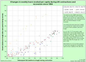
I then identified data pairs that are symmetric in time around each trough (e.g. 3 months before and after the trough) and put them in a scatter-plot:

Scatter plot of falls-to-come in weekly hours per capita against subsequent gains in recovery

Points along the 45-degree line here would represent recoveries that were perfectly symmetric with their preceding contraction.  Notice that for five of the six recessions shown, recoveries are in a fairly tight line below the 45-degree line.  By comparison, the recovery following the ’81-’82 recession was especially rapid – it came back up faster than it fell down.

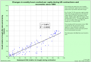
Excluding the ’81-’82 recession on the basis that it’s recovery seems to have been driven by a separate process, a simple linear regression gives a remarkably good fit:

comparingrecessions_20090605_symmetry_scatter_excl_81-82

This is a very rough-and-ready analysis.  In particular, I’ve not allowed for any autoregressive component to employment growth during the recovery.  Nevertheless, it is suggestive.

There are more serious efforts in looking at this for the economy as a whole (rather than just hours worked).  James Hamilton is not convinced that it will occur this time.  The oddly rapid recovery in hours worked per capita following the ’81-’82 recession should give us reason to agree with Professor Hamilton, not disagree: it shows that the typical recovery is not guaranteed.  Look back at the scatter-plot of all the recessions.  Notice that the recovery following the ’69-’70 recession was actually quite slow.  It’s fitted line is y = 0.252 x.

For me, the big thing that makes me lean towards Professor Hamilton’s fears of a slower-than-typical recovery is the possibility of zombie banks, or as John Hempton argues, zombie borrowers.  Zombie borrowers should worry us because, if they exist, they are keeping hold of the capital that could (and should) be better placed elsewhere in the economy, which means that those more deserving would-be borrowers are not able to expand and employ more people.

As Hempton argues in the second of his posts, on this basis it is a Good Thing ™ that two of the three US car manufacturers have been forced into a bankruptcy-induced contraction.  Note that Ford only really managed to avoid the same fate by borrowing a huge amount just before the credit markets froze.  It probably needs (from the point of view of the economy as a whole) to follow the same process, whether inside or outside the courts.

But the car manufacturers are by no means the only candidates for the “zombie borrower” epithet.  The really big borrower behind all of the mess in the financial sector is the one at the bottom of all the “toxic” CDOs:  the underwater American households.

Once more on bankers’ pay

Megan McArdle makes a perfectly sensible point when she writes:

More than one smart analyst thinks that the yearly bonus regime encouraged both traders and their managers to take excess risk. I’m not sure, as an empircal matter, that I buy this argument. Most of those bankers who were allegedly gambling for free with (implicit) taxpayer money in fact lost half or more of their own fortunes in the ensuing crash. From this I infer that they did not, in fact, realize that they were gambling.

I still think that some regulation on bonuses is warranted. Indeed, I think it warranted precisely because the bankers didn’t fully appreciate the risks they were taking. By holding bonuses in escrow for, say, five years, we serve to increase the risk aversion of those bankers.  Megan implies partial agreement with the conclusion, if not the logic, a little later on:

But enforcing, say, a multi-year bonus scheme wouldn’t be terribly destructive, and it might help.

Continuing immediately on, she writes:

On the other hand, if the government starts meddling with the level of compensation, this will be disturbing both because it will not do good things for the American financial services industry, and because, well, who the hell is the government to start telling private firms that are not receiving any taxpayer money how much to pay their employees?

In general I’d agree, but we should also consider the recent work by Thomas Philippon and Ariell Reshef suggesting that remuneration in the finance sector relative to the rest of the economy for a given level of education has been especially high lately.  Here is an ungated version of their paper.  Here is the abstract:

We use detailed information about wages, education and occupations to shed light on the evolution of the U.S. financial sector over the past century. We uncover a set of new, interrelated stylized facts: financial jobs were relatively skill intensive, complex, and highly paid until the 1930s and after the 1980s, but not in the interim period. We investigate the determinants of this evolution and find that financial deregulation and corporate activities linked to IPOs and credit risk increase the demand for skills in financial jobs. Computers and information technology play a more limited role. Our analysis also shows that wages in finance were excessively high around 1930 and from the mid 1990s until 2006. For the recent period we estimate that rents accounted for 30% to 50% of the wage differential between the financial sector and the rest of the private sector. [emphasis added]

… which is prima facie evidence in support of some sort of regulation on remuneration in the finance sector.

Comparison of US recessions in hours worked per capita

Following on from my graphs from January and February‘s data releases, here are some updated graphs based on May’s data release from the BLS [click on each graph to get a bigger version].

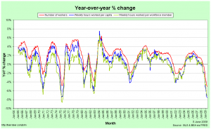
First the year-over-year % change in number of production workers, hours worked per member of the workforce and hours worked per capita:

Year-over-year changes in employment and hours worked

A casual inspection of this graph suggests that the current recession is, for employment, about the same as or a little better than the 1973-75 recession, but that is an incorrect interpretation.  This graph effectively shows rates of change, so it’s not just the depth below zero that matters but the time beneath it as well.  As we will shortly see, the current recession is actually quite a bit worse than the ’73-75 recession and the 2001 recession was a lot worse than it looks.

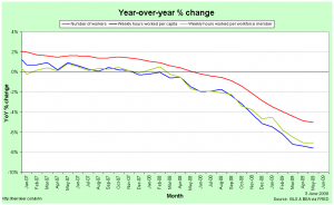
First, though, it’s instructive to zoom-in to the last year or two on the graph:

Year-over-year change in employment and hours worked (zoomed in)

The red line indicates the year-over-year change in employment.  It’s clearly badly negative.  The green line is the change in hours worked per member of the workforce.  This is worse than that for employment because not only are people losing their jobs, but those who keep their jobs are, on average, having their hours cut.  The blue line is the change in hours worked per capita.  This is the worst of the three because in addition to people losing their jobs and those with jobs having their hours cut, some of those without jobs have given up looking.  Notice that the blue and green lines were pretty close together at first.  This suggests that in the first half of the current recession, people who lost their jobs were staying in the workforce in the hope of finding work, while it was only in the second half that some of the unemployed started to lose hope and give up looking.

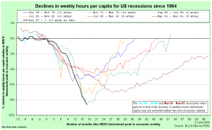
In comparing recessions, I prefer to use the hours-worked-per-capita metric because it captures much more of the employment picture than just employment figures or total hours worked.  Here is a comparison between recessions dating back to 1964, centred around their NBER-determined peak in economic activity:

Comparing hours worked per capita in US recessions relative to NBER-determined peaks in economic activity

Notice that hours worked per capita tend to have been falling for some time before the NBER-determined peak in economic activity.  This is because employment is not the be all and end all of the economy and the dating committee has to take those other elements into account as well.

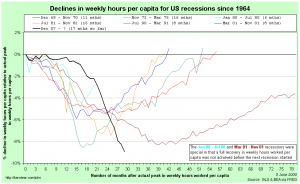
Now we rebase that comparison so each recession is relative to it’s actual peak in hours worked per capita:

Comparing US recessions relative to actual peaks in hours worked per capita

This gives us a true measure of the depth of each recession with respect to employment.  We can see that the ’71-75 and 2001 recessions reached about the same depth and that the current recession has now gone lower than either of them.  Since it is reasonable to assume that the USA will continue to lose jobs (or at least hours worked) in the next couple of months, we can safely call the current recession the worst of this group of seven.

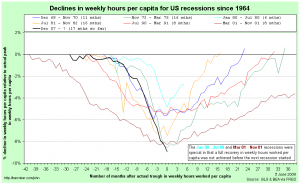
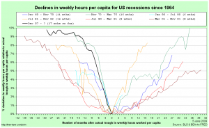
Finally, I thought it worthwhile to compare the falls relative to actual peaks, but centred around each recession’s trough in hours worked per capita (for comparison purposes, I have assumed that the current recession’s trough was in May ’09):

Comparing US recessions in hours worked per capita, centred around their troughs

This graph gives some hope to those imagining a quick recovery.  While the recoveries do tend to be a little slower than the recessions, there does appear to be some symmetry around the troughs.

The short-long-run, the medium-long-run and the long-long-run

EC102 has once again finished for the year.  It occurs to me that my students (quite understandably) got a little confused about the timeframes over which various elements of macroeconomics occur.  I think the reason is that we use overlapping ideas of medium- and long-run timeframes.

In essense, there are four models that we use at an undergraduate level for thinking about aggregate demand and supply.  In increasing order of time-spans involved, they are:  Investment & Savings vs. Liquidity & Money (IS-LM),  Aggregate Supply – Aggregate Demand (AS-AD), Factor accumulation (Solow growth), and Endogenous Growth Theory.

It’s usually taught that following an exogenous shock, the IS-LM model reaches a new equilibrium very quickly (which means that the AD curve shifts very quickly), the goods market in the AS-AD world clears quite quickly and the economy returns to full-employment in “the long-run” once all firms have a chance to update their prices.

But when thinking about the Solow growth model of factor (i.e. capital) accumulation, we often refer to deviations from the steady-state being in the medium-run and that we reach the steady state in the long-run.  This is not the same “long-run” as in the AS-AD model.  The Solow growth model is a classical model, which among other things means that it assumes full employment all the time.  In other words, the medium-run in the world of Solow is longer than the long-run of AS-AD.  The Solow growth model is about shifting the steady-state of the AS-AD model.

Endogenous growth theory then does the same thing to the Solow growth model: endogenous growth is the shifting of the steady-state in a Solow framework.

What we end up with are three different ideas of the “long-run”:  one at business-cycle frequencies, one for catching up to industrialised nations and one for low-frequency stuff in the industrialised countries, or as I like to call them: the short-long-run, the medium-long-run and the long-long-run.

A hint on the nature of the current global recession

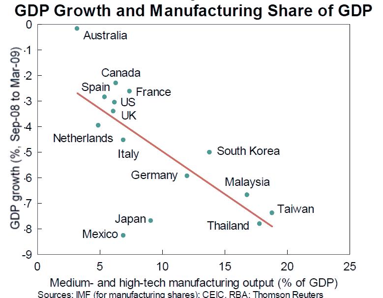
It’s only for a six-month time period and (importantly) doesn’t attempt to correct for the varying policy responses across countries, but this graph highlighted by the Australian Reserve Bank’s governor, Glenn Stevens, is interesting:

gdp-manufacutring


Australia generally imports intermediate capital goods so in the latest numbers the fall in investment was largely balanced out by a fall in imports, while the government’s stimulus handouts probably served to keep consumption up.

As a first guess and without hunting around to see if there are numbers, I suspect that households’ spending of the handouts was also skewed more towards domestically produced goods/services over imports than has been typical for the last few years.

It would be interesting to see trade figures broken down into intermediate and final goods flows more generally.

Hat tip: Peter Martin.